
Measuring Risk-Adjusted Returns with Downside Deviation and the Sortino Ratio
Measuring Risk-Adjusted Returns with Downside Deviation and the Sortino Ratio
April 2026
Topics this month
- Downside deviation as a risk measure visualized on a risk-return scatterplot
- How downside deviation is calculated and why it differs from standard deviation
- Ranking portfolio recipes by Sortino Ratio over a 20-year period
- The Sortino Ratio of 1.00 as a benchmark and what it means for portfolio comparison
Welcome to the April 2026 commentary from RecipeInvesting.com. This month, the focus turns to a deeper examination of risk and return metrics, specifically the trade-offs that emerge when analyzing both Downside Deviation and the Sortino Ratio.
Navigating to Portfolio Recipes and Results, reveals a comprehensive list of all the different asset allocation portfolios, or "portfolio recipes," that we track each month. Above this ranked list, sorted by total return, sits a risk versus return scatterplot worth noting. The scatterplot plots risk on the horizontal axis and return on the vertical axis, using maximum drawdown as its risk measure. Maximum drawdown represents the peak-to-trough loss of an investment based on month-end closing values over a given time period.
Over a 20-year period, for instance, the key question this chart answers is: what is the largest loss any individual portfolio recipe has experienced from peak to trough, measured at each month's end? Some examples from the chart illustrate this well:
- One portfolio recipe recorded a maximum drawdown of 64%, a figure that is, by any measure, quite striking
- Another sits at a 50% drawdown, yet posts a return of 19.5%, reflecting a portfolio that carries meaningful risk but also delivers meaningful rewards, which is why it appears in the upper right corner of the chart
This placement in the upper right is telling. It signals that while the portfolio has experienced significant losses at its worst points, it has also generated strong long-term returns, making it a classic example of the risk-return trade-off that investors must carefully consider.
Introducing Downside Deviation
In addition to maximum drawdown, the platform tracks a number of other risk measures. One such measure is downside deviation, which can also be visualized on a scatterplot, with downside deviation on the horizontal axis and annualized return on the vertical axis.
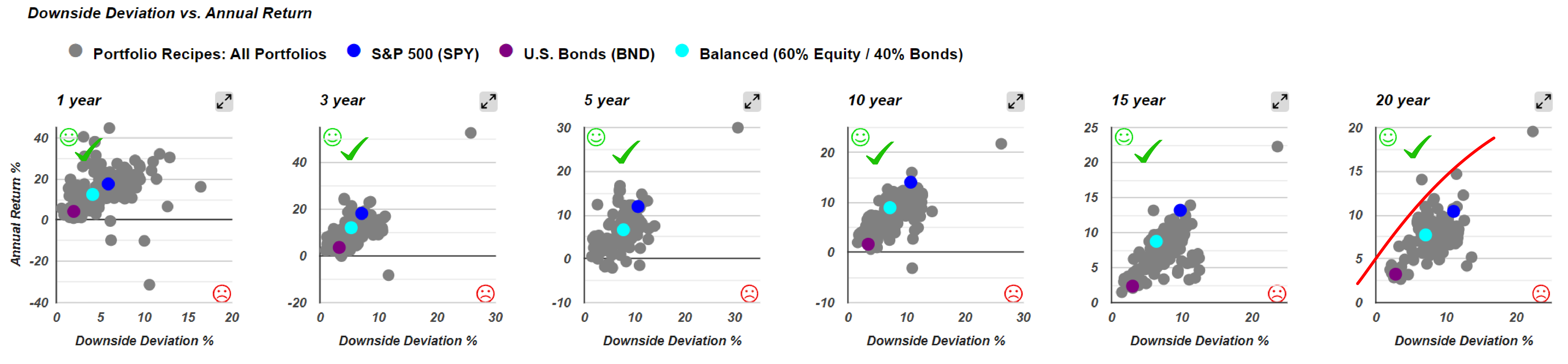
On the scatterplot, the most desirable position is the upper left corner, as it represents an investment that achieves both a high annualized return and a low level of risk. While this corner is largely unattainable in practice, some investments do fall along the frontier, tracing a curved shape that reflects their attempt to get as close as possible to that ideal northwest position.
What Is Downside Deviation and How Is It Calculated?
So what exactly is downside deviation? It is closely related to standard deviation, and RecipeInvesting.com has dedicated a section under Risk and Return Metrics in the getting started page to explain it in greater detail, including what it is, how it works, and how it is calculated.
To put it briefly, the calculation can be done using either annual or monthly returns. Using annual returns over the past ten years as an example, here is how the two measures differ:
- Standard deviation measures how much all returns deviate from the average, meaning even a strong up year can contribute to a higher standard deviation
- Downside deviation, by contrast, sets the minimum acceptable return at zero, meaning only negative or down years are counted as inputs into the calculation
The process for calculating downside deviation is as follows:
- Take each down year, expressed as a negative value
- Square it to convert it to a positive number
- Average the squared values across all years in the period
- Take the square root to convert the result back into a percentage
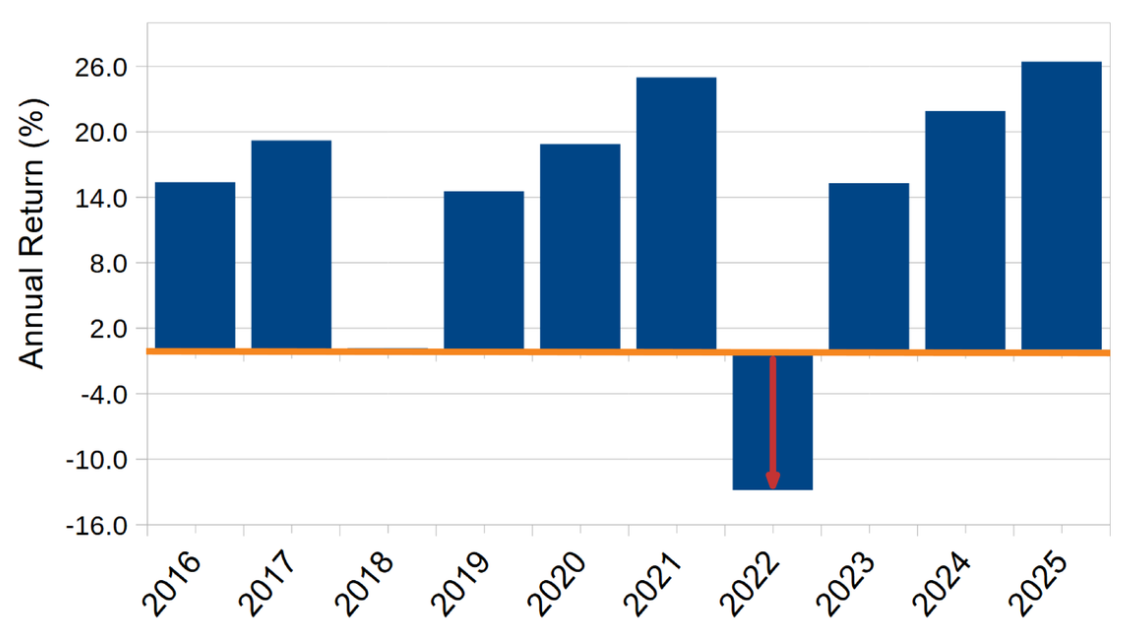
In essence, downside deviation functions like standard deviation, but looks only at downward movement rather than both directions. This is precisely why many investors tend to favor it over standard deviation. It reflects the degree to which an investment has historically dropped below zero in a given period, making it a more targeted and meaningful measure of risk. That said, as with any historical metric, past performance does not necessarily predict future results. It does, however, provide a useful indication of how volatile a particular portfolio has been in the past.
Applying Downside Deviation Across Portfolio Recipes
With downside deviation now established as a metric, it becomes possible to calculate it across all the portfolio recipes tracked on the platform. Returning to the summary sheet, investors can view downside deviation for all portfolio recipes in list form, alongside a 20-year scatterplot that maps downside deviation against returns. Each dot on this chart represents an individual portfolio recipe.
Some portfolios stand out as particularly notable along what might be called the frontier range. Three worth highlighting are:
These three portfolios are performing quite well, though they do carry some degree of risk.
Rather than relying on a general sense that a portfolio has a decent return and a not-too-bad downside deviation, it would be far more useful to attach a single number to each dot on the scatterplot that captures exactly where it stands. As it turns out, such a number does exist. It is essentially the ratio of the height to the width of a rectangle drawn around each dot's position on the chart, reflecting its aspect ratio.

A portfolio sitting high on the vertical axis with a low horizontal spread would produce a tall, narrow rectangle, almost like a skyscraper, and that shape would represent a near-ideal investment. By contrast, portfolios like t.srqr produce much wider rectangles, indicating that while returns are present, the risk dimension stretches considerably. The closer a portfolio's rectangle resembles a skyscraper, the more favorable its risk-return profile.
Another way to think about this is to ask: how much return is an investor getting per unit of risk? Portfolios with a tall, narrow rectangle on the scatterplot are desirable, while those with a wide, flat rectangle signal a poor risk-return trade-off.
Returning to the idea of capturing each portfolio's position on the scatterplot as a single number, the approach is essentially one of measuring aspect ratios, much like how televisions are described by their screen proportions. Each point on the chart has an implied rectangle, and the goal is to determine how tall and narrow that rectangle is relative to how wide it is.
The one additional refinement to this calculation is subtracting the risk-free rate. The risk-free rate, which typically falls somewhere between 3% and 5%, represents the return an investor could earn simply by holding cash or short-term Treasury bills. Since this level of return is available to anyone at essentially no risk, it would not be meaningful to reward a portfolio for merely matching it.
As a result, the aspect ratio of each portfolio's rectangle is measured not from the bottom of the chart, but from the risk-free rate line upward. This ensures that only the return earned above and beyond what is freely available is counted. Across all the portfolios on the scatterplot, it is this adjusted aspect ratio that allows for a fair and consistent comparison of how efficiently each one converts risk into meaningful return.
A Graphical View of the Sortino Ratio
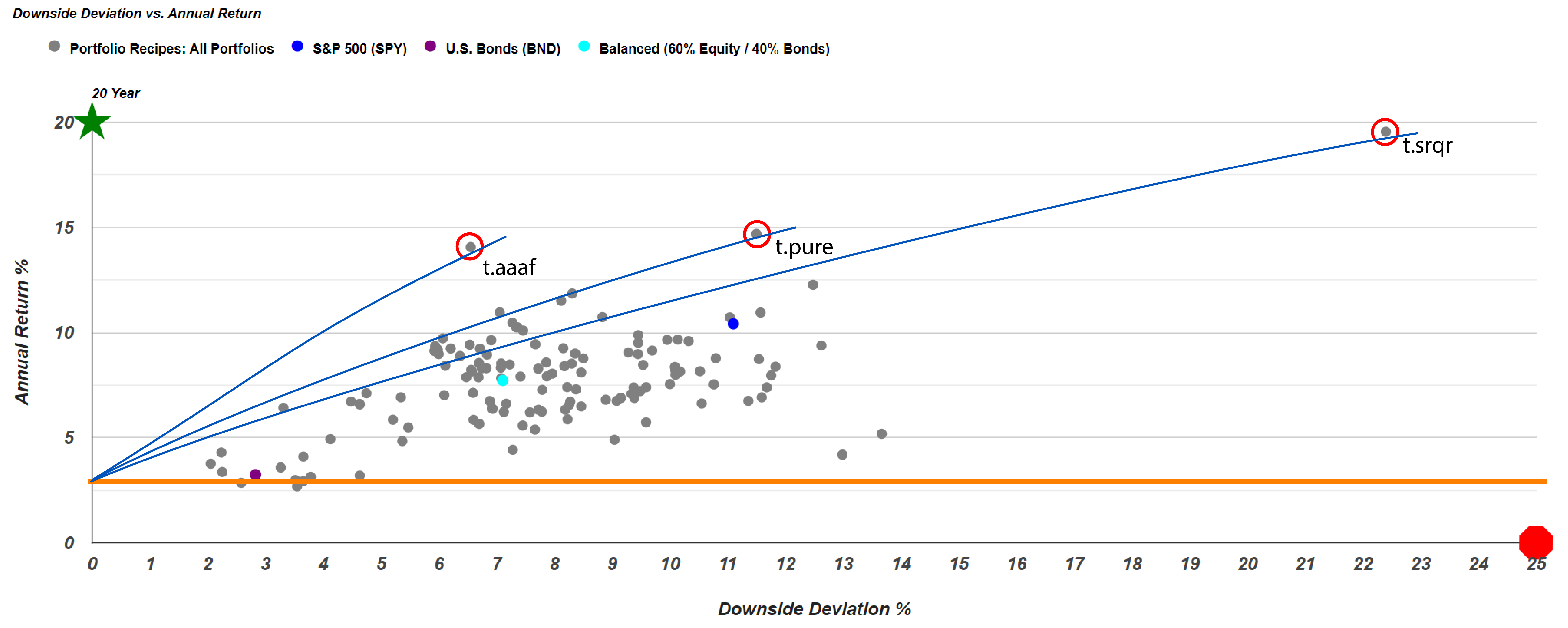
Another way to think about this mathematically is to consider the slope of a line drawn from the risk-free rate up to any given point on the scatterplot. The steeper that line, the better the portfolio's risk-adjusted return. Looking at the three standout portfolios identified earlier, drawing a line from the risk-free rate to each of their positions on the chart reveals something important. Even though one portfolio may show a greater absolute return, the one with the steeper slope, meaning the taller and narrower rectangle, will have the superior aspect ratio.
It is worth noting that t.aaaf has long been a favorite among investors on the platform, and for good reason. It has delivered strong returns over time while maintaining a relatively reasonable level of downside deviation, a combination that positions it favorably when evaluated through the lens of the Sortino Ratio.
To put the expected ranking to the test, sorting all tracked portfolios by their 20-year Sortino Ratio confirms what the scatterplot suggested. The results align closely with the projected order:
- t.aaaf (Adaptive Asset Allocation F): Sortino Ratio of 1.93, ranked first
- t.pure (Pure Momentum): Sortino Ratio of 1.30, ranked second
- t.srqr (Quartile Sector Rotation): Sortino Ratio of 1.15, ranked third
The gap between first and second place is particularly striking. At 1.93, t.aaaf sits well ahead of the rest of the field, meaning that for every unit of risk taken on, the portfolio is generating nearly two units of return. These three portfolios are the same ones that appeared on the downside deviation versus total return scatterplot, and their Sortino Ratios correspond directly to the slopes of the lines drawn from the risk-free rate to each of their positions. The steepest slope produced the highest ratio, and the ranking followed accordingly.
This is precisely what makes the Sortino Ratio such a valuable tool. It distills the entire risk-versus-return trade-off into a single number, specifically measuring the return an investor is receiving per unit of downside risk. Unlike standard deviation, which captures movement in both directions, the Sortino Ratio focuses exclusively on the kind of deviation that actually concerns investors: the downside. That targeted focus makes it a particularly useful and meaningful measure of portfolio performance.
What a Sortino Ratio of 1.00 Tells Investors

As this analysis draws to a close, it is worth pausing on what a Sortino Ratio of exactly 1.00 actually means. A ratio of one indicates that for every unit of downside risk taken on above the risk-free rate, the portfolio is generating exactly one unit of return. Two funds that land at this benchmark are Vanguard Wellesley (VWIAX) and Janus Henderson Balanced (JANBX). Both do a commendable job of delivering returns that are commensurate with the risk they carry.
Plotting these two funds on the downside deviation versus annual return scatterplot alongside other well-known benchmarks, including the S&P 500 ETF (SPY), a Balanced 60/40 portfolio (s.6040), and a U.S. Bond fund (BND), makes the risk-return trade-off visually apparent across the full spectrum of options.

Since VWIAX and JANBX share the same Sortino Ratio of 1.00, they also share the same slope when a line is drawn from the risk-free rate to each of their positions on the chart. This means both funds fall along the same line, which can be thought of as the "Sortino equals one" line on the scatterplot.
Any portfolio sitting above this line carries a Sortino Ratio greater than one, meaning it is generating more return per unit of downside risk than the benchmark. Any portfolio below it is delivering less. The portfolios positioned furthest to the northwest of this line will naturally carry the highest Sortino Ratios, reinforcing once again that proximity to that upper left corner of the chart is the clearest indicator of a strong risk-adjusted return profile.
That covers the overview of the risk versus return chart for downside deviation versus annual return, and how the slope of lines drawn from the risk-free rate to each point on the chart provides a graphical way of thinking about the Sortino Ratio. At its core, the Sortino Ratio takes the portfolio's return, subtracts the risk-free rate, and divides the result by the downside deviation, producing a single figure that represents return earned per unit of downside risk.
When sorting the aggregated list by Sortino Ratio across different time periods, one important consideration is that shorter time periods can introduce distortion. A portfolio that happens to have a strong year with relatively low risk will produce an inflated Sortino Ratio that may not reflect its true long-term profile. For this reason, longer periods of 10, 15, or 20 years tend to offer a more reliable picture. It is worth noting that not all funds or portfolio recipes have been tracked long enough to have 20-year data available, so some entries will show incomplete figures. Exchange-traded funds do appear on the list as well, though they tend to show up further down before the threshold of meaningful Sortino performance is reached.
Sortino Ratio Performance Among Sector ETFs
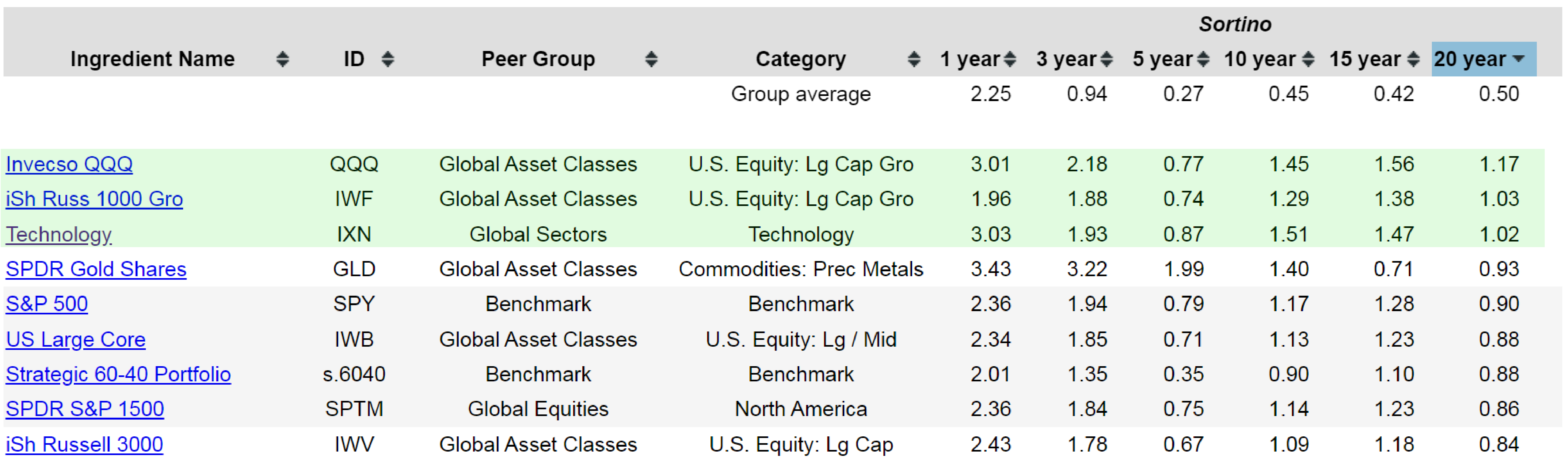
Shifting focus to individual asset class exchange-traded funds, which are broader instruments designed to provide exposure to a particular sector, global asset class, or regional equity market rather than serve as balanced portfolios, the Sortino Ratio data tells an interesting story. When sorted by 20-year performance, only three out of all the asset class and sector funds tracked on the platform have managed to achieve a Sortino Ratio above 1.0:
The fact that so few individual sector funds clear this threshold underscores the importance of diversification. Concentrating an investment in a single industry exposes a portfolio to significant ups and downs over time, and the data reflects this reality clearly. For the vast majority of sector-focused funds, generating returns that exceed the unit of risk taken on has proven to be a difficult bar to clear.
Ultimately, the Sortino Ratio is a powerful yet accessible metric that distills the risk-return relationship into a single, meaningful number. By focusing exclusively on downside risk rather than overall volatility, it gives investors a clearer and more honest picture of how well a portfolio is being compensated for the risks it takes on. Whether evaluating mutual funds, static allocations, tactical portfolios, or individual ETFs, the Sortino Ratio remains one of the most practical tools available for comparing and selecting investments with confidence.