
2026 How to Use Beta and the Treynor Ratio to Pick the Right Portfolio
How to Use Beta and the Treynor Ratio to Pick the Right Portfolio
May 2026
Topics this month
- Beta as a measure of portfolio volatility relative to the S&P 500, visualized through scatterplots comparing beta to annualized return
- Risk vs. return tradeoffs across portfolio recipes, individual asset classes, and outliers like Gold and commodity funds
- The Treynor ratio as a single metric for ranking portfolios by how efficiently they convert market risk into return
Welcome to the May 2026 commentary from RecipeInvesting.com. This month's update is available through the subscriber portal at go.recipeinvesting.com, where investors can access the full range of data and insights covered in this edition.
Understanding Beta Through Portfolio Scatterplots
Most investors have heard the term "beta" before, but understanding how it applies across different portfolio strategies can unlock deeper insight into risk and return.
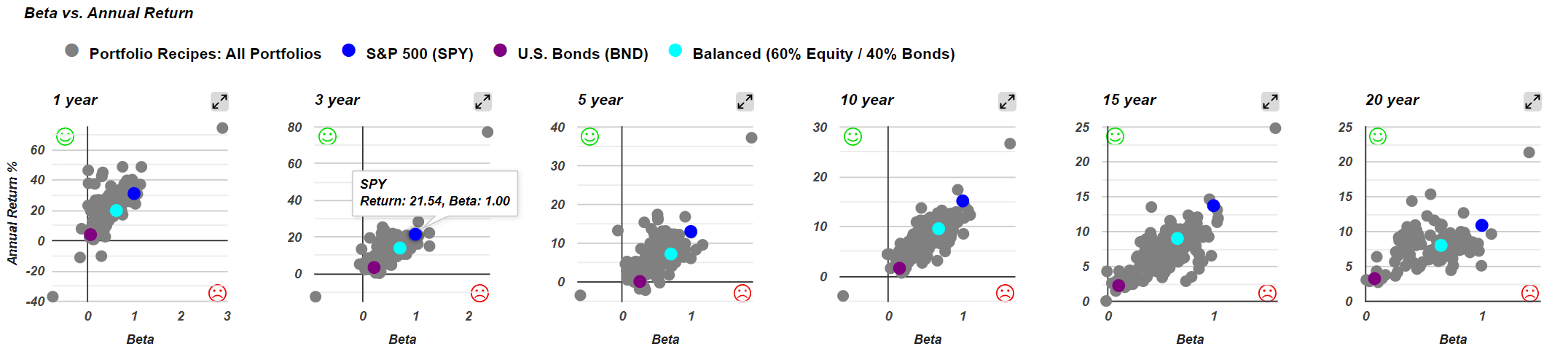
Recipe Investing now features scatterplots that plot beta against total return for every portfolio recipe tracked on the platform. Each portfolio recipe is represented by a single dot on the chart. This layout allows an investor to evaluate two critical variables at once, making it easier to spot how different strategies balance risk exposure with performance.
What Beta Measures
Beta is a measure of volatility for a stock or, in this case, a portfolio recipe, compared to the broader market. Recipe Investing uses the S&P 500 ETF (SPY) as its benchmark, meaning SPY is assigned a beta of exactly 1.0. From there, each portfolio recipe's beta is calculated using a formula that incorporates standard deviation and covariance relative to SPY over a given time period.
The resulting beta value tells an investor how a portfolio's price movements compare to the market:
- A beta of 1.0 means the portfolio moves in line with the S&P 500.
- A beta greater than 1.0 means the portfolio is more volatile than the market.
- A beta less than 1.0 means the portfolio is less volatile than the market.
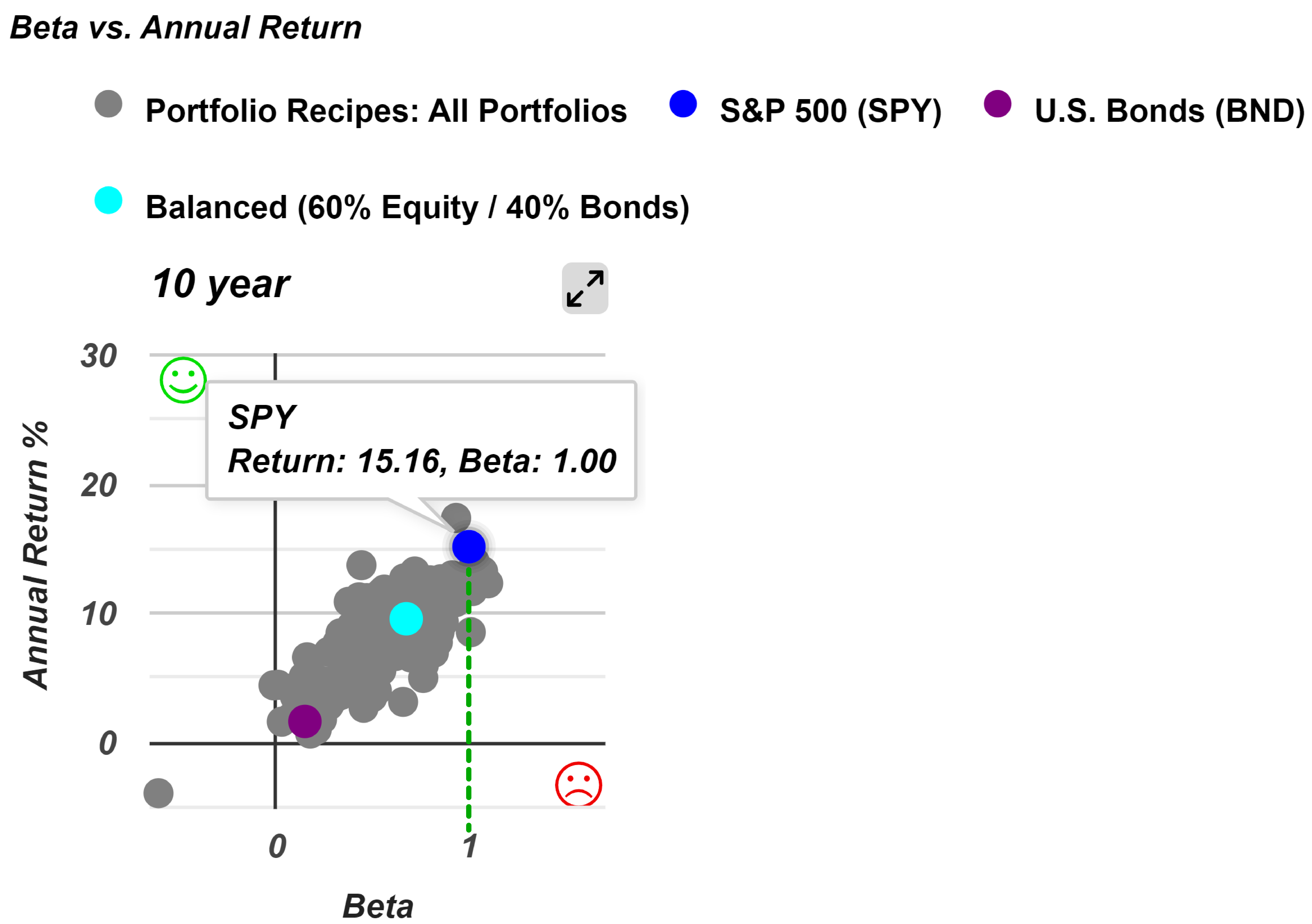
Looking at the ten-year beta scatterplot as an example, each dot represents the variability of an individual portfolio recipe compared to the S&P 500. On the chart, the blue dot representing SPY sits precisely at 1.0 on the horizontal axis, confirming its role as the baseline. Every other dot to the left or right of that benchmark reveals whether a given portfolio has historically been more or less volatile than the market over the same period.
Beta vs. Return: Is the Extra Volatility Worth It?
Using the scatterplot, an investor can quickly evaluate whether any given portfolio recipe has experienced greater or lesser volatility than the S&P 500.
Take the tactical Quartile Sector Rotation portfolio (t.srqr) as an example. Over a ten-year period, it has recorded a beta of 1.64, meaning it has been roughly 64% more volatile than the S&P 500. However, it has also delivered an annualized return of nearly 27% per year. The natural question for any investor becomes: is the additional risk, as measured by beta, justified by the higher return? The answer depends on individual risk tolerance. For some investors, that tradeoff is well worth it. For others, it is not.
This pattern holds over the 15-year period as well, where the same portfolio has shown:
- A beta of 1.59, indicating consistently elevated volatility relative to the S&P 500
- An annualized return of nearly 25%, demonstrating sustained high performance alongside that volatility
This is the classic risk-versus-return dynamic: higher risk paired with higher reward. Beta provides yet another lens through which an investor can evaluate that tradeoff across different portfolio strategies.
Portfolio Ingredients: Beta and Return Across Global Asset Classes
Before examining full portfolio recipes, it is worth looking at what Recipe Investing calls "portfolio ingredients." These are the individual exchange-traded funds representing global asset classes, global equities, and global sectors. These are not designed to function as diversified portfolios on their own. Instead, they are building blocks that an investor can combine in different allocations, ratios, and percentages to construct a portfolio recipe with the desired risk-versus-return profile.
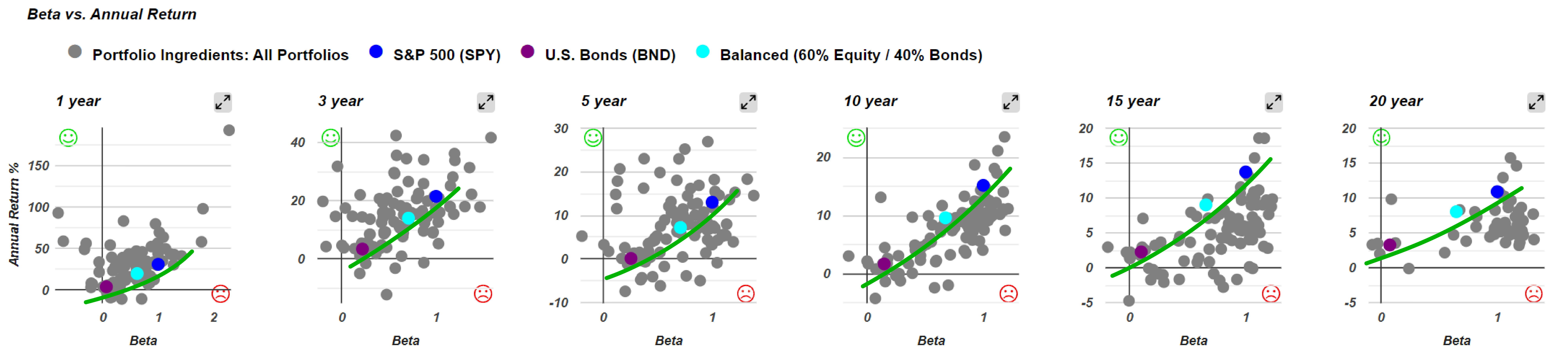
Over the most recent three-year period, the scatterplot for portfolio ingredients looks like a scattershot. Visually, there is no clear correlation between beta and annualized return. There may be a relationship buried in the data, but it does not stand out.
The picture becomes much clearer on the 15-year scatterplot, where a recognizable risk-versus-return frontier begins to take shape: higher risk tends to correspond with higher return.
Notably, the three colored benchmark dots fall roughly into a straight line across all time periods. This alignment forms a useful reference frontier against which an investor can evaluate any other ingredient on the chart.
The Case of Gold
By examining the scatterplots for outliers, an investor can identify assets that behave differently from the broader market. Gold (GLD) is one such standout.
- On the 15-year scatterplot, Gold carries a very low beta of just 0.12 yet has delivered an annualized return of roughly 7%.
- On the 20-year scatterplot, Gold's beta drops even further to 0.09, meaning it moves almost entirely independently of the S&P 500, while its annualized return climbs to 9.8%.
By contrast, some assets at the lower end of the beta scale have produced negative returns over the same 20-year period, making them far less attractive despite their low volatility.
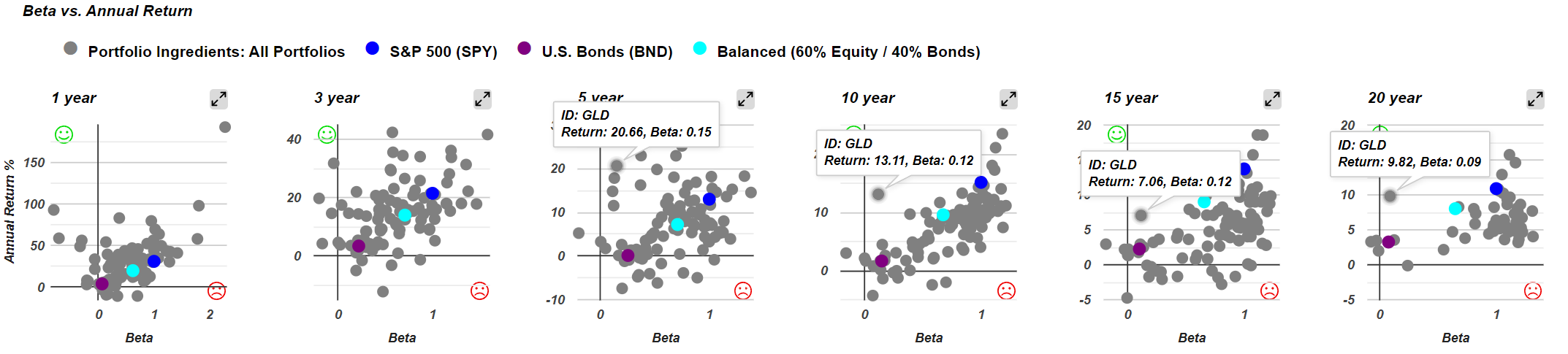
On the five-year scatterplot, Gold again appears in the upper left, joined by several commodity funds. These assets share a common trait: low beta paired with decent returns. This is because commodities tend not to track closely with the S&P 500, giving them a low correlation to the broader equity market.
For the most part, across ten-year and longer time horizons, the leading edge of these asset clusters tells a consistent story: higher risk, higher return. But assets like Gold and certain commodity funds demonstrate that low beta does not always mean low return, making them valuable ingredients for an investor constructing a diversified portfolio recipe.
Portfolio Recipes: Tighter Clusters and Standout Performers
Turning back to portfolio recipes, which is where most of the analysis tends to focus, these are designed to be investable portfolios. Each one combines multiple exchange-traded funds on either a tactical or strategic basis. Unlike the individual portfolio ingredients examined earlier, these recipes are built to function as complete, diversified allocations.
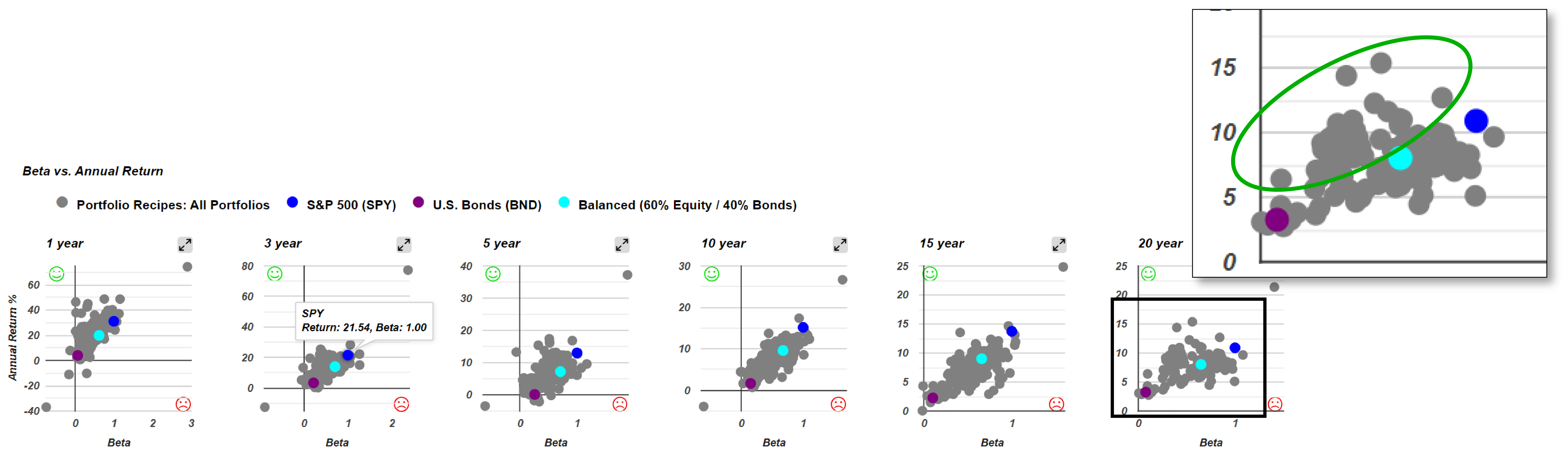
When plotted on the beta scatterplot, portfolio recipes form noticeably tighter clusters compared to the individual ingredients. This makes sense, as diversification within each recipe naturally dampens the extremes.
The Balanced 60/40 portfolio (s.6040) serves as a useful middle-ground benchmark. It is not as risky as the S&P 500, but it is intentionally more volatile than a pure bond fund like the U.S. Bonds (BND). What stands out on the scatterplot is that a significant number of portfolio recipes fall to the left of and above the line connecting the three benchmarks, meaning they have achieved a lower beta and a higher return than the Balanced 60/40.
A few portfolios illustrate the range of outcomes an investor can find:
- Tactical Adaptive Allocation F (t.aaaf): A popular choice among subscribers, this portfolio has a beta of just 0.4, meaning it carries only 40% of the S&P 500's volatility. Despite that low risk profile, it has delivered an annualized return of 14.38% over the past 20 years. This makes it a compelling example of a low-beta, high-return portfolio.
- Pure Momentum (t.pure): Another tactical portfolio that sits in the favorable lower-beta, higher-return zone of the scatterplot.
- Quartile Sector Rotation (t.srqr): The clear outlier on the chart, this highly concentrated portfolio sits at the opposite end of the spectrum with both a high beta and a notably high annualized return exceeding 20% per year. It is the textbook example of a high-risk, high-return portfolio.
These examples demonstrate the value of the beta scatterplot at a glance. An investor can quickly identify which portfolios offer attractive returns relative to their volatility and decide which risk-return tradeoff best fits their investment goals.
Beyond the scatterplot, the data table allows an investor to sort portfolio recipes by beta to quickly identify the highest and lowest values.
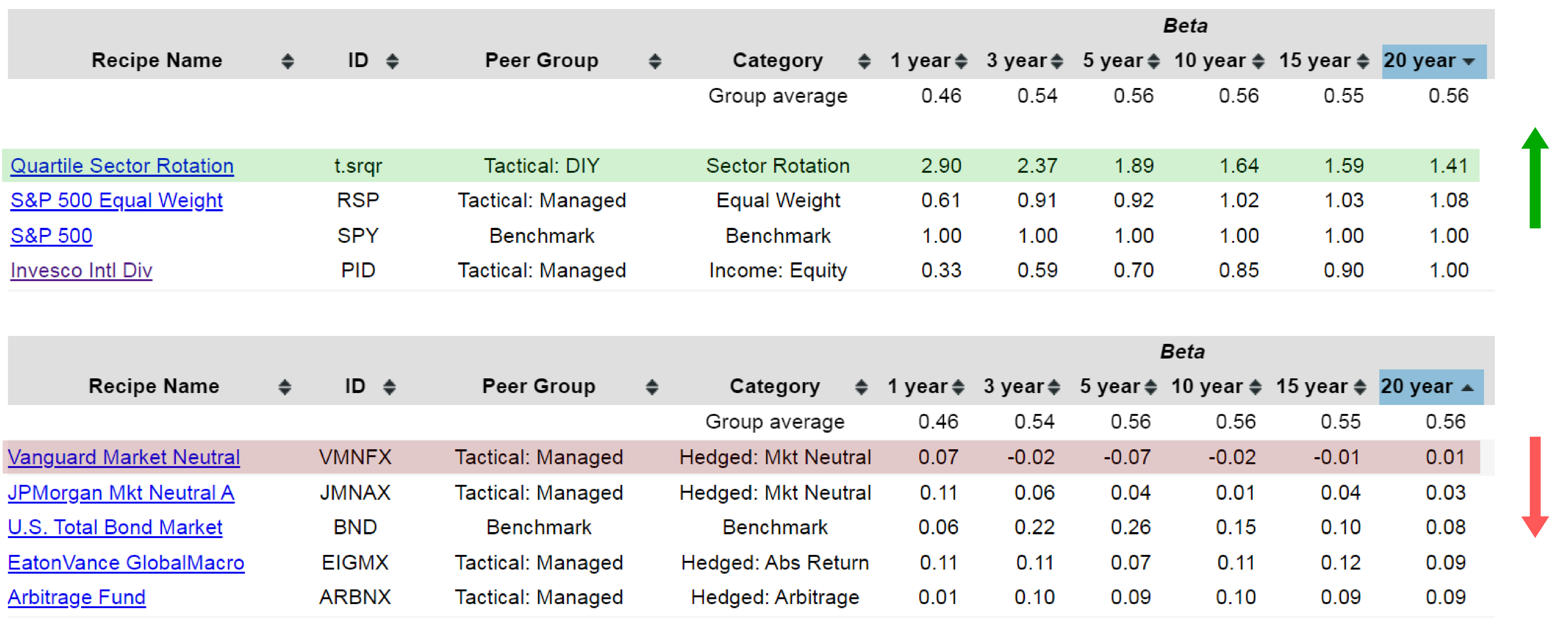
At the top of the list:
- Quartile Sector Rotation (t.srqr) ranks as the highest-beta portfolio with a 20-year beta of 1.41, consistent with its position as the high-risk, high-return outlier on the scatterplot.
- S&P 500 (SPY) comes in at exactly 1.00, confirming that the beta calculations are working as expected since SPY serves as the benchmark.
At the bottom of the list:
- Vanguard Market Neutral (VMNFX) stands out with a 20-year beta of just 0.01, making it the lowest-beta fund tracked. As its name suggests, the fund delivers true market neutrality in the form of a near-zero beta. Credit to Vanguard for doing exactly what it says on the label.
However, that near-zero volatility comes at a cost. Vanguard Market Neutral has returned only 3.1% annualized over the past 20 years. For most investors, that is unlikely to be compelling on its own. That said, the fund's five-year performance has been notably more impressive, which makes it an interesting case study in how market-neutral strategies can perform differently depending on the time horizon. Sorting by beta in this way gives an investor a quick, data-driven method for understanding how different portfolios and funds stack up in terms of volatility relative to the S&P 500.
The beta scatterplots provide a clear visual overview of how different portfolio recipes compare in terms of annualized returns and volatility relative to the S&P 500. But an investor may naturally wonder: is there a single number that captures how close a portfolio sits to the ideal, meaning the upper-left corner of the chart where returns are high and beta is low?
There is, and the concept is rooted in the slope of the line from the origin to each portfolio's dot on the scatterplot.
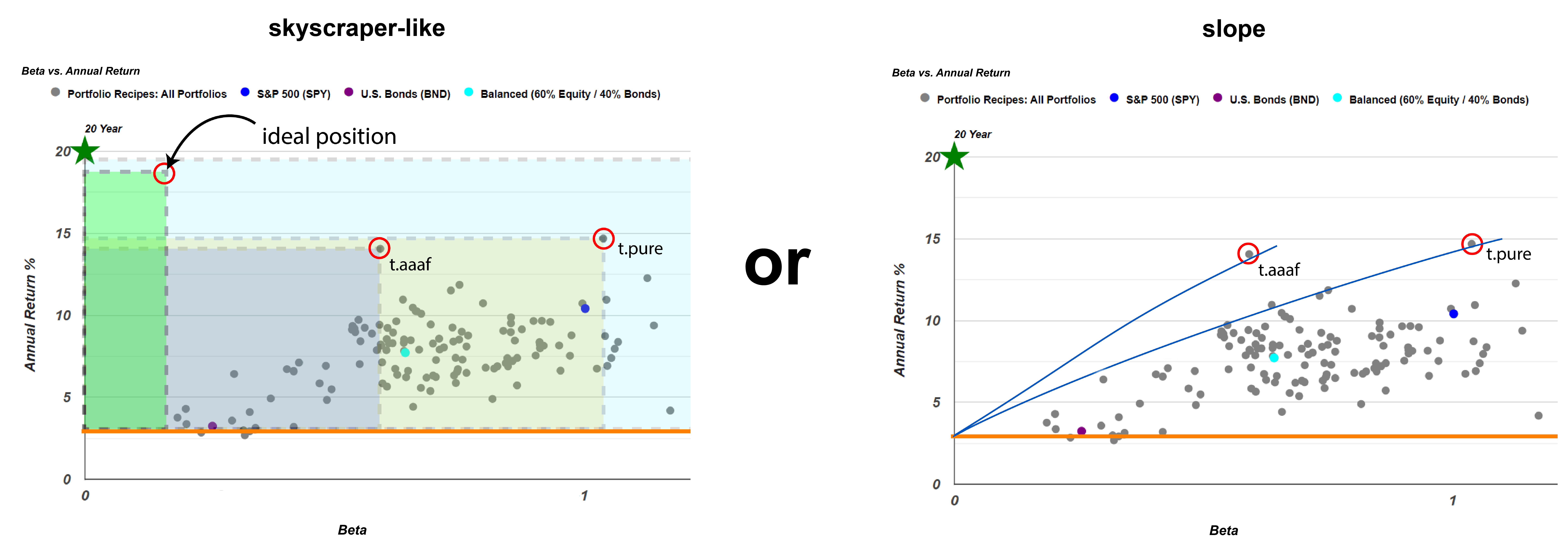
- A portfolio with a narrow beta (x-axis) and a tall return (y-axis) would form a steep, skyscraper-like shape, producing a high slope.
- A portfolio sitting flat along the x-axis would have a slope near zero, meaning high volatility with little return.
- A portfolio straight up near the y-axis would approach an infinite slope, meaning strong returns with almost no market-correlated risk.
In other words, the steeper the slope from the origin to a given dot, the more attractive the risk-return profile. To make this calculation fair, the risk-free return is subtracted from each portfolio's annualized return. It would not be appropriate to give a portfolio credit for the small amount of return an investor could earn simply by holding a short-term treasury. This adjustment is a minor part of the overall calculation, but it ensures a more accurate comparison.
Introducing the Treynor Ratio
The idea of calculating the ratio between a portfolio's return and its beta is not a new one. This concept was formalized long ago and is known as the Treynor ratio.
The Treynor ratio measures the excess return an investor earns for each unit of market-related risk, as measured by beta. The formula is straightforward:
$$\text{Treynor ratio} = \frac{R_p - R_f}{\beta_p}$$
In visual terms, the Treynor ratio represents the slope of the line drawn from the risk-free rate on the scatterplot to a portfolio's dot. The steeper the line, the higher the Treynor ratio, and the more efficiently the portfolio has converted market risk into return. A very steep line might correspond to a Treynor ratio of five or more, which is exceptionally high.
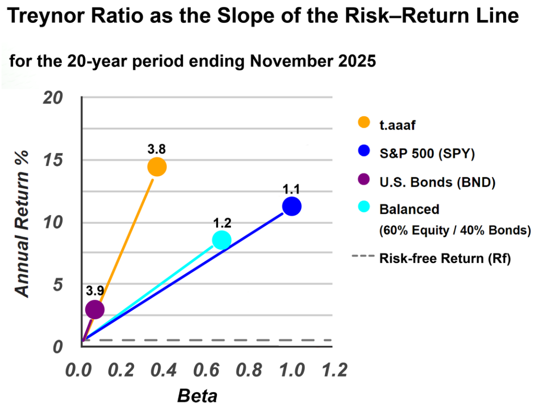
Sorting the data table by Treynor ratio surfaces some interesting results:
- Vanguard Market Neutral (VMNFX) appears at the top, but this is somewhat misleading. Because its beta is extremely small (roughly 0.01), even a modest return produces an outsized Treynor ratio when divided by such a tiny denominator. This is a known quirk of the metric when applied to near-zero-beta funds.
- Tactical Adaptive Allocation F (t.aaaf) stands out as a more meaningful leader with a Treynor ratio of 3.5 and an annualized return of 14.4%. Unlike the market-neutral fund, this ratio is not inflated by an unusually small beta, making it a genuinely impressive result.
- Several other portfolios follow closely behind, with annualized returns exceeding 10% and Treynor ratios just under 3.0.
A more detailed explanation of the Treynor ratio, along with other risk and return metrics, is available on the Recipe Investing "Getting Started: Risk and Return Metrics" page.
Putting It All Together
The Treynor ratio provides a single, all-in-one number that relates beta to total return, making it easy to rank and compare portfolio recipes side by side. But the beta versus total return scatterplot offers something equally valuable: a visual representation of that same relationship.
On the scatterplot, the most desirable position is the upper-left corner, where a portfolio would have high returns and low beta. In practice, no portfolio lands perfectly in that corner, but the closer a dot sits to it, the more efficiently that portfolio has delivered returns relative to its market risk.
This visual approach also makes it easy for an investor to match portfolios to personal risk tolerance:
- Higher risk appetite: An investor comfortable with greater volatility may gravitate toward portfolios in the upper-right area of the chart, where both beta and returns are elevated.
- Lower risk appetite: An investor seeking stability may prefer portfolios clustered in the lower-left, where beta and returns are more modest but the ride is smoother.
Together, the beta scatterplot and the Treynor ratio give an investor two complementary tools for evaluating risk and return. The scatterplot provides an intuitive, visual overview, while the Treynor ratio distills that picture into a single number that can be used to rank and compare portfolios on the Recipe Investing portfolio recipe summary page.