Article - Top Performing Asset Allocation Portfolios Based On Maximum Drawdown
Top Performing Asset Allocation Portfolios Based On Maximum Drawdown
We recently had a discussion with some fellow investors about the best risk measures for evaluating an asset allocation portfolio. It became clear that maximum drawdown is a key "fear metric" to consider as part of the asset allocation decision. Maximum Drawdown measures the amount of portfolio value lost (in percentage terms) from peak to trough in a given time period.
But a chart today covering the past five years (2009-2013) will no longer reflect the maximum drawdown during the 2008 crisis.
So this article answers the question "What was the maximum drawdown for 65 leading asset allocation portfolios during the 2008 market turbulence?" While the world is divided on the future of this market (after the gains of 2013), we think it's prudent to look at maximum drawdown vs. total return for these portfolios.
Our approach
First, we chose a time period of the past 7 years, from January 2007 through December 2013. This allows us to capture the peak prior to the 2008 crisis, thereby capturing the full amount of the drawdown.
Second, we chose a sample of asset allocation portfolios for the head-to-head comparison. We chose a mix of 65 different portfolios in the following 6 categories:
- Tactical Asset Allocation: Global/Macro
- Tactical Asset Allocation: Blended
- Tactical Asset Allocation: Risk & Momentum
- Strategic Asset Allocation: Model ETF Portfolios
- Tactical Income: Equity-based
- Tactical Income: Multi-strategy
These portfolios include funds run by well-known asset managers, balanced funds, and ETF model portfolios. Tactical income portfolios are included for comparison, even though some of these portfolios may focus solely on equity or debt.
Third, we calculated the maximum drawdown and total return (the compounded annual growth rate) for each portfolio for 2007-2013. We used month-end data, so this will not capture intra-month highs and lows.
Finally, we plotted all the portfolios on a risk vs. return scatterplot. Annual total return is the Y-axis, and maximum drawdown is the X-axis. The best portfolios will be at the top left of the chart, and the worst portfolios at the bottom right. For a PDF of this scatterplot and a complete list of all 65 portfolios, download VizMetrics Report #vm03, which is part of the VizMetrics Free subscription.
The Results
The resulting scatterplot reminds us of the brutality of the 2008 market decline. For example, the S&P 500 (SPY) had a 51% drawdown. SPY is #66 (indicated by the blue arrow) in Figure 1, below. The portfolios in Figure 1 have a drawdown range from 12% to 65%.
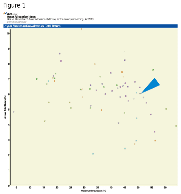
But there were some bright (or at least brighter) spots. Figure 1 shows several portfolios that provided above-market returns with less than 25% drawdown. Download the PDF of the full chart (Report #vm03) at www.vizmetrics.com.
Let's look at a few highlights from this maximum drawdown scatterplot:
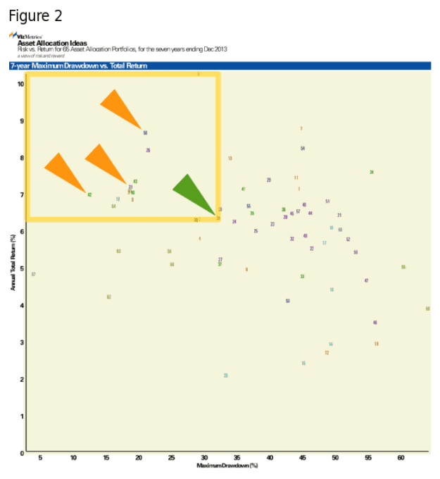
1. Twelve portfolios outperform a 60-40 balanced allocation
We used a simple benchmark for our analysis: a balanced ETF model portfolio of 60% stocks (VTI) and 40% bonds (BND). This is #39, indicated by the green arrow on Figure 2, below. This 60-40 balanced allocation performs better than many of the 65 allocations, but is still outpaced by 9 tactical portfolios with dynamic allocations and 3 strategic portfolios with fixed allocations. The yellow-bordered region in Figure 2 contains these portfolios with lower risk and higher return. These include Templeton Global (#56, GIM), a Harry Browne-inspired ETF portfolio (#42) and Vanguard Wellesley (#31, VWINX), all indicated with orange arrows.
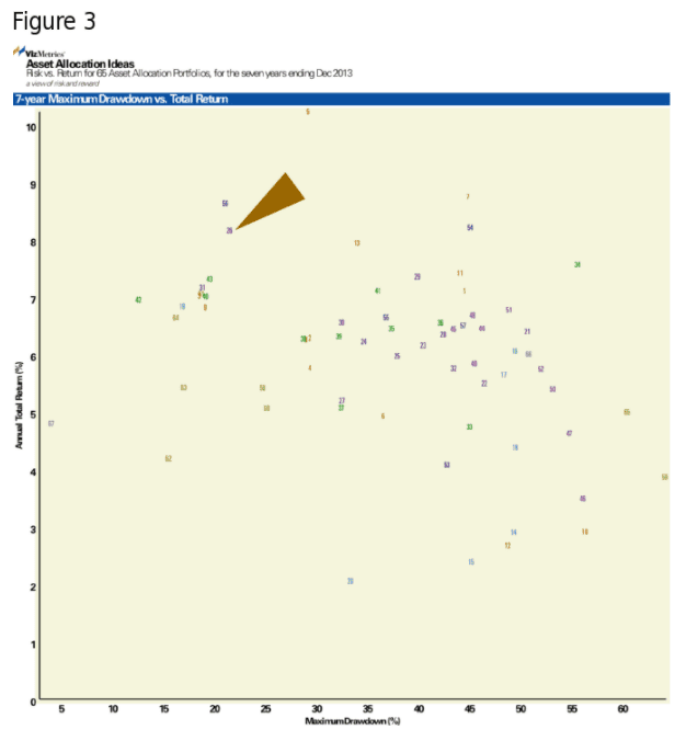
2. Balanced funds vary widely
Not all balanced funds are created equal. The balanced funds from Fidelity (#23), Schwab (#27), Janus (#26), and Vanguard (#30) performed quite differently. Janus Balanced (#26, JANBX, brown arrow in Figure 3) performed best, and is one of only six portfolios returning over 8% annually. The Vanguard Balanced index fund (#30, VBIAX) performs similar to the 60-40 ETF Model Portfolio (#39 on the chart).
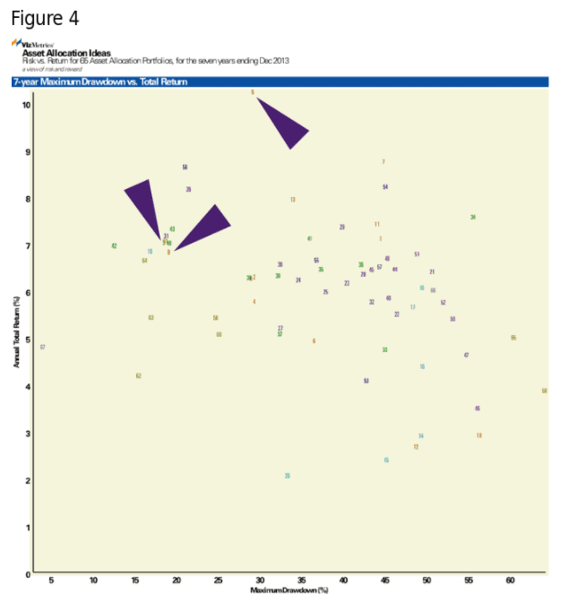
3. Three global/macro managers stand out
Of all the global/macro portfolios on the chart, three managers have beaten the benchmark 60-40 balanced portfolio.
- Ben Inker (#3, GBMFX, GMO Benchmark-Free Allocation III)
- Rob Arnott (#9, PAUIX, PIMCO All-Asset All-Authority)
- Mike Avery (#5, IVAEX, Ivy Asset Strategy)
These portfolios are indicated by purple arrows on Figure 4.
At the opposite end of the spectrum, at the lower right corner of the chart we see the worst 7 portfolios. These failed to beat the S&P 500 on both dimensions. See the region with the red border in Figure 5, below.
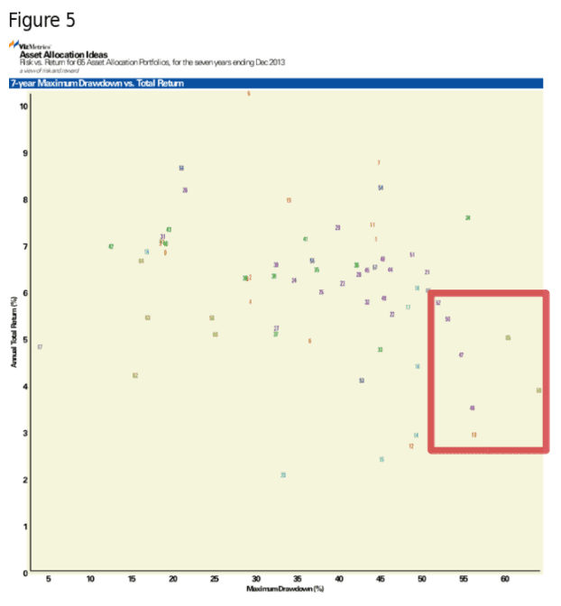
One of these portfolios (#10) is a poor showing from a global equity fund. Six of the portfolios are in the "Tactical Income" category. This reminds us that a "tactical income" label does not necessarily result in lower risk.
Conclusion
Using maximum drawdown as a measure of risk gives us a useful tool for comparing asset allocation portfolios. Only 12 of the 65 portfolios examined managed to beat a 60-40 stock-bond index portfolio. If we believe that another market drop is ahead, it may be helpful to look more closely at these portfolios and managers that weathered the last crisis.
as published on
Disclosure: I am/we are long EFA, IWM, GLD, TLT, QQQ, SPY, EEM. I wrote this article myself, and it expresses my own opinions. I am not receiving compensation for it. I have no business relationship with any company whose stock is mentioned in this article.