Article - Top Asset Allocation Portfolios From 1 Million Combinations
Top Asset Allocation Portfolios From 1 Million Combinations
In previous articles on strategic asset allocation, we have explored 3-ETF equal-weight portfolios. Now this article goes a step further and identifies high-performing strategic portfolios using unequal weights across 14 global asset classes.
We analyzed over one million asset allocation portfolios over 41 years and we identified several with a risk-adjusted return better than a Balanced Portfolio (60% stocks and 40% bonds). For example, a portfolio identified later in this article has an annualized return of 13.25% over 41 years, compared to 9.40% return for the Balanced Portfolio at the same risk level.
We followed a step-by-step process to find these top asset allocation portfolios:
Step 1. Generate a list of all possible portfolios
Using combinatorics, we created a list of all the possible portfolios with different weightings using our set of 14 global asset classes. To keep the math manageable, we applied the following constraints:
- Allow a zero to 100% allocation to each asset class, in 10% increments
- Allow 1 to 10 assets in each portfolio
This resulted in 1,144,066 possible portfolios.
Step 2. Create a scatterplot to see risk vs. return
We used 41 years of data to calculate the total return for each portfolio based on the allocations from Step 1. We also calculated standard deviation for each portfolio to use as the risk measure. Then we plotted risk vs. return for all the portfolios to see what stood out. Each portfolio is represented by a gray dot on the chart below.
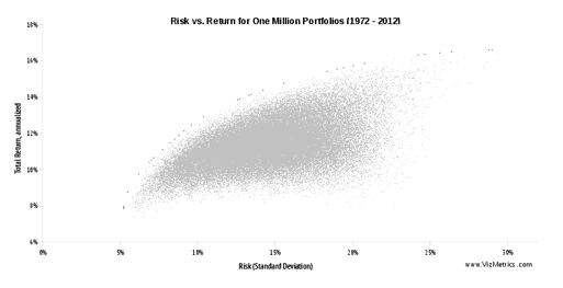
For comparison, we also plotted the set of portfolios that achieve the theoretical maximum return for any given level of risk. These portfolios could use any allocation increment (e.g., allocate 2.485% to Large Cap Value equities). This set of portfolios is sometimes referred to as the "efficient frontier." These frontier portfolios appear as a curved set of dots above the main cloud of gray dots in the chart above.
Even with our constraint of creating portfolios in 10% increments instead of infinitely small increments, we see several gray dots on the chart near the frontier. This gives us some assurance that we can find many good portfolios despite the 10% allocation constraint.
For the full, high-resolution poster comparing all 14 global asset classes to the one-million allocation portfolios over 41 years (1972 through 2012), download our "One Million Strategic Portfolios Poster."
Step 3. Add a Balanced Portfolio as a benchmark
With so many possible portfolios, we needed a point of reference to focus our search. So we added a popular asset allocation in the form of a Balanced Portfolio (60% stocks + 40% bonds), shown as item "B" on the chart below. We also added the S&P 500 to the chart, indicated by item "S" on the chart. This helped us see the following:
- The Balanced Portfolio offers a significant advantage over a pure stock portfolio. We can see that the Balanced Portfolio ("B") offers nearly the same return as the S&P 500 ("S"), but with significantly less risk. "B" appears to the left of "S", but at almost the same level of Total Return.
- Plenty of opportunity exists beyond the basic Balanced Portfolio. There are many portfolios that appear above and to the left (i.e., "northwest") of the Balanced Portfolio. These portfolios lie inside the orange rectangle in the chart below.
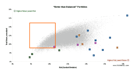
In fact, there are 278,104 portfolios within the orange rectangle that have a higher total return and lower risk than the Balanced Portfolio. So out of 1,144,066 total portfolios, the Balanced Portfolio is only in the 75th percentile. Fully one-quarter of all the possible portfolios would have beaten the Balanced Portfolio over the past 41 years.
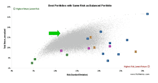
Step 4. Find specific portfolios that beat the benchmark
Our last step asks "What are the best choices among the 278,104 'Better than Balanced' portfolios?"
We decided to focus on portfolios with the same level of risk as the Balanced Portfolio (11.4% standard deviation) but with returns closer to the efficient frontier. Asked another way, "if we keep the risk level the same as the Balanced Portfolio, what other portfolios maximize total return?" The location of these other portfolios is shown by the green arrow below.
One example of a portfolio that is "Better Than Balanced" has the following allocation:
- 10% U.S. Large Cap Value Equities (IWD)
- 20% Bond: Long Term (TLT)
- 20% Emerging Market (EEM)
- 30% U.S. Real Estate (VNQ)
- 10% Gold (GLD)
- 10% Commodities (DBC)
This portfolio has produced an annual return of 13.25% with a standard deviation of 11.35%.
To view eight portfolios with Total Annual Return exceeding 13% (while keeping the same risk level as the Balanced Portfolio), visit our page "Better Than Balanced… Eight Portfolios that Beat a Balanced Allocation."
Conclusion
The scatterplot clearly shows that there are hundreds of thousands of asset allocation portfolios that outperform the benchmark Balanced Portfolio, providing opportunities for the savvy asset allocator.
Looking Ahead
In future articles we plan to analyze portfolios using other risk metrics, and study the performance over different time periods to avoid look-back bias.
as published on
Disclosure: I am/we are long EFA, IWM, GLD, TLT, QQQ, SPY, EEM. I wrote this article myself, and it expresses my own opinions. I am not receiving compensation for it. I have no business relationship with any company whose stock is mentioned in this article.