Article - Top 3-ETF Portfolio Based On 14 Asset Classes
Top 3-ETF Portfolio Based On 14 Asset Classes
In a previous article "Top Portfolios Using Just 3 ETFs" we explored the 56 unique portfolio allocations that can be formed by choosing 3 ETFs from 8 asset classes. For simplicity, the allocations were equal-weighted in the portfolios (i.e., 1/3 allocation to each ETF in each portfolio). Then we looked at risk vs. return for the 56 portfolios over the past 40 years.
Since that article, we have researched the effect of adding six more asset classes to our initial set of 8 asset classes. This has uncovered hundreds more 3-ETF portfolios with a wider range of risk and return.
Finding better allocations using more asset classes
In this article we want to see if we can find better portfolios using a set of 14 asset classes instead of 8 asset classes. But which asset classes to add? We want to see the effect of equity factor tilts (e.g., large capitalization companies vs. small capitalization companies, plus growth stocks vs. value stocks) so we split our previous single U.S. equity asset class into 5 components: Large Cap Growth, Large Cap Value, Small Cap Growth, Small Cap Value, and Micro Cap. We also split the single international equity asset class into 3 components: Growth, Value, and Emerging Markets.
Our expanded set of 14 asset classes is as follows:
- Gold (NYSEARCA:GLD)
- Commodities (NYSEARCA:DBC)
- International Equities: Emerging Markets (NYSEARCA:EEM)
- International Equities: Growth (BATS:EFV)
- International Equities: Value (BATS:EFG)
- U.S. Bonds: Aggregate (NASDAQ:BND)
- U.S. Bonds: Long Term Treasuries, 20+ years (NASDAQ:TLT)
- U.S. Bonds: Short Term Treasuries, 1-3 years (NASDAQ:SHY)
- U.S. Equity: Large Cap Growth (NYSEARCA:IWF)
- U.S. Equity: Large Cap Value (NYSEARCA:IWD)
- U.S. Equity: Micro Cap (NYSEARCA:IWC)
- U.S. Equity: Small Cap Growth (NYSEARCA:IWO)
- U.S. Equity: Small Cap Value (NYSEARCA:IWN)
- U.S. Real Estate (NYSEARCA:VNQ)
Since the ETFs don't have 40 years of history, we have used the closest corresponding mutual fund or index for the older years. We rebalance these allocations annually.
Charting the new asset allocation portfolios
The chart below plots risk vs. return for two batches of portfolios.
The "choose 3 from 8" batch of portfolios:
- The orange diamonds are 3-ETF portfolios chosen from 8 asset classes.
- There are 56 possible equal-weight portfolios when choosing 3 asset classes from a set of 8.
The "choose 3 from 14" batch of portfolios:
- The blue squares are 3-ETF portfolios chosen from 14 asset classes.
- There are 364 possible equal-weight portfolios when choosing 3 asset classes from a set of 14.
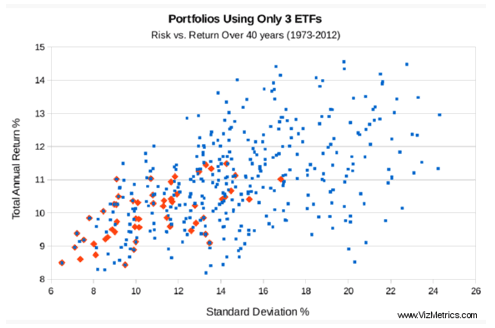
Since the northwest corner (i.e., top left) of the chart is the ideal combination of high return and low risk, the first thing we look for is any new data points (blue squares) that are northwest of the set of 56 portfolios (orange diamonds). Several orange diamonds have blue squares above and to the left. These new portfolios offer greater return with lower volatility.
We also see that we have added many new portfolios that provide higher return at higher risk levels.
Below 9.1% standard deviation, there are no new portfolios that offer better risk or returns compared to the "choose 3 from 8" batch of 56 portfolios.
Above 9.1% standard deviation, there are many new blue squares that offer more return for less risk than those in the original batch of 56 portfolios. Some of the new portfolios have returned more than 14% per year for the past 40 years.
An example of a "portfolio upgrade"
Let's look at an example of finding an improved portfolio using the chart. The riskiest portfolio from the "choose 3 of 8" batch is shown next to the red arrow in the chart below. This portfolio has a standard deviation of 17% and 11% annual return. Any blue square in the yellow region (see chart) represents a portfolio with reduced risk and higher return.
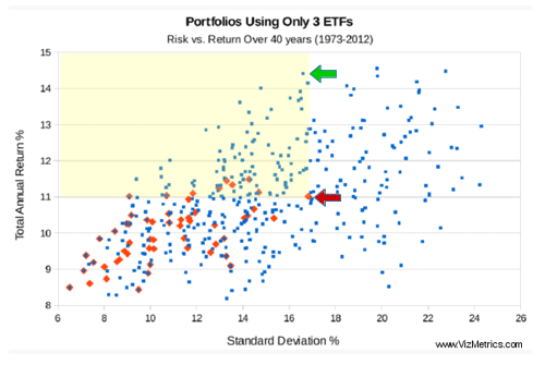
We see a blue square near the top of the chart (see the green arrow above) that represents a portfolio with 14.4% annual return (a significant 3.4% improvement) with slightly less risk.
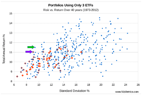
Another example of a "portfolio upgrade"
The portfolio consisting of Long Term Bonds + Commodities + Real Estate appears in both the "choose 3 of 8" and "choose 3 of 14" batches. This portfolio has returned 11.0% annually with a standard deviation of 9.1%. This is indicated by the purple arrow in the chart below.
But looking at the blue squares we see another portfolio offering 11.5% return with 9.4% volatility. This portfolio consists of U.S. Small Cap Value + Long Term Bonds + Commodities. We think this is a good trade-off and represents an improvement over the above portfolio, since we are adding more return than risk. This new portfolio is indicated by the green arrow in the chart below.
List of 3-ETF portfolio components
For a list of all the 3-ETF equal-weighted portfolios with 10% volatility or less (as measured by standard deviation), see "List of Reduced Volatility Portfolios Using 3 ETFs."
Conclusion
Several desirable 3-ETF portfolios appear by adding new asset classes, mainly at the higher risk levels.
Looking Ahead
In upcoming articles we will explore more strategic asset allocation portfolios using quantitative, visual metrics of risk and return. We plan to look at more equal-weighted portfolios as well as portfolios that are not equal-weighted.
as published on
Disclosure: I am/we are long EFA, IWM, GLD, TLT, QQQ, SPY, EEM. I wrote this article myself, and it expresses my own opinions. I am not receiving compensation for it. I have no business relationship with any company whose stock is mentioned in this article.