Article - Risk Vs. Return Scatterplot For 59 Global Asset Class ETFs
Risk Vs. Return Scatterplot For 59 Global Asset Class ETFs
What's the best way to visualize risk vs. return for global asset classes?
We're fans of the tried-and-true risk vs. return scatterplot, using standard deviation and total return. This allows us to quickly focus on portfolios (or asset classes, in this case) that appear in the prized top-left quadrant. To verify the worthiness of the scatterplot, we have also calculated two other risk-adjusted return metrics, shown at the end of this article. These are 1) the Modigliani-Modigliani measure and 2) alpha, using global equities (ACWI) as the benchmark. We prefer the Modigliani risk-adjusted, easy-to-read percentages over the unitless Sharpe ratio. Thankfully, the asset classes appearing in the top left quadrant of the risk vs. return scatterplot also rank highly using Modigliani and Alpha.
Building the scatterplot
To create a "global asset class scatterplot" we gathered risk and return data for a set of 59 global asset classes that could each be represented by an ETF proxy. For the risk metric we used standard deviation of monthly returns and for the return metric we used total return (including distributions). Our time period was 12 months ending May 31, 2013.
Risk vs. Return Scatterplot
In the scatterplot below, asset classes are color-coded according to their broad asset class category: equities in orange, fixed income in green, real estate in purple, commodities in teal blue, and benchmarks in gray.
For the 3-year and 5-year versions of this scatterplot, review our Asset Class Risk vs. Return Scatterplots.
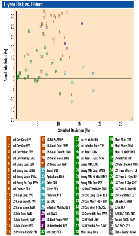
Insights from the broad asset classes
For equities (in orange on the chart), this chart provides quick visual confirmation that most equity asset classes have outperformed other asset classes on a total return basis over the past year. But there's at least one outlier: Frontier equities (FRN, #9 on the chart above), have seriously lagged their peers. Emerging market core equities (EEM, #5 on chart) and emerging market value equities (EVAL, #7 on chart), while still in positive return territory, have also lagged.
We can see examples of asset classes offering similar total return at a much lower risk level. For example, compare US convertible securities (CWB, #45 on chart) with International Emerging Small Cap (EWX, #8 on chart). Both have similar returns, but convertibles have a much lower standard deviation.
For fixed income asset classes (in green on the chart), we see some interesting comparisons of developed countries vs. emerging markets. International High Yield (IHY, #33 on chart) has offered more than twice the return of Emerging Market Government Bonds (PCY, #40 on chart) with substantially lower risk.
For commodities (in teal blue on the chart), the entire group (not just gold!) has lagged over the past 12 months. Silver (SLV, #25 on chart) has taken a particular beating, having the highest risk and lowest return of all asset classes reviewed.
Looking at the numbers
First, let's look at the Top 5 for Total Return over last 12 months:
- US Mid Value (IWS) 33.6%, #15 on chart
- International Developed Value (EFV) 32.7%, #3 on chart
- US Large Value (IWD) 32.5%, #12 on chart
- US Micro Cap (IWC) 32.4%, #21 on chart
- US Small Value (IWN) 31.2%, #20 on chart
For the full list of asset class total returns, review our Asset Class Total Return List which included values for all 59 asset classes and 5 benchmarks.
Now let's look at a Top 5 Ranking of risk-adjusted returns using the M-squared (Modigliani-Modigliani) measure.
- US Convertible Securities 21.0%, #45 on chart
- US Hi Yield 0-5yr (SJNK) 3.9%, #47 on chart
- US Mid Cap Value 3.5%, #15 on chart
- US Large Cap Value 2.2%, #12 on chart
- US Mid Cap Core (IWR) 0.6%, #13 on chart
For comparison, SPY has an M-squared of 0.04% using the ACWI benchmark.
Finally, here are the Top 5 Asset Classes, based on Alpha:
- US Mid Cap Value 15.1%, #15 on chart
- US Convertible Securities 14.7%, #45 on chart
- US Mid Cap Core 13.1%, #13 on chart
- US Large Cap Value 12.2%, #12 on chart
- US Mid Growth (IWP) 10.4%, #14 on chart
For comparison, SPY has an alpha of 9.16% using the ACWI benchmark.
For the full comparison of M-squared and Alpha for all 59 asset classes and 5 benchmarks, review our Asset Class Risk-Adjusted Return List.
When using Alpha instead of M-squared, the "US High-Yield Short Term Bonds" asset class falls out of the Top 5 (to rank 17th) with Alpha of 3.6%. The new asset class appearing on the Top Alpha list is IWP which has an M-squared of -3.72%.
Disclaimer: This report is provided "as is" for informational purposes only and is not intended for trading purposes or advice. Please consult a financial advisor for advice on your specific situation. Neither VizMetrics nor any of its information providers is liable for errors, omissions, or for any actions taken based on this information.
Data sources: Barchart.com Inc., U.S. Federal Reserve, VizMetrics analysis
as published on
Disclosure: I am/we are long EFA, IWM, GLD, TLT, QQQ, SPY, EEM. I wrote this article myself, and it expresses my own opinions. I am not receiving compensation for it. I have no business relationship with any company whose stock is mentioned in this article.