Article - 3 Portfolios Inspired By Graham, Swensen, And Browne: A Risk Vs. Return Analysis
3 Portfolios Inspired By Graham, Swensen, And Browne: A Risk Vs. Return Analysis
As part of our ongoing effort to identify the best and worst asset allocation portfolios, we compare some ETF portfolios inspired by investing gurus: Benjamin Graham, David Swensen, and Harry Browne.
Here's our plan of attack:
- Create an ETF portfolio that resembles each guru's target allocation, based on their investment philosophy, book, or other statements. These are static allocations, rebalanced monthly.
- Crunch the numbers to get risk-adjusted returns for the past 5 years for each portfolio.
- Look at the risk/return metrics to see if there are any clear winners. Compare to some benchmarks, too.
Creating the Portfolios
First up, Benjamin Graham, the "Father of Value Investing." We have modeled a Graham-inspired Portfolio using 50% equity and 50% fixed income, implemented with a value and dividend tilt to the equity selections, as follows:
- 25% TIP (iShares TIPS Bond)
- 25% LQD (iShares Investment Grade Corporate Bond)
- 10% PFM (PowerShares Dividend Achievers)
- 20% EFV (iShares MSCI EAFE Value Index)
- 6.7% VTV (Vanguard Value)
- 6.7% VBR (Vanguard Small-Cap Value)
- 6.6% VOE (Vanguard MSCI Emerging Markets)
Second, David Swensen. He is the Chief Investment Officer of Yale University and author of Unconventional Success: A Fundamental Approach to Personal Investment. His target portfolio described in the book uses total-market funds, real estate, and inflation-protected securities (OTCPK:TIPS). We have modeled a Swensen-inspired portfolio as follows:
- 30% VTI (Vanguard Total Stock Market)
- 20% VNQ (Vanguard REIT)
- 20% VEU (Vanguard FTSE All-World ex-US)
- 15% TIP (iShares TIPS Bond)
- 15% TLT (iShares 20+ Yr Treasury Bond)
Third, Harry Browne. He suggests a simple, "permanent" allocation for weathering various market conditions. His Permanent Portfolio concept is designed to provide some diversification across several different market scenarios. We have create a Browne-inspired Portfolio as follows:
- 25% GLD (SPDR Gold Trust)
- 25% VTI (Vanguard Total Stock Market)
- 25% TLT (iShares Barclays 20+ Year Treasury Bond)
- 25% SHY (iShares Barclays 1-3 Year Treasury Bond)
Fourth, let's add a 50-50 portfolio. This is similar to the "Couch Potato Portfolio" espoused by the Dallas Morning News columnist Scott Burns. We've used TIP instead of a broader-based bond fund like BND.
- 50% VTI (Vanguard Total Stock Market)
- 50% TIP (iShares TIPS Bond)
Finally, for we'll add two more portfolios as benchmarks:
- S&P 500 (represented by 100% allocation to SPY) plus a balanced 60-40 portfolio of 60% equities and 40% bonds (BND).
Crunching the numbers
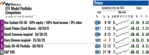
Below is the annualized performance data through June. Looking at the 5-year column ('5y' on the chart), we see the annualized performance over five years is quite similar for these portfolios. However there have been striking differences over the past 12 months. The portfolios with more equity exposure have clearly outperformed. But this outperformance comes with extra risk, as we will see next.
Risk-adjusted returns
The 5-year risk-adjusted winner is the Browne portfolio with a 6% risk-adjusted annual return using the Modigliani-Modigliani metric. We prefer using the Modigliani-Modigliani ("M-squared") measure instead of the unitless Sharpe ratio. The Browne portfolio's alpha is 14.2% over the past 5 years, which is the best in this comparison. Also notable is the maximum drawdown that the Browne portfolio has experienced over the past five years: only 11%.
This compares favorably to the 42% drawdown that SPY has seen over the same period.
But over the past 1-year and 3-year periods, the 60-40 portfolio has offered the best risk-adjusted returns. The maximum drawdown for the 60-40 portfolio is 27% over the past 5 years.
To see a graphical comparison of risk and risk-adjusted returns visit Inspired Portfolios: Risk Metrics. The analysis uses standard deviation, drawdown, beta, Modigliani, and alpha over the past 1, 3, and 5 years.
Risk vs. Return Scatterplot
The 5-year risk vs. return scatterplot (below) shows these portfolios have similar returns but different risk levels.
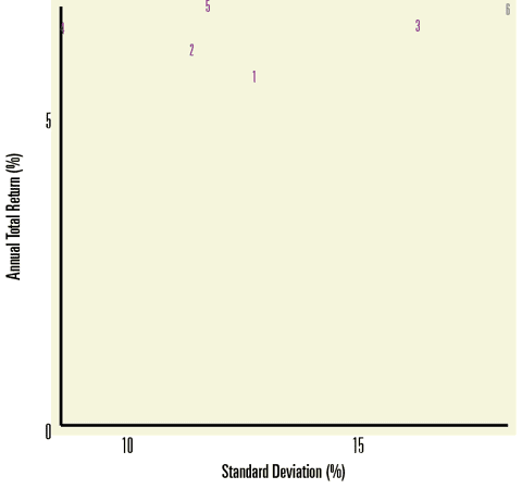
The S&P 500 benchmark portfolio (#6 on the chart) occupies the high-risk/high-return corner. Note that the 60-40 portfolio (#5 on the chart) and the Browne portfolio (#4 on the chart) offer similar returns at significantly lower risk. To find the Browne portfolio on the chart, look for #4 at the top left, slightly obscured by the Y-axis.
To see the 1-year and 3-year risk vs. return scatterplots, visit Inspired Portfolios: Risk vs. Return Scatterplots.
Conclusion
The 60-40 portfolio has outperformed these "guru inspired" portfolios, and it's hard to beat the simplicity of a two-ETF portfolio. But the 60-40 portfolio has been riskier than the Browne portfolio over the last five years. The Browne portfolio is worth a look if you can stomach some of the recent underperformance due to its gold holdings.
as published on
Disclosure: I am/we are long EFA, IWM, GLD, TLT, QQQ, SPY, EEM. I wrote this article myself, and it expresses my own opinions. I am not receiving compensation for it. I have no business relationship with any company whose stock is mentioned in this article.