Article-2024-04
April 2024 Recipe Investing - Commentary
Topics this month
- Portfolio Ingredients: a Difficult Frontier to Beat
- How Commodity Funds Have Fared
- Global Sectors including Technology, Consumer Discretionary
- Best ingredient returns with less than 40% drawdown
- Portfolios that beat the Balanced Portfolio, at least one green and no reds: t.frs3, t.frs4, PRPFX, VBIAX, VMNFX, VWELX, and WFAIX
- Vanguard Funds: One Vanguard Fund to Avoid. Avoid Vanguard STAR
Welcome to the April 2024 commentary from recipeinvesting.com. We track investable portfolio recipes that allow investors and advisors to build portfolios that minimize risk and maximize return. We reallocate and rebalance monthly, so we have plenty of new material to cover for our comparisons this month.
Portfolio Ingredients: a Difficult Frontier to Beat
Let's take a look into the ingredients and make a few relevant observations regarding recent developments. Within the scatterplots displayed, we can observe the comparison of risk versus return across dozens or even hundreds of different portfolio ingredients simultaneously. One recurring observation is the challenge of surpassing the frontier formed by the risk and return of these leading-edge portfolio ingredients.
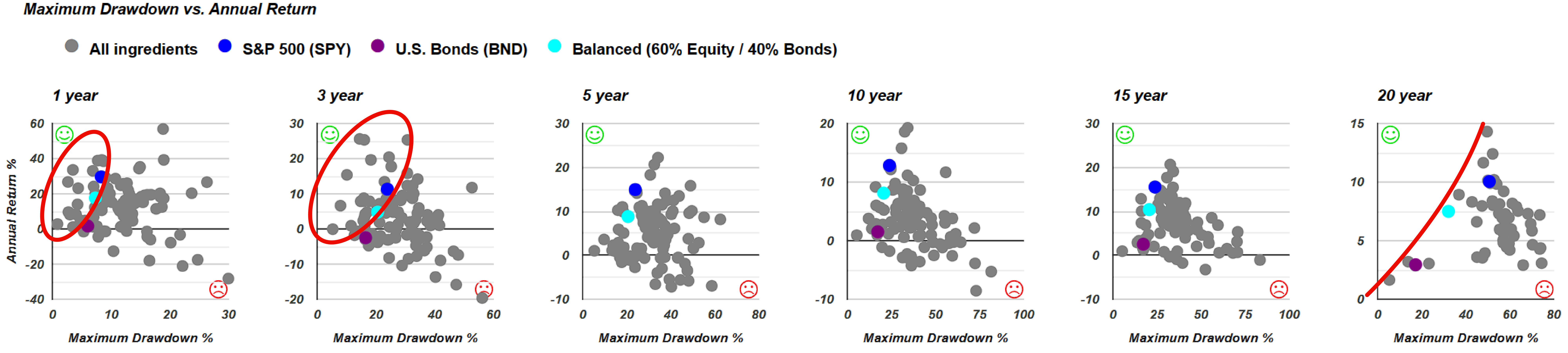
Each graph comes with three benchmarks. There's the purple dot for U.S. Bonds (BND). Then there's the blue dot for S&P 500 (SPY), which includes a bunch of stocks. And right in the middle, we've got a teal dot representing a Balanced 60/40 portfolio (s.6040). This mix has 60% stocks and 40% bonds. It's a classic recipe using just those two funds. And it's a handy benchmark because, as we see, it's really hard sometimes to find anything that gives a better mix of return and risk than this balanced fund.
We notice that over shorter time frames like one year or three years, certain individual exchange-traded funds (ETFs) within specific global equities, global asset classes, or global sectors have outperformed some benchmarks. However, as we extend the time horizon, it becomes increasingly difficult for these particular ETFs or sector ETFs to outperform some of the more basic benchmarks.
How Commodity Funds Have Fared
Investors also have the option to sort by category, enabling them to focus on specific types of funds based on class or category. A new feature introduced this month ensures that when users reach the top of the screen, the headings remain fixed in place, facilitating easier navigation as they scroll down.
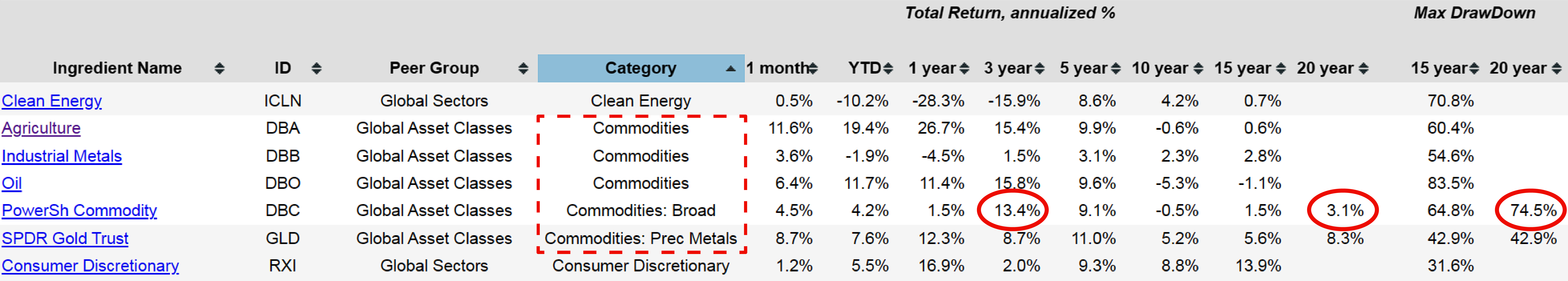
For instance, if one were interested in commodities, there are five different commodity ingredients available, ranging from broad-based to more specific categories like agriculture, industrial metals, oil, and precious metals. Examining their performance over the past 15 to 20 years reveals significant drawdowns for each. Interestingly, precious metals experienced the least maximum drawdown over this period. However, it's essential to consider not only the appealing returns observed over certain time frames but also the broader historical context, particularly in terms of risk. For example, the broad-based commodities fund, PowerSh Commodity (DBC), faced a substantial 74.5% drawdown within the past 20 years. For instance, a return of 13.4% annually over the past three years may seem impressive. However, it's essential to consider this performance within the broader context of the last 20 years, particularly in terms of risk. While some investments may appear promising in the short term, a closer examination reveals that they often lose their luster when their risk profile and long-term performance are evaluated.
Global Sectors including Technology, Consumer Discretionary
Exploring the category of commodities offers valuable insights. Additionally, users have the option to sort by peer group, including global asset classes, global equities, and global sectors. Focusing specifically on global sectors provides an intriguing perspective on their performance over time.
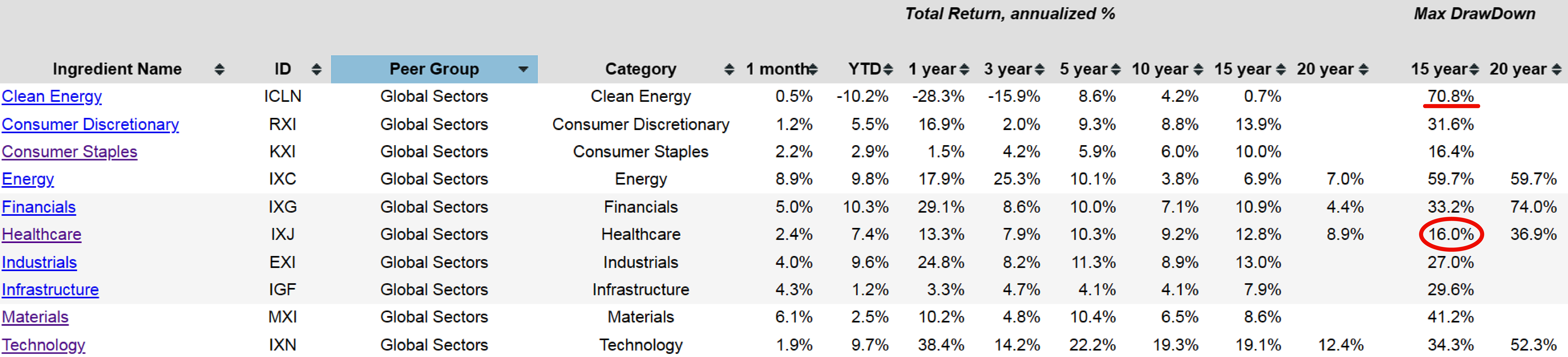
Upon narrowing the view to global sectors, users encounter a diverse selection of representative exchange-traded funds spanning various sectors. Examining the drawdowns of these funds offers further understanding of their performance dynamics and potential risks.
Examining Clean Energy (ICLN) over the past 15 years reveals a maximum drawdown of over 70% from month-end to month-end at some point, with a notable recovery of around 16%. Comparatively, Healthcare (IXJ) has experienced a maximum drawdown of 36.9% over 20 years. This rapid assessment provides a brief understanding of the performance within a single category, considering both returns, as indicated in the corresponding column, and various risk metrics beyond just maximum drawdown.
Best ingredient returns with less than 40% drawdown
Looking into Healthcare, we can utilize the icon to compare risk versus return, leading us directly to the scatterplots. This feature provides a convenient and efficient way to assess risk and return simultaneously.
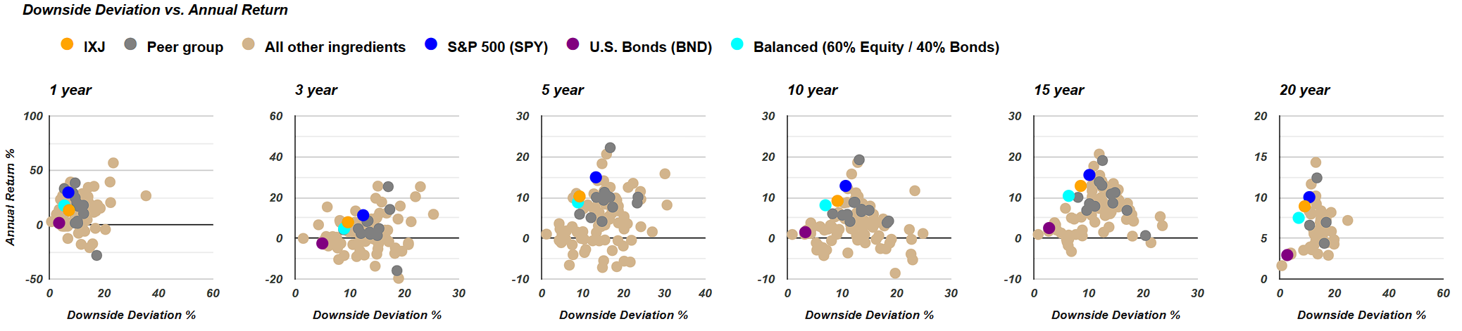
Comparing the orange dot representing the Healthcare Global Sector exchange-traded fund to the teal dot, which represents the Balanced 60/40 portfolio discussed earlier, is particularly interesting. Despite Healthcare being one of the top-performing sectors, it doesn't exhibit significantly different behavior compared to a combination of the teal dot and the broad-based S&P 500 dot. Essentially, it falls in between these two benchmarks. While this positioning may be favorable, it doesn't surpass the performance of either a pure equity portfolio or a balanced 60/40 portfolio. This observation underscores how even the best-performing sectors often fail to outperform basic benchmark portfolios composed of equities or a blend of equities and bonds.
Indeed, this serves as a reminder that while individual portfolio ingredients or underlying asset classes can perform admirably on their own, their true potential shines when they are thoughtfully combined into recipes. By blending these ingredients, investors can harness the strengths of each component to create a well-balanced and diversified portfolio that is better equipped to weather market fluctuations and achieve long-term success.
Returning to the portfolio recipes, investors will notice the same three dots representing the benchmarks: purple for U.S. Bonds, blue for the S&P 500 exchange-traded fund, and teal for the Balanced 60% equities and 40% bonds combination. On the 20-year graph, there's little to choose from in terms of alternatives offering lower risk and higher return compared to these benchmarks.
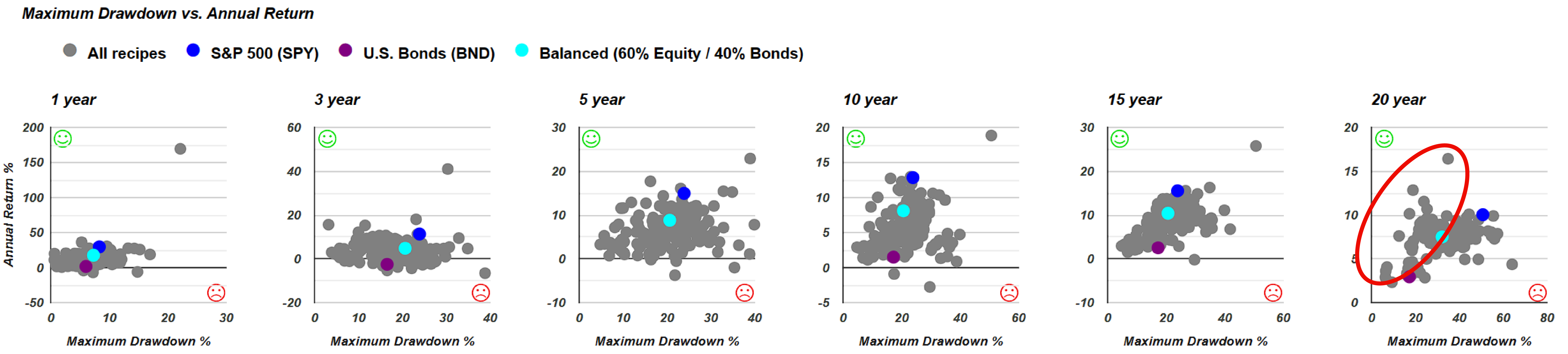
However, on the 20-year graph in the recipe view, users will find a wider array of options. These portfolio recipes can be static, dynamic, or managed, such as mutual funds or exchange-traded funds overseen by professional managers. The objective remains consistent: to achieve the best return for the lowest risk. The portfolio recipes are transparently labeled with a ticker system, such as s.6040 for the static 60/40 balanced portfolio. This transparency underscores the commitment to presenting both successful and less successful strategies without bias towards high-fee mutual fund managers. While some managed portfolios may justify their fees with strong performance, others may not. The aim is to present all options with hard data, allowing users to make informed decisions based on their individual preferences and goals.
Portfolios that beat the Balanced Portfolio, at least one green and no reds
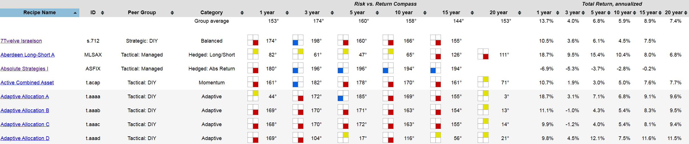
So, let's delve into portfolios that outperform the 60/40 benchmark. We've previously introduced a new metric called the Risk vs. Return Compass, which categorizes every portfolio recipe based on its performance relative to the teal dot representing the balanced 60/40 portfolio benchmark. Imagine dividing each graph into four quadrants, with the teal dot positioned at the center. Portfolios are then categorized based on their risk and return compared to the balanced portfolio benchmark. Here's how we color code them:
Yellow: Higher risk and higher return, indicating a warmer performance.
Green: Lower risk and higher return, represented by a green smiley face.
Red: Higher risk with lower return, the least desirable combination.
Blue: Lower risk with lower return, perhaps of interest but considered cooler.
This color symbolism helps users quickly identify portfolios based on their risk and return characteristics. With an understanding of how we determine the four quadrants and the corresponding color coding, let's revisit the risk versus return compass. This tool, aptly named compass, calculates the position of each portfolio dot relative to the center point, akin to the degrees of a compass.
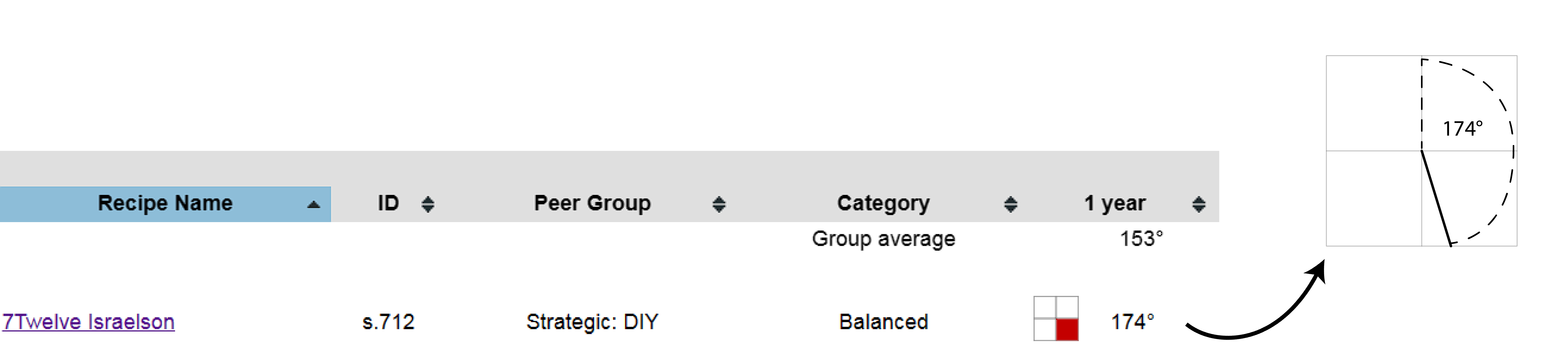
For instance, a dot positioned at 174 degrees indicates that the portfolio, such as 7Twelve Israelson (s.712), resides in the red quadrant, denoting higher risk with lower return. This designation is visually represented by an icon featuring a red corner, indicating that it's not an ideal position for the portfolio.
An intriguing question arises: Can we identify portfolios or recipes that have outperformed the 60/40 balanced portfolio at least once and have consistently avoided the red quadrant across all time periods (1, 3, 5, 10, 15 to 20 years)? This filtering criteria seeks portfolios with at least one green icon and no red marks, which proves to be quite a challenging benchmark to meet. Some portfolios may exhibit a consistently lower risk and lower return profile, akin to cash, which may not align with investors' objectives.
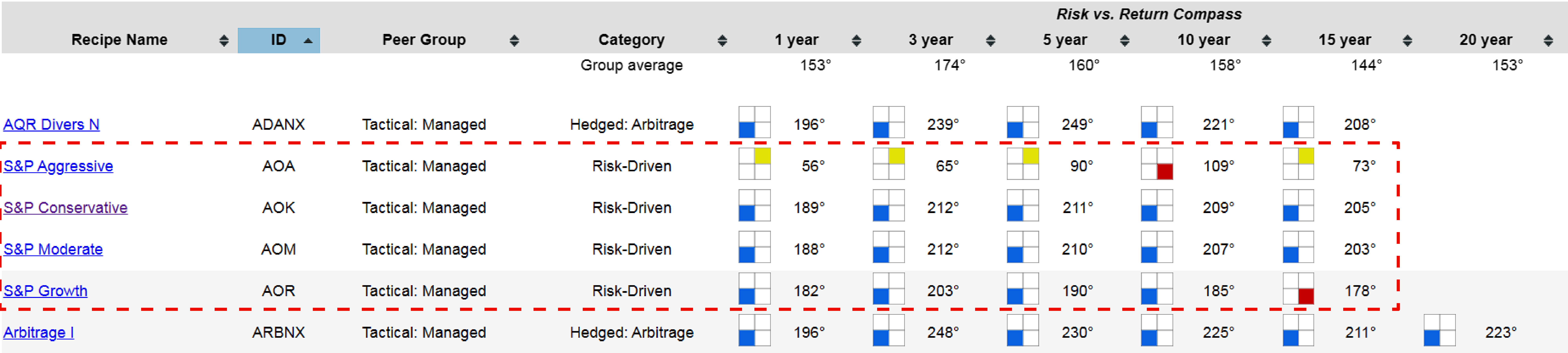
Upon closer examination, we find that several portfolios, including those categorized as conservative, moderate, and growth ETFs within the S&P 500 family, consistently demonstrate lower risk and lower return compared to the benchmark. This observation underscores the importance of thorough evaluation to ensure that a portfolio's risk-return profile aligns with investors' goals and preferences.
Let's continue our search, keeping in mind our filtering criteria of at least one green with no reds. As we scan through the portfolios, we observe the challenges in finding such candidates. Despite our stringent filter, it's important to recognize that some portfolios may excel over certain time periods while facing challenges in others.
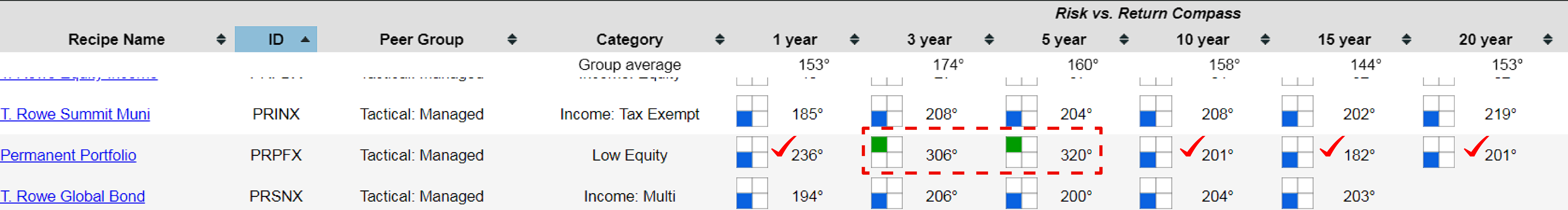
After thorough inspection, we identify the Permanent Portfolio (PRPFX) as a standout candidate. This portfolio has consistently outperformed the benchmark of the 60/40 balanced portfolio over the past three and five years, demonstrating lower risk and lower return profiles. Continuing our search, we observe that none of the static or strategic portfolios (S-dots) have managed to beat the benchmark without experiencing at least one down period. This underscores the effectiveness of tactical investing strategies in navigating market fluctuations.
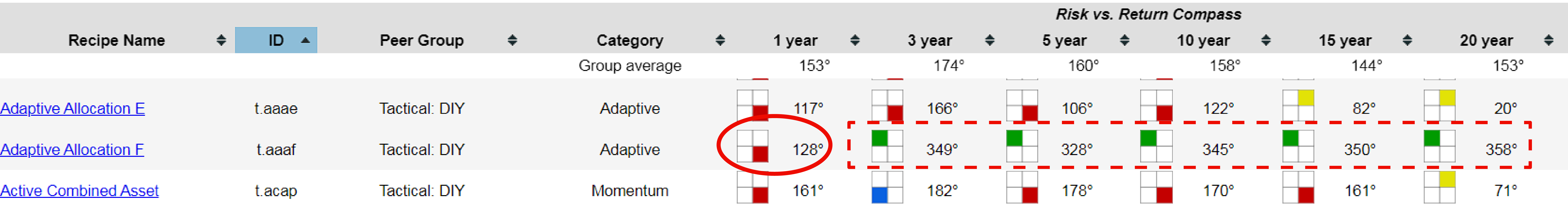
Finally, we come across the Adaptive Allocation F (t.aaaf), which has garnered popularity for its strong performance. However, it's worth noting that it fell short over the past one-year period, showcasing the dynamic nature of investment performance.
As time progresses, the performance of these portfolios may evolve, potentially leading to changes in their indicator lights. For instance, a portfolio that has experienced challenges over the past 12 months could see improvements and eventually turn all green with continued positive performance. However, it's essential to note that indicator lights become less likely to change significantly as we look further into the past, especially when considering a 20-year annualized return.
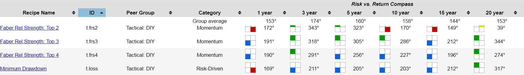
Continuing our examination, we encounter a couple of portfolios that meet our criteria: Faber Rel Strength: Top 3 (t.frs3) and Top 4 (t.frs4). These portfolios have consistently demonstrated lower risk and lower return profiles.
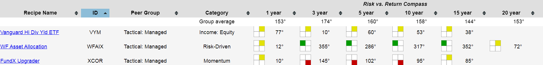
Further down the list, we find Wells Fargo Asset Allocation (WFAIX), which has displayed either higher return with higher risk over 20 years or outperformed the benchmark in other time periods.
Additionally, several Vanguard funds have also met our criteria. Notably, Vanguard Market Neutral (VMNFX) and Vanguard Balanced (VBIAX) have outperformed the benchmark, while Vanguard Wellington Inv (VWELX), the world's oldest mutual fund, has shown commendable performance, particularly in recent time periods. Despite being rated as yellow over the last 20 years, indicating slightly higher risk and return compared to the 60/40 benchmark, it remains a noteworthy contender.
It's indeed fascinating to observe that such a straightforward constraint—requiring at least one green with no reds—results in a relatively short list of qualifying portfolios. Among the vast array of options, only seven portfolios meet this criterion, with Vanguard featuring prominently with three of its funds.
Vanguard Funds: One Vanguard Fund to Avoid
However, it's essential to recognize that even well-established investment companies like Vanguard may have funds that fail to outperform a simple 60/40 benchmark consistently. For instance, Vanguard STAR Inv (VGSTX) has consistently demonstrated lower return with higher risk compared to the benchmark, across all time periods examined.
This observation underscores the importance of diligent research and evaluation when selecting investment options. Merely relying on a brand name or reputation may not guarantee superior performance. Instead, investors should carefully consider the specific characteristics and track record of each fund to ensure alignment with their financial goals and risk tolerance.