Article-2024-02
February 2024 Recipe Investing - Commentary
Topics this month
- Reviewing Portfolio Ingredients: Asset Class ETFs Fall Short on Risk-Return Ratio
- Comparing Portfolios: Understanding the Risk vs. Return Compass
- Understanding January's 16% Return of the Quartile Sector Rotation (t.srqr) Portfolio
- Navigating the Downside Deviation Summary View
Welcome to the February 2024 commentary from recipeinvesting.com. We track investable portfolio recipes that allow investors and advisors to build portfolios that minimize risk and maximize return. We reallocate and rebalance monthly, so we have plenty of new material to cover for our comparisons this month.
Asset Class ETFs Fall Short on Risk-Return Ratio
Let's explore and uncover insights from the results up to January 31, 2024. Moving on, let's focus on what we call "ingredients" – essentially, exchange-traded funds (ETFs) grouped into various types like global asset classes, global equities, and global sectors. These ETFs serve as representatives of the different options available for building a portfolio. As we delve into this, we observe ongoing and intriguing trends.
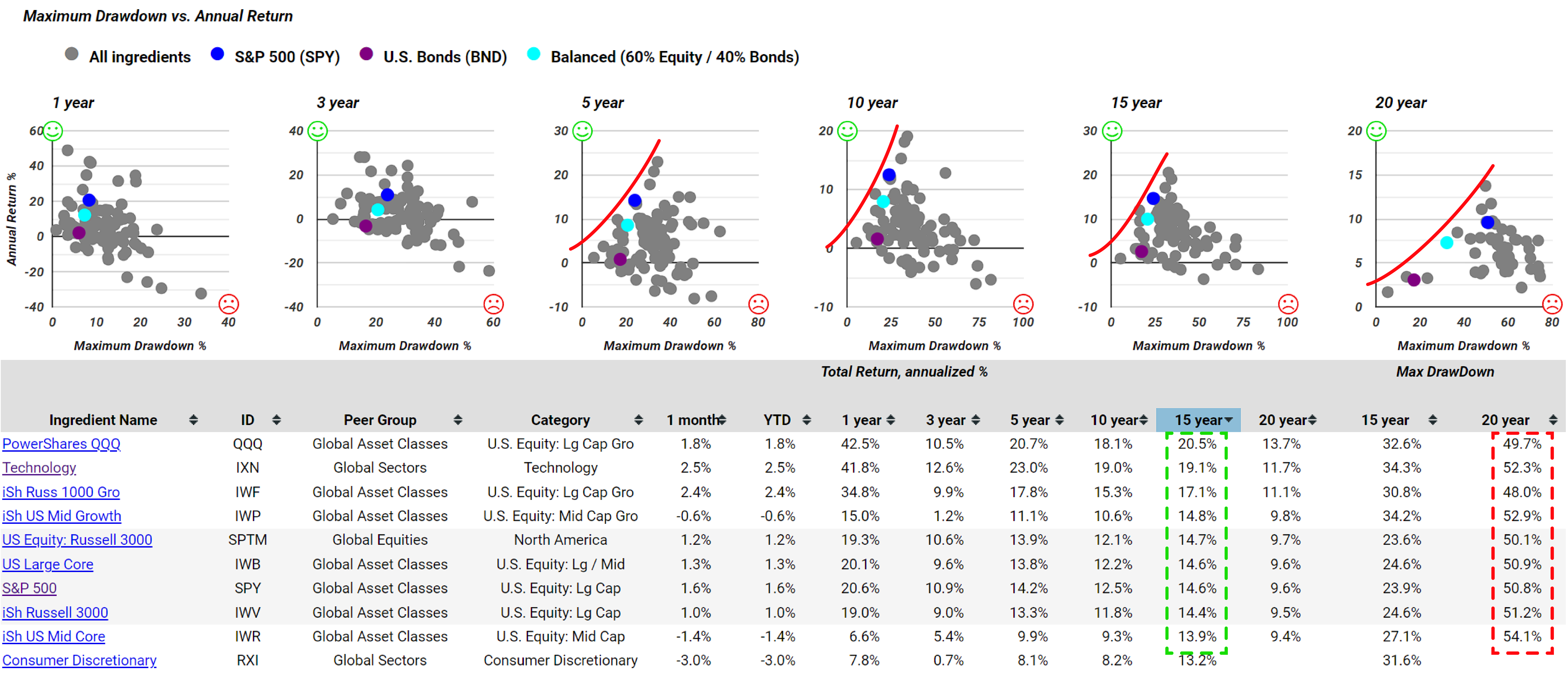
The graph displays the maximum drawdown versus annual return, highlighting a robust relationship between risk and return. By looking at the table, we can explore the drawdown data. Notably, many exchange-traded funds (ETFs) show significant drawdown, despite some boasting relatively attractive total annualized returns over the past 15 or 20 years. However, this attractiveness is accompanied by a substantial drawdown, with almost all experiencing a roughly 50% decrease, mainly during the 2008 timeframe. This underscores the considerable impact of drawdown in this context.
Understanding the Risk-Return Compass
Let's revisit the ingredients summary page, where we can explore various perspectives on these components beyond the overall summary. We can utilize different measures of risk versus return, including one introduced a couple of months ago—the risk-return compass. It comprises four quadrants, each represented by an icon. This comparison assesses each ingredient against a 60/40 balanced portfolio.
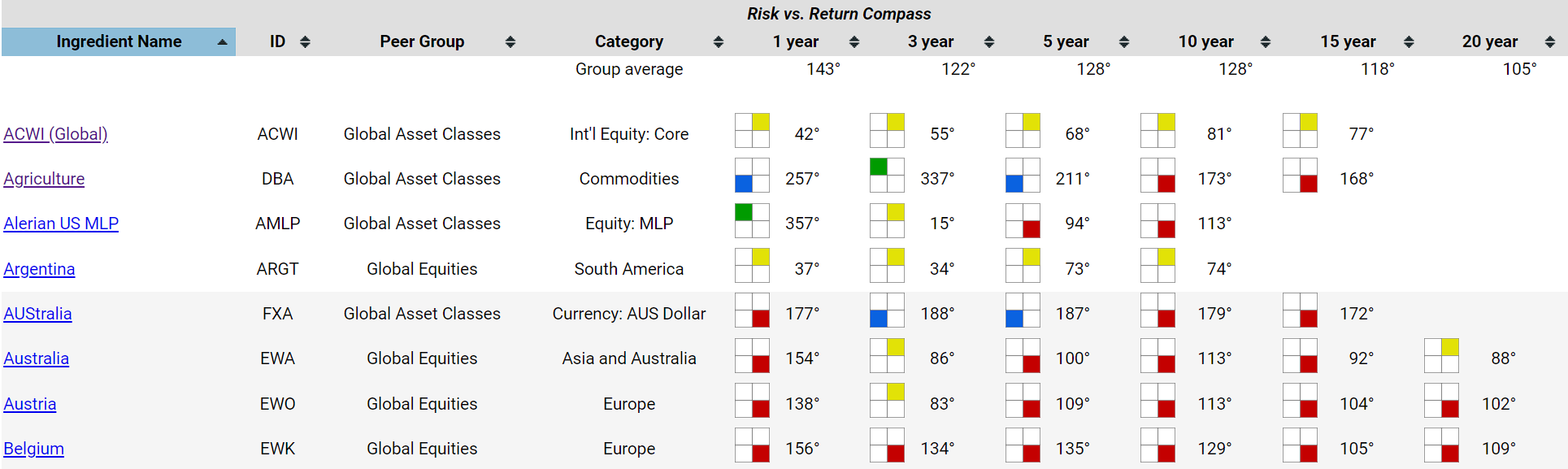
In this visual representation, the yellow indicates that the ACWI Global (ACWI) global asset class exchange-traded fund carries higher risk and offers higher returns compared to the 60/40 balanced portfolio. Consequently, it is positioned in the northeast quadrant, denoted by the color yellow. Some ingredients are represented in green, indicating that over the 3-year period, the Agricultural (DBA) commodity exchange-traded fund exhibited lower risk on the x-axis and higher return on the y-axis. The green quadrant color is assigned to signify this favorable combination. Utilizing portfolio recipes, we can promptly assess whether it outperforms a basic, straightforward balanced fund comprising 60% equities and 40% bonds.
It's noteworthy that over the past 20 years, none of the monitored ingredients has earned a green square, signifying lower risk and lower return. Instead, the squares are predominantly blue, indicating a cooler, lower-risk, and lower-return profile. There's also a presence of red, denoting higher risk with lower return – the least favorable combination, and yellow, representing higher risk with higher returns. Consider yellow if the investor has a higher risk appetite, while blue may appeal to those with a lower risk tolerance. Notably, the red squares, at least for the specific time periods examined, typically don't outperform the 60/40 balanced portfolio. This emphasizes the scarcity of green icons on the ingredients page, underscoring the importance of diversification.
Transitioning to the recipes section, investors can view the same metrics applied to our portfolio recipes, encompassing a mix of exchange-traded funds, a notable selection of mutual funds referred to as tactical managed, as well as strategic static allocations denoted by an 's' prefix. Additionally, there are several tactical do-it-yourself (DIY) funds, with their allocations available on the paid plan, all carrying the 't' dot prefix.
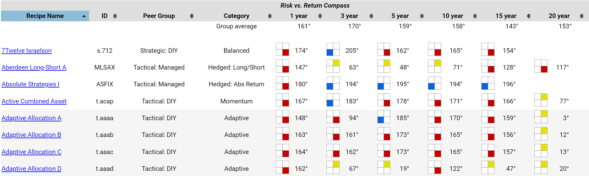
The recipes page presents numerous options, with well over a dozen, perhaps twenty, distinct recipes spanning two decades. These recipes, when assessed on a risk-adjusted basis, have consistently outperformed the 60/40 balanced portfolio in terms of both risk and returns, earning them the coveted green square. Notably, some, such as the Adaptive Allocation F (t.aaaf), have demonstrated robust performance over the years. It not only boasts a respectable total return profile, around 12.7%, but also maintains a reasonable risk profile compared to benchmark standards. This serves as a practical method, using a color-coded system, to assess how a specific recipe stacks up against a straightforward 60/40 balanced portfolio, exclusively comprising exchange-traded funds. As previously pointed out, if certain tactical managed funds consistently fail to outperform the 60/40 balanced portfolio benchmark across all time periods under consideration, it prompts the question–why would anyone opt for them? Now, when something is marked as yellow, it indicates a potential for higher risk and higher return.

For instance, the T.Rowe Price Equity Income (PRFDX) fund falls into this category, displaying a consistent trend of higher risk and higher returns over multiple periods. If the investor possesses a high risk appetite, this might be a suitable choice. In such cases, it wouldn't warrant an immediate dismissal. This four-quadrant color-coded risk versus return compass, as we're labeling it, allows us to specify the degrees. To be precise, its position on the chart is at three hundred fifty-one degrees, just slightly off from the vertical axis of the risk-return scatter plot.
The Top Portfolio Recipe that has return of 16% last month
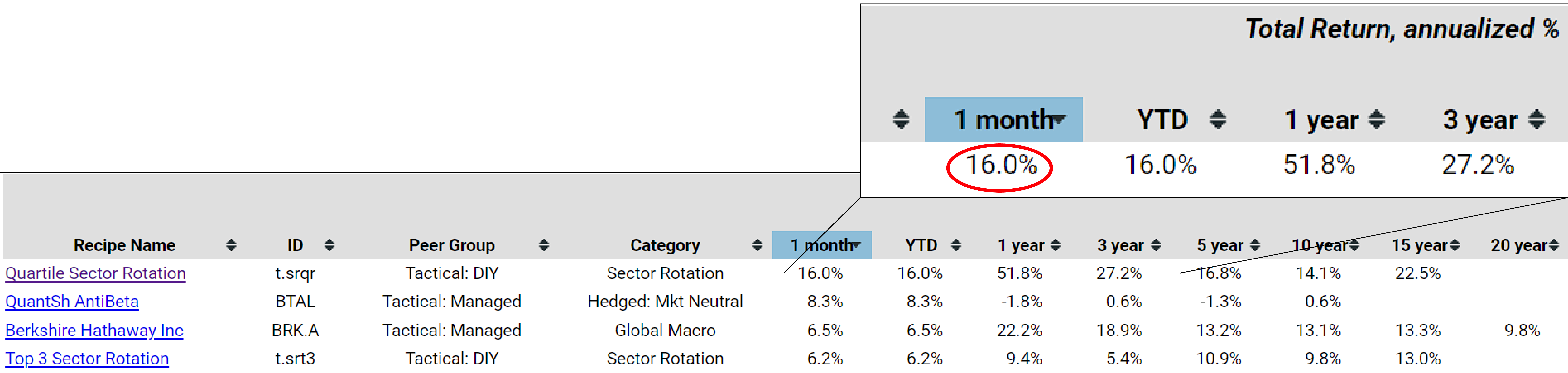
Let's return to the main recipe summary page and examine the one-month returns for all the portfolio recipes we monitor. Remarkably, the Quartile Sector Rotation (t.srqr) recipe stands out with a 16.0% return in a single month. If the investor is curious about how this works, it's essentially a highly concentrated portfolio recipe. The methodology involves selecting from a pool of one hundred and seventeen sector funds, ranking them, and then choosing the top fund. However, a new fund is only selected if the current one drops out of the top quartile in the ranking, hence the name Quartile Sector Rotation.
Over the past month, Quartile Sector Rotation has its investment in ProFunds Semiconductor UltraSector Inv (SMPIX), a ticker introduced a month ago. This highly concentrated position remains in this single mutual fund. As a check, we looked at the statistics on SMPIX and found it nearly 21% percent. However, this data doesn't quite cover the end of January, so the numbers may vary slightly. Nevertheless, here's a fund that has gained 21% over the past month.
Taking a highly concentrated position in this single fund, which not only focuses on a single industry but also targets the ultra sector, suggests leverage at play. Therefore, it's not suitable for everyone and requires a higher risk appetite. Despite its success, it's important to acknowledge the associated risks. For instance, there has been a significant 50.7%percent drawdown over the past 15 years. While we don't yet have a 20-year history for this fund, it's clear that there have been some challenges along the way.
Navigating the Downside Deviation Summary View
There are other recipes that may experience less fluctuation in terms of peaks and valleys. If we wish to conduct a more thorough examination focusing on downside deviation, I find this approach favorable. Unlike standard deviation, downside deviation primarily considers negative returns, penalizing or counting them against the investor in the calculation.
Now, let's take a comprehensive look at all the recipes plotted on risk versus return. Once again, we observe a clear trend showing the relationship between risk and return as expected. From here, we can identify which portfolio recipes, particularly within this 20-year timeframe, offer higher returns in one direction and lower risk in another. These recipes would appear with a green square in the risk versus return analysis, as discussed earlier.
To simplify, let's consider the Balanced 60-40 Portfolio, represented by the teal dot. Recipes falling in certain areas will receive specific colored squares – green, yellow, red, or blue. This risk versus return compass is derived directly from these downside deviation risk versus return scatter plots, providing a single color representation. This eliminates the need to individually compare each recipe to the teal dot, representing the 60/40 portfolio.
Again, the table can be sorted by any of these column headings as needed. If we wish to identify lower risk options, we can look more to find some of these portfolios. Sure enough, some of the popular ones appear in this table with lower risk, exhibiting a 6.8% downside deviation, yet offering a double-digit 12.7% return.
We've added a benchmark category so that investors can view U.S. Bonds (BND) and the S&P 500 (SPY) on the same list. For reference, the downside deviation for the S&P 500 over 10, 15, and 20 years has been approximately 10.7-10.9%. While the returns have been respectable, achieving a better risk-return combination compared to the S&P 500 requires a downside deviation that is equal to or significantly less than this 10.9%.
By sorting from highest to lowest, we can see the benchmark again at a 10.9% downside deviation. However, to find options with lower risk and a decent return, perhaps even surpassing the 9.6% return, we can navigate to the upper left of the chart where the S&P 500 is represented by the blue dot. So, not all of these will have lower returns and higher risk compared to the 60/40 portfolio, but a subset of them will, such as the Adaptive Allocation F, which is an adaptive asset allocation portfolio.
This provides an overview of how to use these detailed pages that focus on specific metrics and rank all the recipes accordingly for the years we track. Additionally, we'll complement this with total returns, allowing for comparison in table format. Recently, we've also added a twenty-year lookback.