Article-2023-12
December 2023 Recipe Investing - Commentary
Topics this month
- Argentina: Top Performing Global Equity Fund for this Month
- CYB and BNAAX: Two Exchange-Traded Funds that Recently Liquidated
- Using Beta as a Tool to Assess a Portfolio’s Risk and Volatility
Welcome to the December 2023 commentary from recipeinvesting.com. We track investable portfolio recipes that allow investors and advisors to build portfolios that minimize risk and maximize return. We reallocate and rebalance monthly, so we have plenty of new material to cover for our comparisons this month.
Let's start by discussing portfolio ingredients. These are the foundational ETFs that form the basis of many of our portfolio recipes or algorithms, as we commonly call them. The table provides a summary of these ingredients, and by clicking on the header of any column, we can sort the information based on the specified period. This allows us to observe changes over the past month.
Argentina: Top Performing Global Equity Fund for this Month
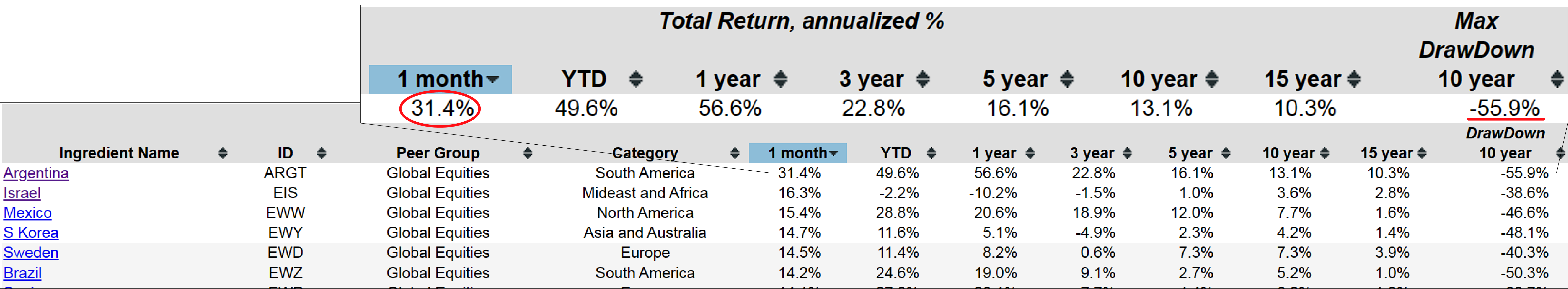
Argentina (ARGT) recently elected a new president, making headlines. This development may be contributing to some optimism regarding the state of their currency and economy. The performance in the past month reflects a significant increase of 31%, which is impressive. However, it's essential to consider the broader context–over the past decade, there has been a decline of 55%. This indicates that Argentina has faced challenges over the last ten to fifteen years, resulting in noticeable volatility. Looking beyond Argentina, similar patterns are observed with other global equity players that have experienced substantial gains in the past month. While delving into the details of these individual cases is not our primary focus, it's worth noting that a couple of exchange-traded funds and one mutual fund have been delisted, ceasing to exist.
Two Exchange-Traded Funds that Recently Liquidated
CYB
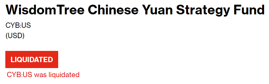
One of the components in our portfolio falls under the currency category. Several ingredients in our portfolio are designed to track different currencies, including the Australian dollar, pound, yen, and US dollar. These currencies are categorized as Global Asset Classes. However, in the past month, the Currency Exchange-Traded Fund with the ticker CYB, which tracked the Chinese Renminbi or Chinese Yuan, has ceased to exist. Yes, it went defunct, and the Wisdom Tree Chinese Yuan Strategy Fund is no longer operational. Surprisingly, there doesn't seem to be a replacement Exchange-Traded Fund for it.
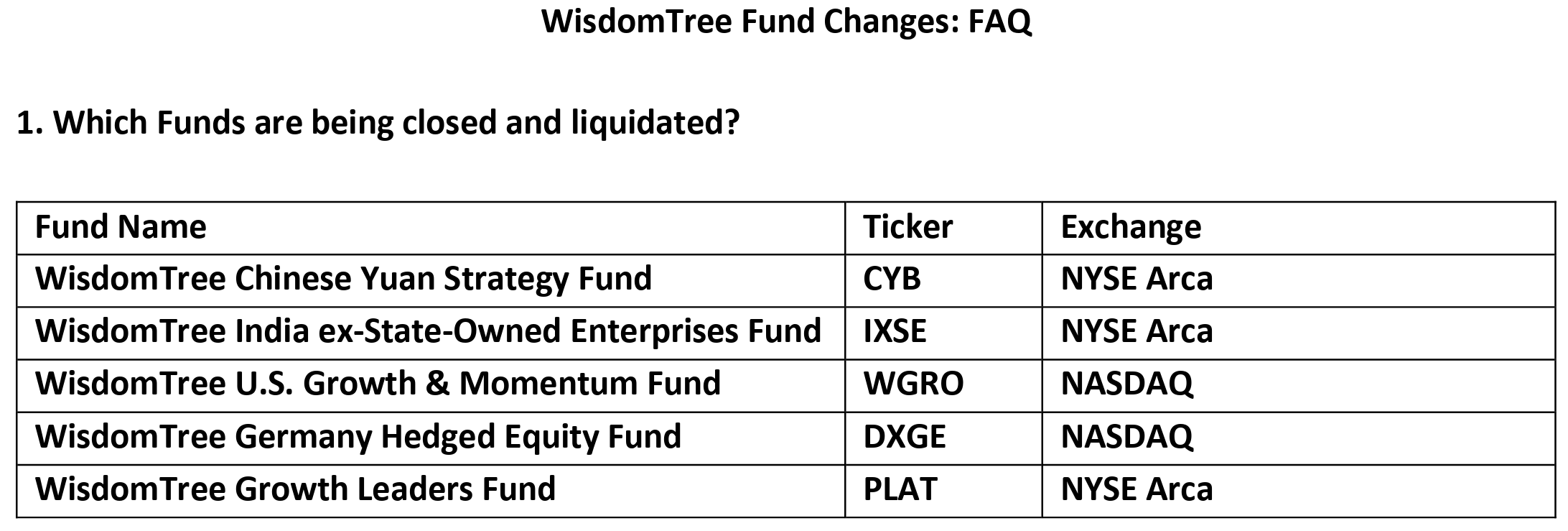
As we investigate further, it's intriguing how these financial instruments can vanish without leaving much of a trace or explanation. Occasionally, we may find information on the issuer's website, such as the Wisdom Tree website. In their Fund Changes FAQ section, they announce the removal of the CYB ticker, providing insight into the reasons behind its liquidation. The evaluation considered factors such as the length of time on the market and asset levels. Essentially, there wasn't enough investor interest, and the limited market demand made it unprofitable. It's interesting to note how certain funds can quietly fade away due to the economic considerations of the managing entity.
BNAAX
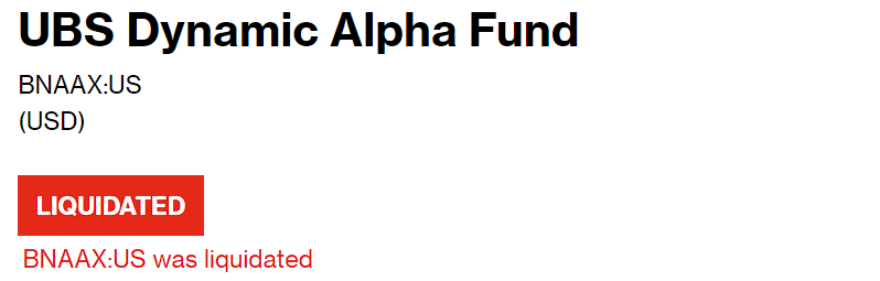
On the portfolio recipe, there's another Exchange-Traded Fund that has recently been liquidated–the UBS Dynamic Alpha (BNAAX) fund. Unlike our strategic or tactical portfolios, which undergo monthly rebalancing, we included this fund for comparison purposes. The allure of its name, "Dynamic Alpha," suggests constant changes and the potential to invest in multiple asset classes. The concept of consistently seeking alpha or excess returns beyond a benchmark, as described by the reputable company UBS, was particularly intriguing. However, disappointingly, the fund has been liquidated, bringing an end to its existence. This turn of events is noteworthy, especially considering its initial inclusion in our list of portfolio recipes for benchmarking and comparison.
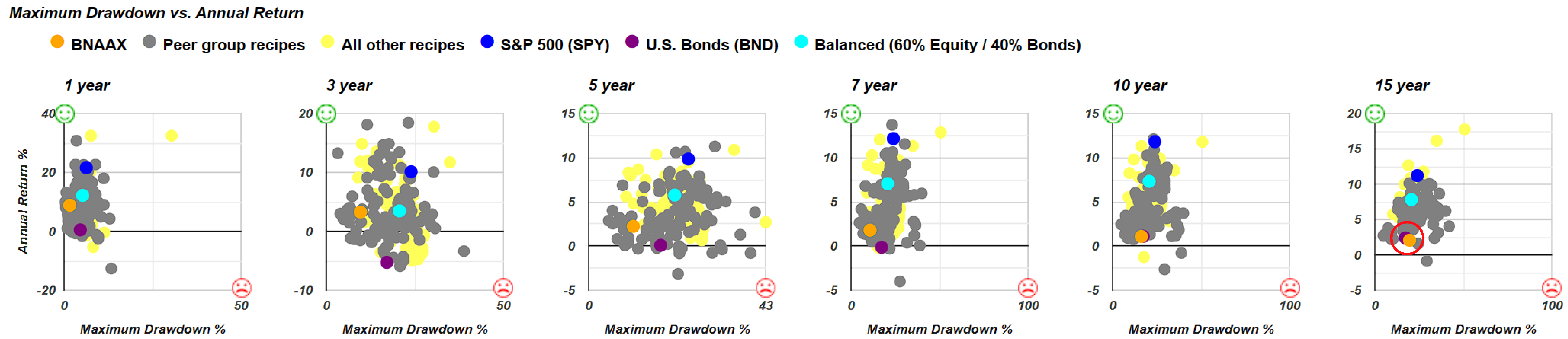
Let's dig into our archives and take a retrospective look at the UBS Dynamic Alpha (BNAAX) Fund, examining its performance a few months before it was delisted. This can be seen as a kind of postmortem analysis. We'll focus on the comparison between maximum drawdown and annual return. The orange dot represents the now-liquidated fund. Surprisingly, it's not performing as poorly as anticipated. Contrary to expectations, it's positioned above and to the left of the purple U.S. Bonds (BND) Fund, indicating a higher return with potentially lower risk. However, the concern arises when we extend the analysis to 15 years. In this case, it's positioned below and to the right of the U.S. Bond Fund, signifying higher risk, measured by maximum drawdown, and a lower total return. Not an encouraging sign.
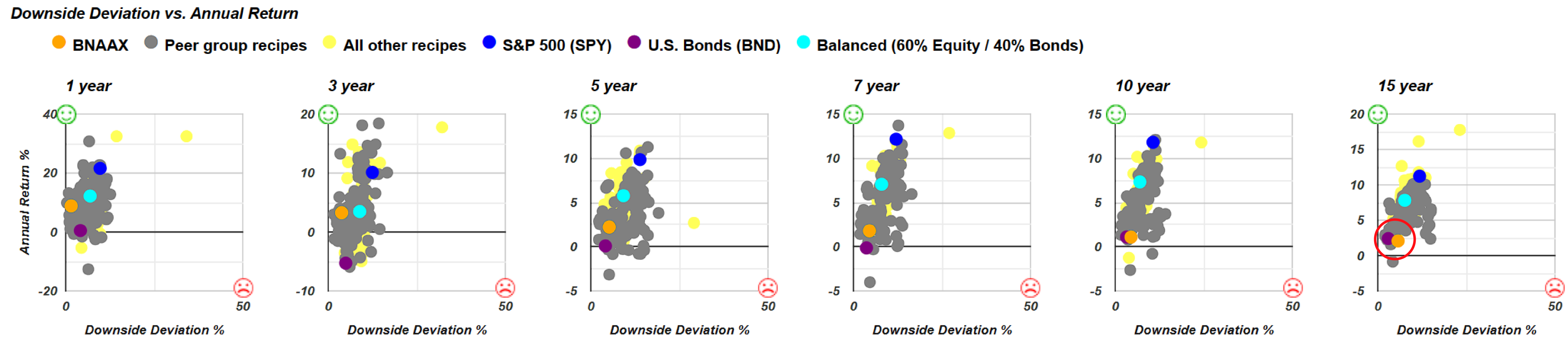
Moving on, we'll also explore its downside deviation for a more nuanced understanding of the recently liquidated fund's performance over the past few years. Compared to a broad-based U.S. Bond Fund, it was positioned above and to the left, a positive direction indicated by the green smiley face. However, over five years, it shifted above and to the right, implying higher risk and potentially a less favorable risk-return trade-off. This recurring theme raises questions about its relative positioning below and to the right of a very cost-effective, broad-based U.S. Bond Fund. The higher downside deviation and lower return of the recently liquidated fund don't exactly make for a compelling sales pitch.
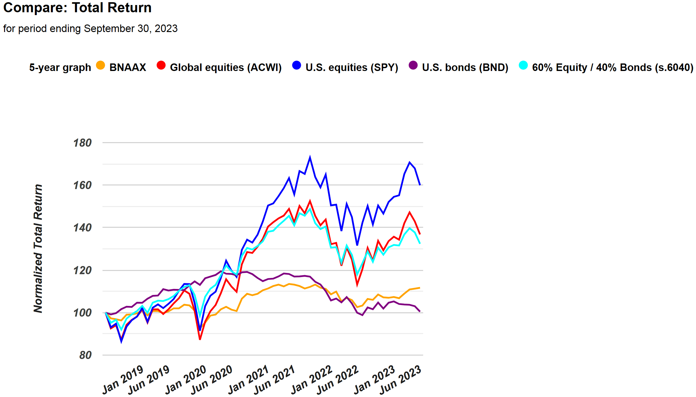
If we examine the 5-year total return graph, essentially what we're presenting is the orange line. Comparatively, the U.S. Bond Fund resembles the purple line, but with significantly poorer performance. While there may have been a recent uptick, overall, its track record has been consistently worse, and it comes at a higher cost. With the benefit of hindsight being 20/20, it becomes clearer why the decision was made to discontinue this particular fund.
Alright, let's shift our focus from the discussion on recently liquidated funds to examining the portfolio recipes. These are combinations of various exchange-traded funds and mutual funds that compose our strategic, static, or dynamic portfolios listed on this summary page. Sorting by one month and looking at the top-to-bottom performers, we notice Quartile Sector Rotation (t.srqr) taking the lead. This algorithm is unique—it's a highly concentrated single-fund strategy. While it evaluates multiple funds, it ultimately places a single investment into a mutual fund each month, resulting in a concentrated approach. This concentration can lead to significant returns in favorable months, but it also exposes the portfolio to substantial declines, even exceeding 50% over certain periods.
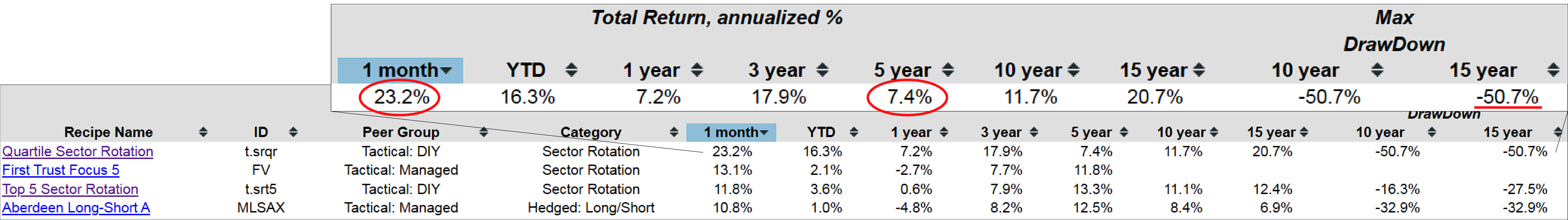
The one-month return is impressive at 23.2%, showcasing the potential for substantial gains. However, the drop to 7.4% over the past five years indicates a rocky journey, suggesting challenges over an extended period. Despite this, Quartile Sector Rotation seems to be making a strong comeback.
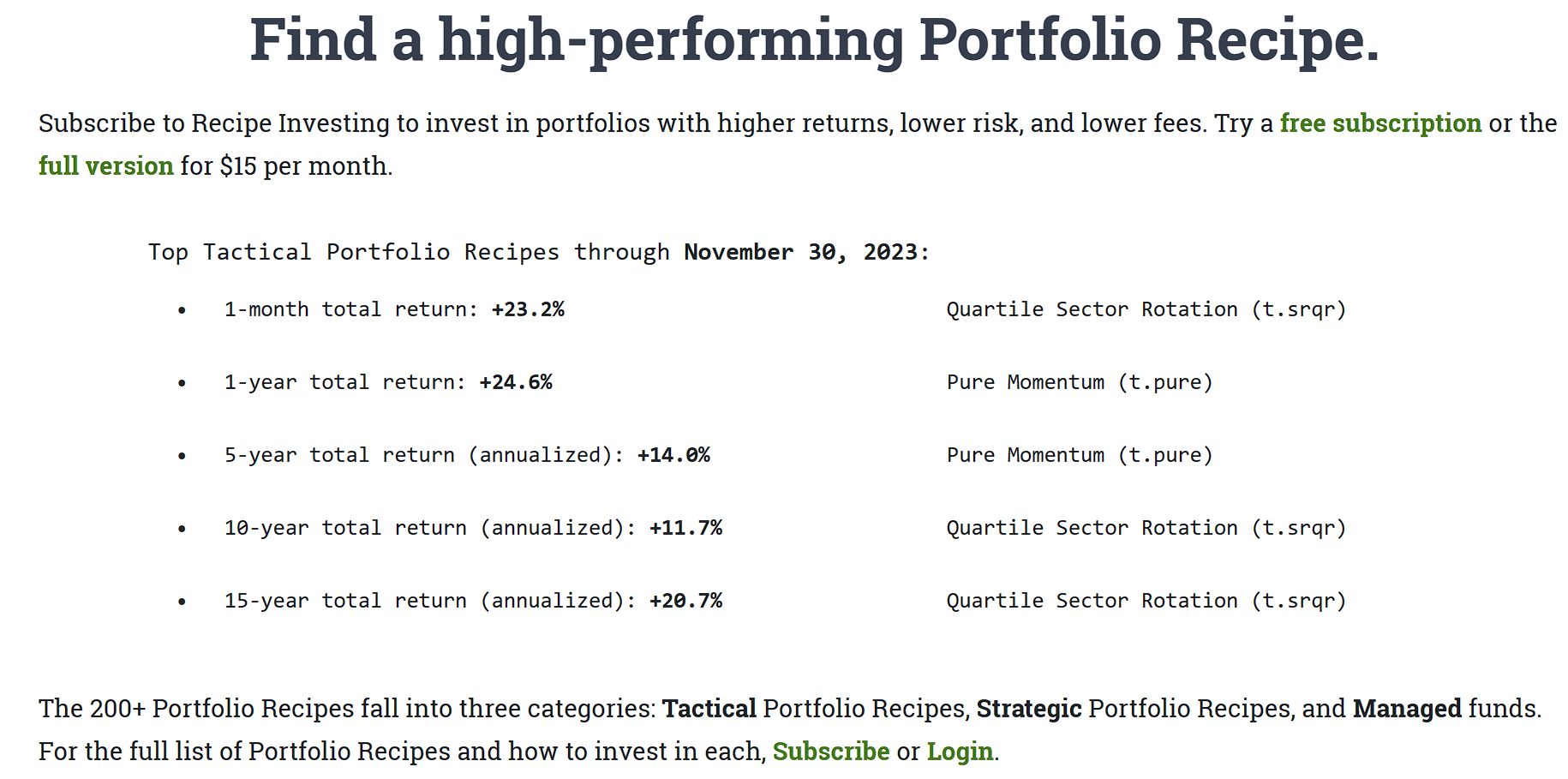
Additionally, for the investor's reference, our website, Recipe Investing, displays the top performers for various periods—ranging from one month to 15 years—right on the homepage at RecipeInvesting.com. This serves as a quick highlight for investors seeking performance insights. Moreover, investors might receive our monthly email newsletter, providing a more in-depth look. In each newsletter edition, we feature the top three tactical recipes in each category. If the investor hasn't already, ensure that they are on our mailing list. Investors may want to check their spam folder and ensure our newsletter is set to arrive each month. Sent shortly after the beginning of the month, our newsletter not only showcases the top tactical portfolios but also includes additional articles and updates.
Using Beta as a Tool to Assess Portfolio’s Risk and Volatility
Let's conclude our discussion by delving into the use of Beta as a tool to assess risk. While we may not have touched on this topic before, it's worth noting that we employ various return, volatility, and risk-to-return measures to analyze our diverse portfolio recipes. Focusing on beta, it gauges the volatility of each recipe compared to the S&P 500 (SPY) equity benchmark. Beta proves handy in this context, as a value of 1.0 signifies volatility on par with the S&P 500 (SPY). If a portfolio has a higher beta, as is often the case, it implies an expectation of greater return in exchange for the elevated volatility—essentially, a higher-risk, higher-return scenario.
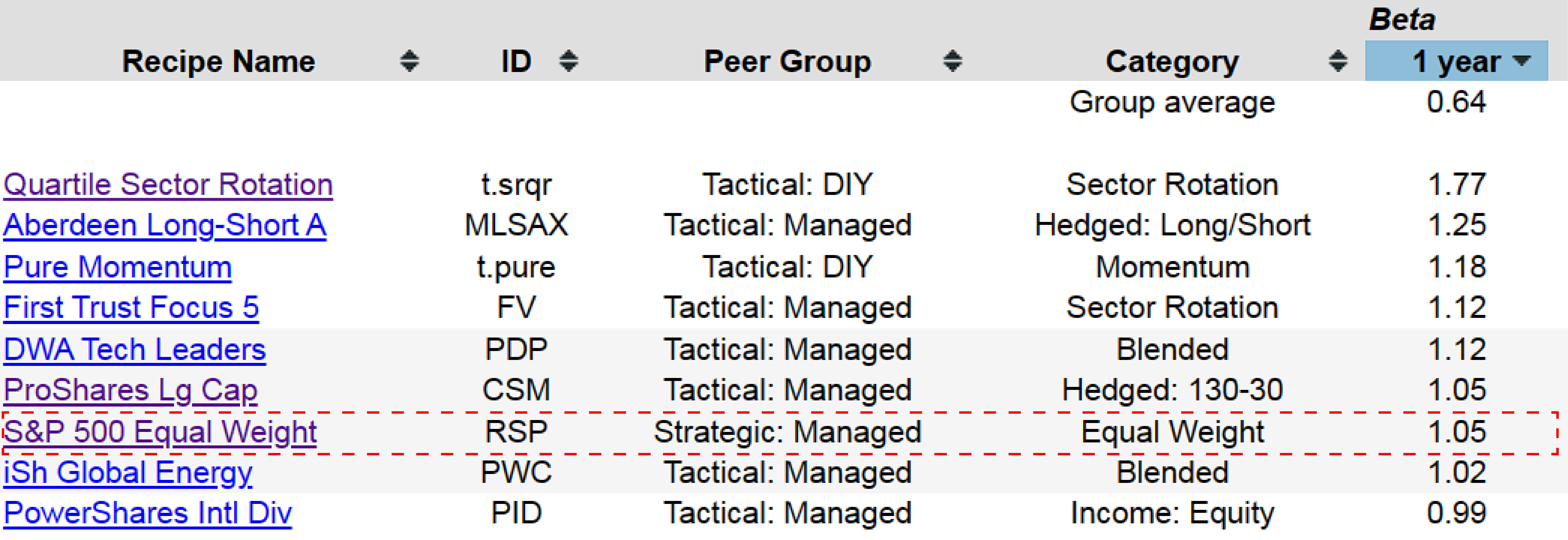
Interestingly, consider the S&P 500 Equal Weight (RSP), which employs a slightly different weighting approach than the traditional S&P 500 (SPY). Surprisingly, RSP has a beta of 1.05, indicating slightly higher volatility. This suggests that if you evenly distribute the weight among all 500 equities in the S&P 500, it results in a tad more volatility compared to the capitalization-weighted approach used by SPY.
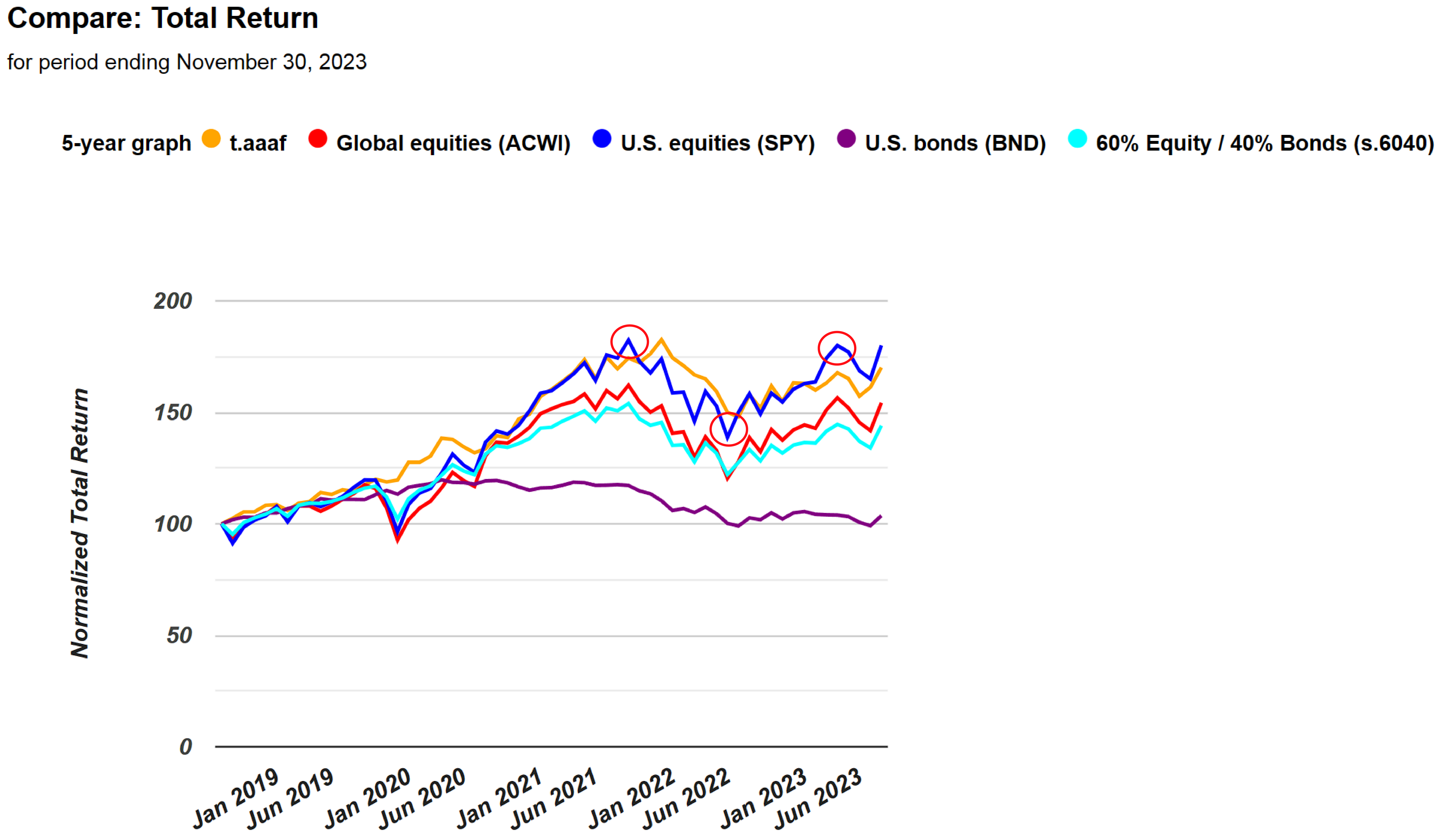
Let's take a closer look at one of our portfolio recipes, like Adaptive Allocation F (t.aaaf). By going into its detail page, we can observe the volatility of this portfolio. Even from the 5-year line graph that we have, comparing the orange line to the blue line representing the S&P 500, we notice that the S&P 500 has dipped a bit lower, risen slightly higher, and has been generally more erratic. Subjectively, observing the orange line, it seems less volatile, with smoother movements and not as pronounced highs and lows. This subjective assessment aligns with the expected beta of this orange line or t.aaaf being less than one. Upon checking, it indeed confirms this expectation.
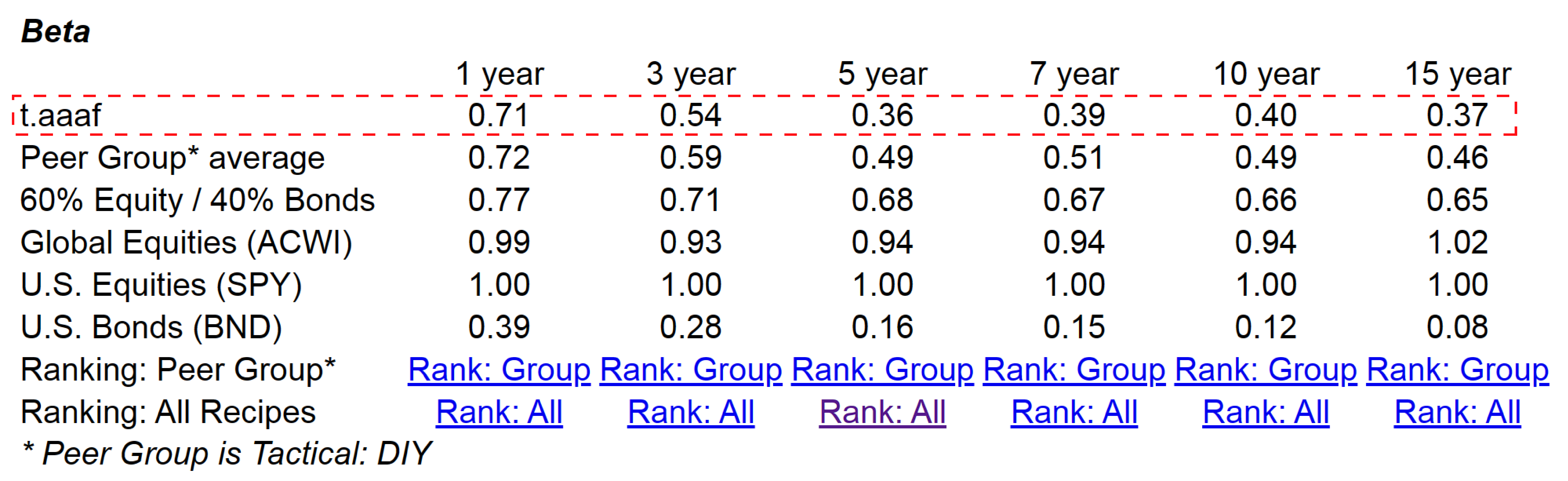
The beta of t.aaaf, our Adaptive Asset Allocation portfolio recipe, is notably less than one. This implies that, on average, it has exhibited lower volatility than the S&P 500. It's a useful metric for assessing risk. It's also crucial to consider this alongside the total return. While we don't display the Treynor Ratio, which combines total return and beta into a single ratio, it's another valuable measure. However, for a more detailed analysis, we can examine the beta independently in comparison to the S&P 500.
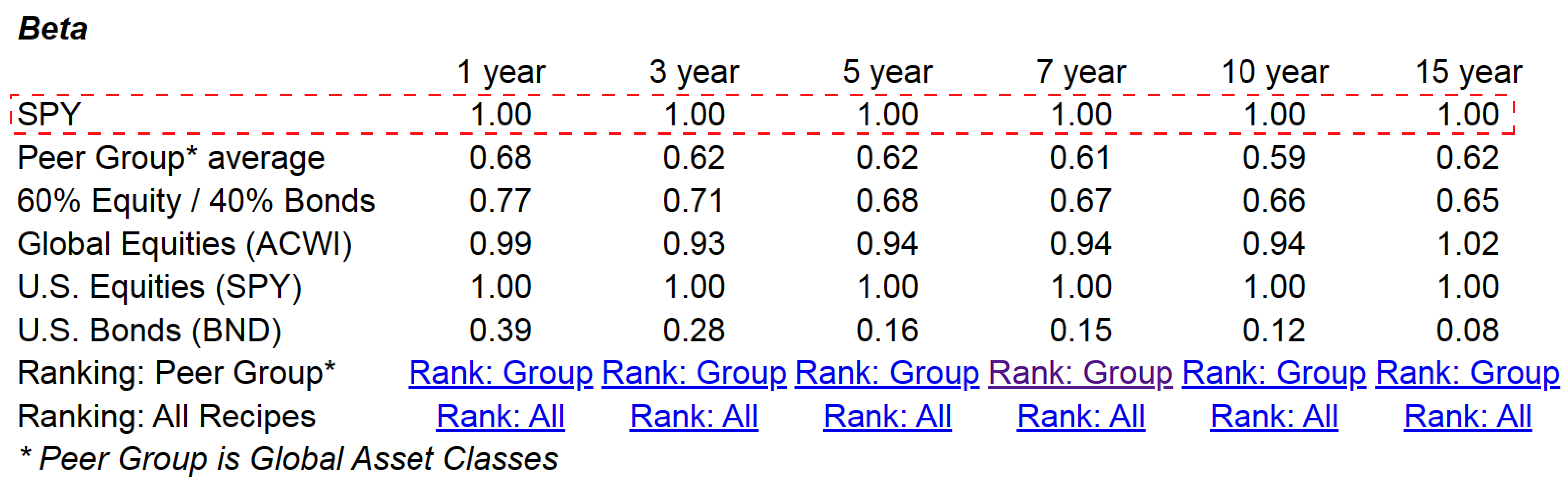
Now, if we turn our attention to the S&P 500 by itself, examining the chart here, we find that, as expected, the beta for the S&P 500 is precisely 1.00. Additionally, we can observe other benchmarks, with bonds having a much lower beta compared to the S&P 500. This discrepancy underscores the rationale behind constructing portfolios like the 60/40, where 60% comprises equities and 40% consists of bonds. Similar to the S&P 500, this blend aims to achieve more stable returns over time by leveraging the distinct volatility profiles of these two portfolio components. This underscores the importance of combining different underlying ingredients within a particular asset class to create a well-balanced and resilient portfolio.
Indeed, that's the operational principle behind many of our portfolio recipes – the art of blending various exchange-traded funds and mutual funds into portfolios denoted by t-dot or s-dot. This provides a comprehensive look at the month's developments, including a couple of funds that faced challenges. Additionally, we've explored the utility of beta as a tool for assessing a portfolio's volatility in comparison to the S&P 500.