Article-2023-09
September 2023 Recipe Investing - Commentary
Topics this month
- Looking at Portfolio Ingredients in 3 Broad categories: Global Asset Classes, Global Equities, and Global Sectors
- Top Performer in each of 3 Broad categories
- Global Technology ETF: IXN
- Berkshire Hathaway: steady, but SPY clone?
- Using the 3-year scatter plot to view risk vs. return
- Best performing static portfolio over 1 year and 15 years
Welcome to the September 2023 commentary from recipeinvesting.com. We track investible portfolio recipes that allow investors and advisors to build portfolios that minimize risk and maximize return. We reallocate and rebalance monthly, so we have plenty of new material to cover for our comparisons this month.
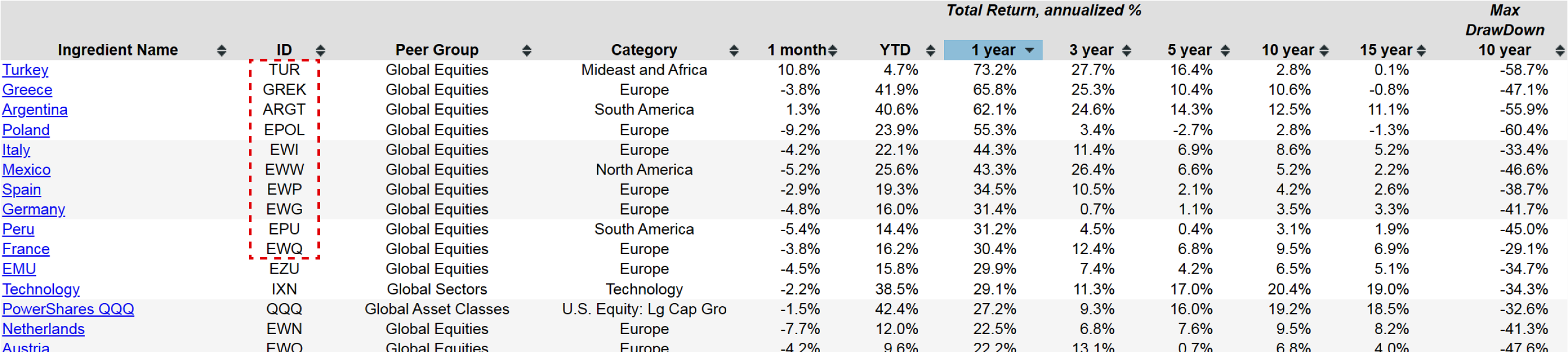
These are a selection of exchange-traded funds spanning three distinct peer groups or categories: global asset classes, global equities, and global sectors. This represents just a sample of the various exchange-traded funds available across different countries, asset classes, and sectors. We can examine each of these three categories individually. For instance, if we want to assess the latest one-year return, we can rank them from best to worst. Upon doing so, it becomes clear that over the past year, specific country funds have performed the best, although they are volatile and not without risk. They have delivered the strongest performance in the last 12 months. We can explore global asset classes, such as the PowerShares QQQ (QQQ), which focuses on technology within the global asset class category.
Top Portfolio Ingredients in 3 Broad categories
In terms of global sectors, the top performer over the past year has been the Technology exchange-traded fund with the ticker IXN, boasting an impressive 29% return. Let’s explore this Technology (IXN) ETF to see more of its details where it is represented as the orange dot on a scatterplot.
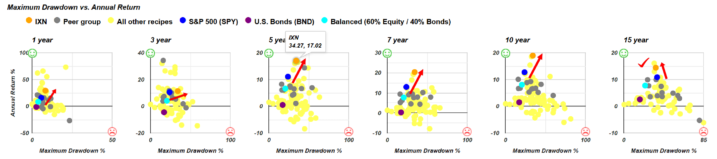
We use three benchmarks for comparison: a broad U.S. Bond (BND) fund, a Balanced (60% Equity / 40% Bonds) fund, and the S&P 500 (SPY) represented as the blue dot. In this case, the exchange-traded fund, represented by the orange dot, appears above and to the left of the blue dot. However, on the 15-year scale, it's slightly to the left, showing lower drawdown with a higher return. This is a positive outcome, as compared to the S&P 500, it has delivered significantly higher annualized returns with slightly less risk, measured by maximum drawdown. For all these other time periods, ranging from one year to 10 years, it consistently appears above and to the right of the S&P 500. This signifies a higher return, notably nearly 20% annualized over the last ten years. However, it comes with increased risk, as reflected in the higher maximum drawdown.
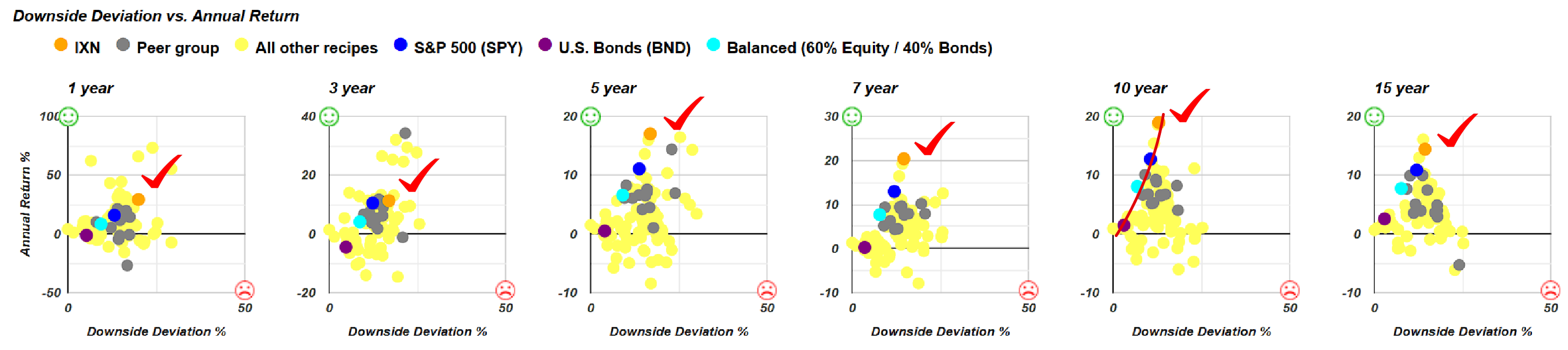
We can also assess the risk versus return using other scatterplots, with downside deviation being a useful metric. Once again, we observe the same trend: in each of these scatterplots, the IXN Technology Global Sector ETF consistently outperforms the S&P 500, positioned above and to the right. This ETF has consistently delivered solid performance. However, it's crucial to remember it aligns closely with this risk-return frontier we observe. The goal is to optimize and seek funds or portfolios positioned closer to the top northwest corner, where everyone would prefer to be. Yet, when using these portfolio ingredients, our options are rather limited, and there are few choices available beyond what lies above the frontier line.
Let's examine some portfolio recipes. These portfolios comprise various combinations of exchange-traded funds or mutual funds, crafted using different algorithms or methodologies. As a result, they offer a broader spectrum of risk-return profiles. We continue to use the same benchmarks for evaluation. Let's consider the relationship between maximum drawdown and annual return.
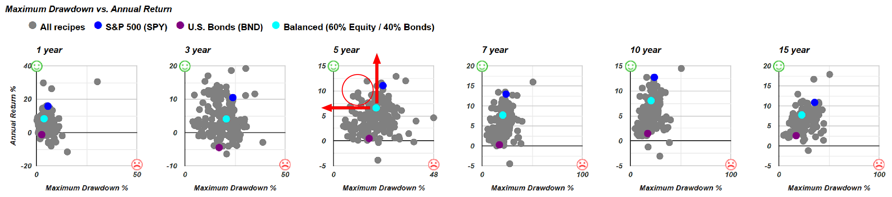
Over the past five years, for instance, if we draw a line in these scatterplots, you can see several portfolio recipes, represented by gray dots, that outperform any of the benchmarks. A balanced portfolio serves as a useful benchmark in this context. Ideally, we aim for portfolios with higher returns, shown by dots above the teal dot, and lower risk, meaning less drawdown in the opposite direction. All the gray dots in the quadrant signify higher returns and lower risk compared to the teal dot, which represents the 60/40 balanced portfolio.
Viewing the list of all the recipes, spanning until the end of August 2023. The column headings allow us to sort and examine performance over various time periods. For instance, there's a tactical recipe denoted by the T-dot prefix, signifying our Quartile Sector Rotation (t.srqr) tactical portfolio.
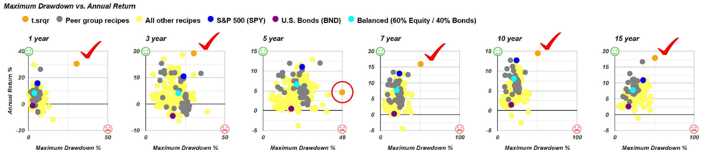
This recipe is highly concentrated, and we can dive deeper for details by going to its page. In the upcoming month, it's primarily invested in a single mutual fund, which accounts for its impressive returns. It stands out on the scatterplot, although not as much over a five-year period. Over five years, it has yielded about a 5% return but experienced a significant drawdown, showing higher risk. Similar to what we observed with the Technology (IXN) ETF, higher returns often come with increased risk, as measured by drawdown. If you prefer not to use maximum drawdown as a risk measure, you can consider downside deviation, and in both risk and return, this recipe stands as an outlier.
Berkshire Hathaway: steady, but SPY clone?
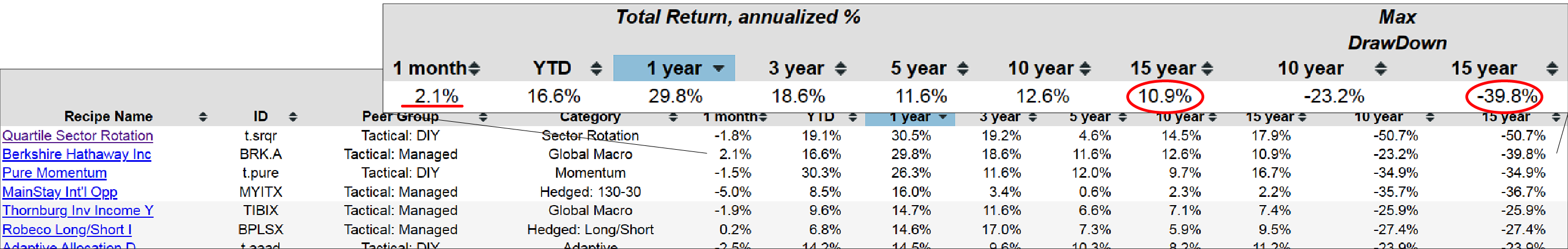
Let's return to the list and sort by one-year return. Berkshire Hathaway, with the ticker BRK.A, stands out as a consistent performer, shining not only over the past month but also over the past year. Impressively, it has delivered an almost 11% annualized return over the past 15 years, although with a 40% drawdown. This indicates a robust risk-return trade-off.
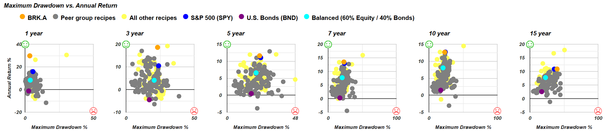
By going into the Berkshire Hathaway page, you'll notice the orange dot (BRK.A). Essentially, it offers superior returns compared to the S&P 500 with similar risk, especially over the three-year period. However, when we focus on the 15-year timeframe, the allure diminishes slightly, as it provides nearly the same return as the S&P 500 but with a slightly higher drawdown. What's intriguing here is the comparison of risk versus return between Berkshire Hathaway and the S&P 500. Over the past year, it's highly favorable, offering significantly greater returns at approximately 30% with just a 7.4% drawdown. There's no doubt about its impressive performance, which is remarkably close to the green smiley face indicator. However, when we extend the timeframe to ten years, fifteen years, or anything beyond five years, you'll notice how closely the orange dot (BRK.A) aligns with the blue dot (SPY), indicating that it closely tracks the S&P 500.
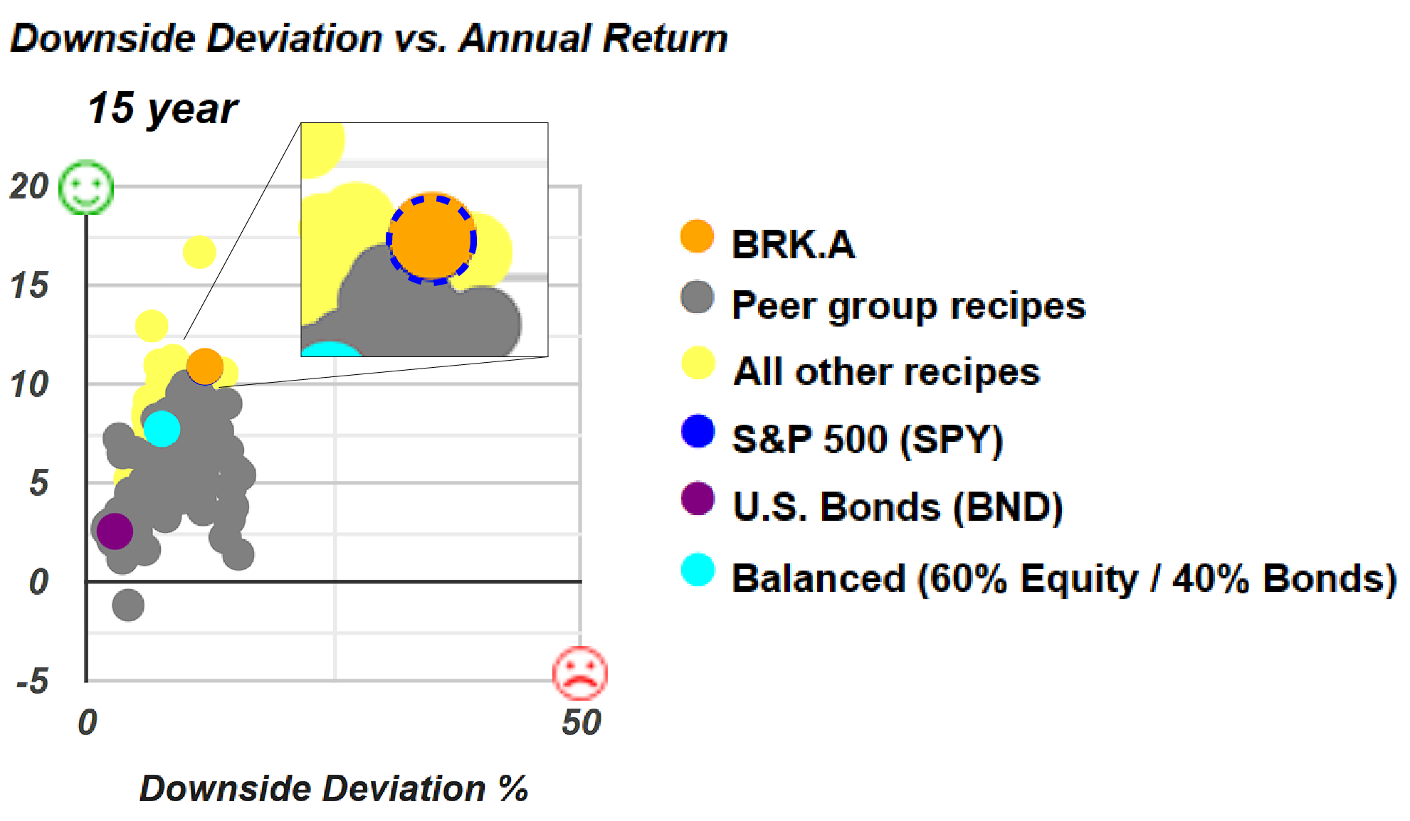
Interestingly, as we go to the 15-year view, the risk-return performance of Berkshire Hathaway is so similar to the S&P 500 that the blue dot is barely distinguishable beneath it. Over the past 15 years, the risk-return profile of Berkshire Hathaway closely mirrors that of the S&P 500 to the point where the difference is hardly discernible on the 15-year scatter plot for risk versus return. There's a slight distinction, with Berkshire Hathaway appearing slightly lower, showing a slightly lower return, and slightly to the right, suggesting slightly higher risk measured by downside deviation. While its performance has been outstanding over the last few years, particularly in the one-year and three-year periods, as we extend the timeframe to 10 to 15 years, Berkshire Hathaway increasingly resembles the S&P 500 or the SPY exchange-traded fund.
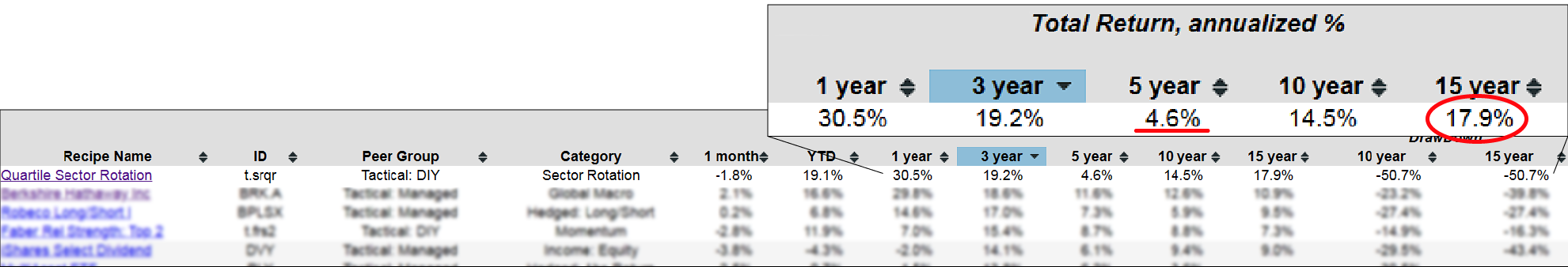
So we can also go back to our portfolio recipe summary and we can sort by other time periods if we want to. If we want to look at three years, which has been a challenging period for a lot of these recipes, we can then scan down and see the top tactical portfolio that has the T-dot prefix, that's Quartile Sector Rotation. Again, highly concentrated has significant risk with it. It's been down over 50% at one point over the last 15 years, but it's certainly done quite well over the last three years. You can see it's struggled a bit over the last five years if we look at that 60 month time period, but over the last 15 years, almost 18% annualized.
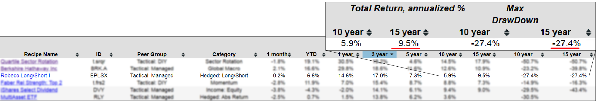
Quite interestingly, we have the Robeco Long/Short Institutional fund (BPLSX) in the portfolio recipe summary. It's worth noting that this isn't readily accessible to retail investors, which can be a bit frustrating. Nevertheless, it's an appealing mutual fund that has delivered an annualized return of 9.5%over the last 15 years, coupled with a reasonable drawdown. While it may not be accessible to the average investor, including it here for comparison purposes can inspire thoughts about other alternatives or similar funds that might replicate its performance. Having it as a point of comparison, even if it's not universally available, can be quite helpful.
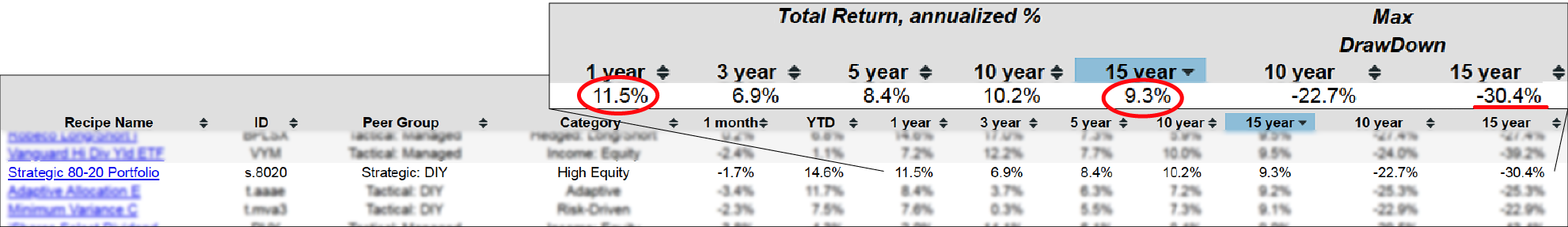
We can find several other exchange-traded funds that are diverse, showcasing their performance. Sorting the columns and comparing them provides valuable insights. Over the past 15 years, the tactical recipes have shown strong performance. However, if you prefer a 'set it and forget it' approach and aren't interested in tactical strategies, the top-performing static portfolio, denoted by the 'S-dot' prefix, is the Strategic 80-20 Portfolio (s.8020). This portfolio consists of 80% equities and 20% of a broad bond fund, delivering a 9.3% annualized return over the past 15 years, albeit with a 30% drawdown. Even over the past year or year-to-date, it has performed impressively at 11.5%. We aim to cater to various preferences, offering prepackaged managed tactical mutual funds, tactical portfolios that require monthly rebalancing for intriguing risk-return trade-offs, and static portfolios for those who prefer a 'set it and forget it' approach. There are different options there for everyone.
To wrap up, let's examine the maximum drawdown scatterplot for the three-year period. I found this particularly interesting because it showcases a significant amount of variation, serving as a powerful reminder of the value of this scatter plot when assessing risk versus return.
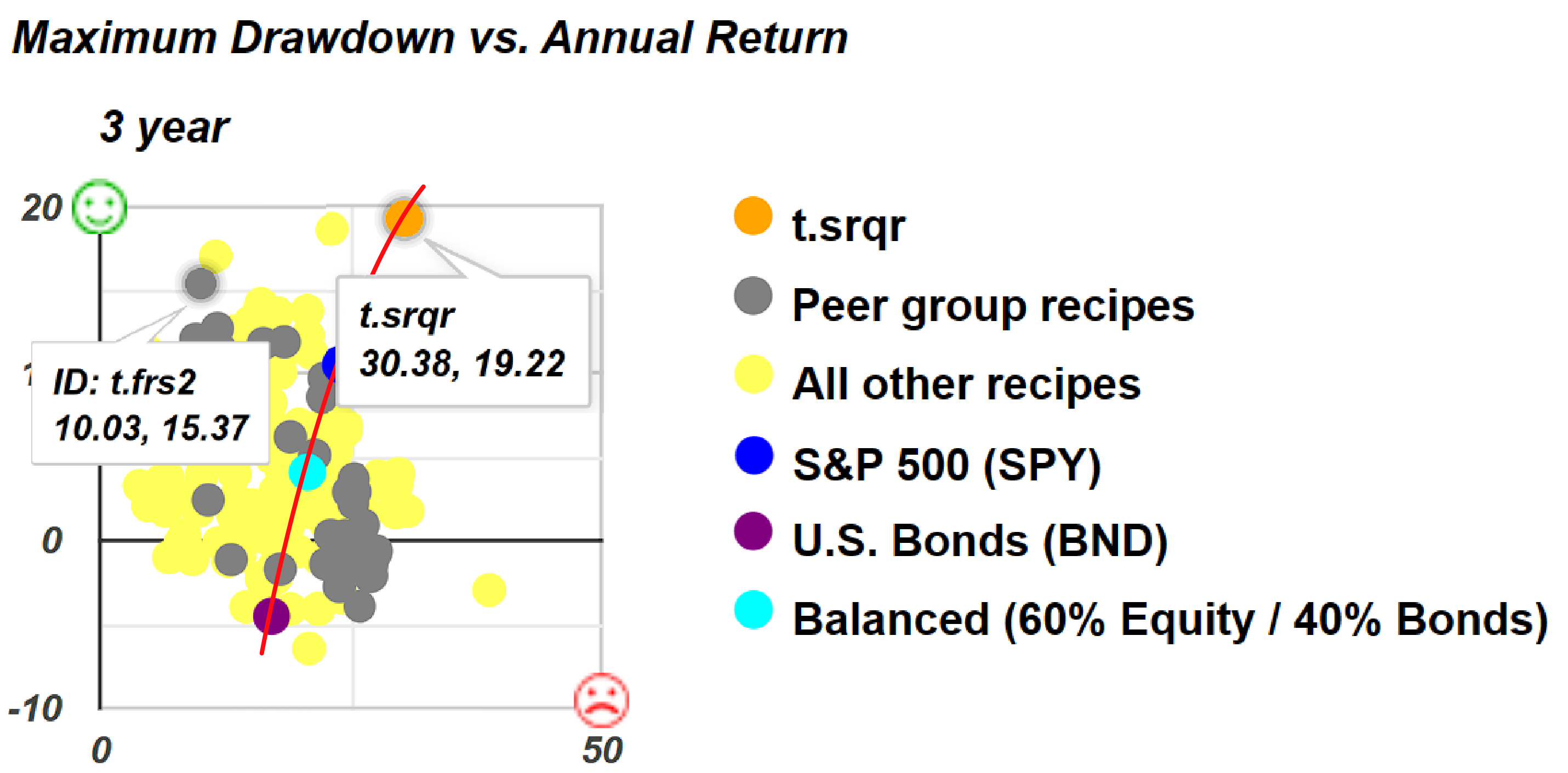
In the scatterplot above, we have a line we've seen before, representing a risk-return trade-off intersecting with our three benchmarks. However, over the past three years, we can observe several options that have provided superior returns and better risk profiles than any of our benchmarks. When you mouse over these options, you'll notice that the first number represents the maximum drawdown, while the second number in the pair shows the return. For example, Faber Rel Strength: Top 2 (t.frs2) has delivered a 15% annualized return over the last three years with a 10% drawdown. The Quartile Sector Rotation portfolio recipe exhibits a 19% drawdown with a 30% return. This scatterplot appears more scattered than others, highlighting the diverse range of risk-return trade-offs available through different portfolio types.