Article-2023-08
August 2023 Recipe Investing - Commentary
Topics this month
- The top performers over the last month
- Max Drawdown as a risk indicator
- Looking at the 15-year performance ranking
- How Vanguard describes risk (using VEIPX as an example)
- Using M-Squared as a measure of risk vs. return
Welcome to the August 2023 commentary from recipeinvesting.com. We track investible portfolio recipes that allow investors and advisors to build portfolios that minimize risk and maximize return. We reallocate and rebalance monthly, so we have plenty of new material to cover for our comparisons this month.
The top performers over the last month
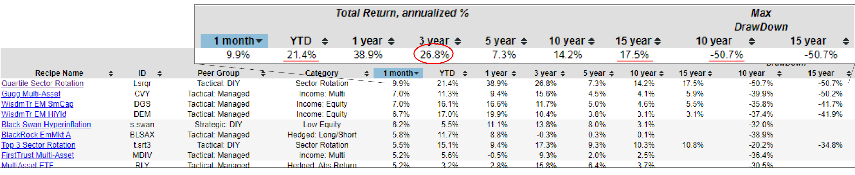
Here are the portfolio recipes that we track, and let’s rank them by a month. And we can see that Quartile Sector Rotation (t.srqr) has generally continued to be a superior performer with 21.4% year to date (YTD). Over the past 3 years, it returned 26.8% annualized, and over the past 15 years is 17.5% annualized. Phenomenal numbers, but then we also have to remember that drawdown at some point over the past 10 years, has dropped by more than half based on the month end numbers that we track. Investors need to carefully consider these risk numbers. It's important to emphasize that it's not just about returns; risk is a significant factor too. Some of the drawdown numbers can be quite severe.
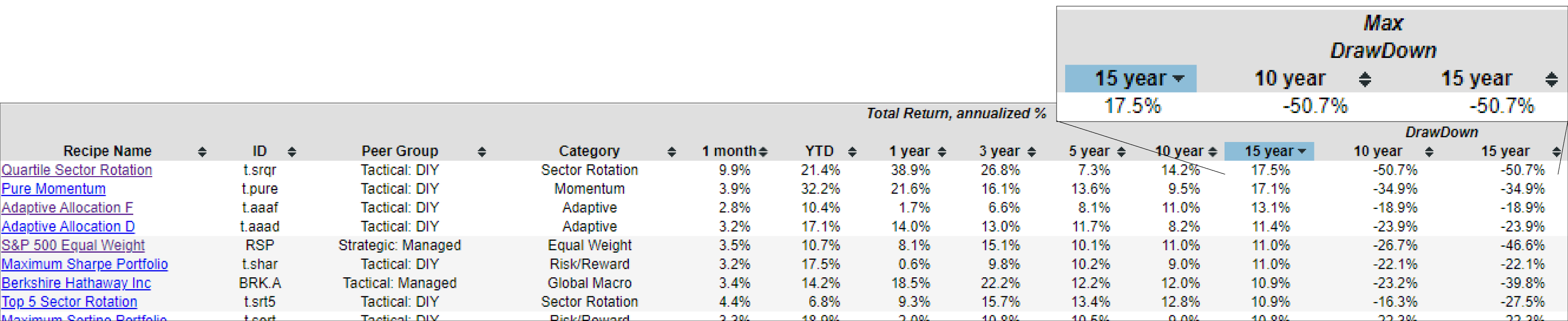
Sorting the table by the 15-year timeframe reveals that Quartile Sector Rotation is also positioned at the top, just like we observed. However, it comes with a notable downside: a relatively high maximum drawdown over the course of the past 15 years. This drawdown represents the largest decline from peak to trough in the month-end closing adjusted price during that time period.
How Vanguard describes risk (using VEIPX as an example)
One other thing to consider would be that investors typically don't find this maximum drawdown number or some of these longer term risk measures without digging a little more deeply.
We've got this Vanguard Equity Mutual Fund (VEIPX) and let's see what Vanguard Equity Mutual Fund would have to say about this fund. Let’s go over to the Vanguard Mutual Funds site. Typically, the mutual funds that we track are more or less blended or are meant to provide sort of a holistic portfolio rather than just exposure to a single asset class. But because this is equity income, we have it in our list of portfolios that we track for comparison purposes. So let's check on this Vanguard Equity Mutual Fund or VEIPX, investor shares and see what Vanguard has to say about it.
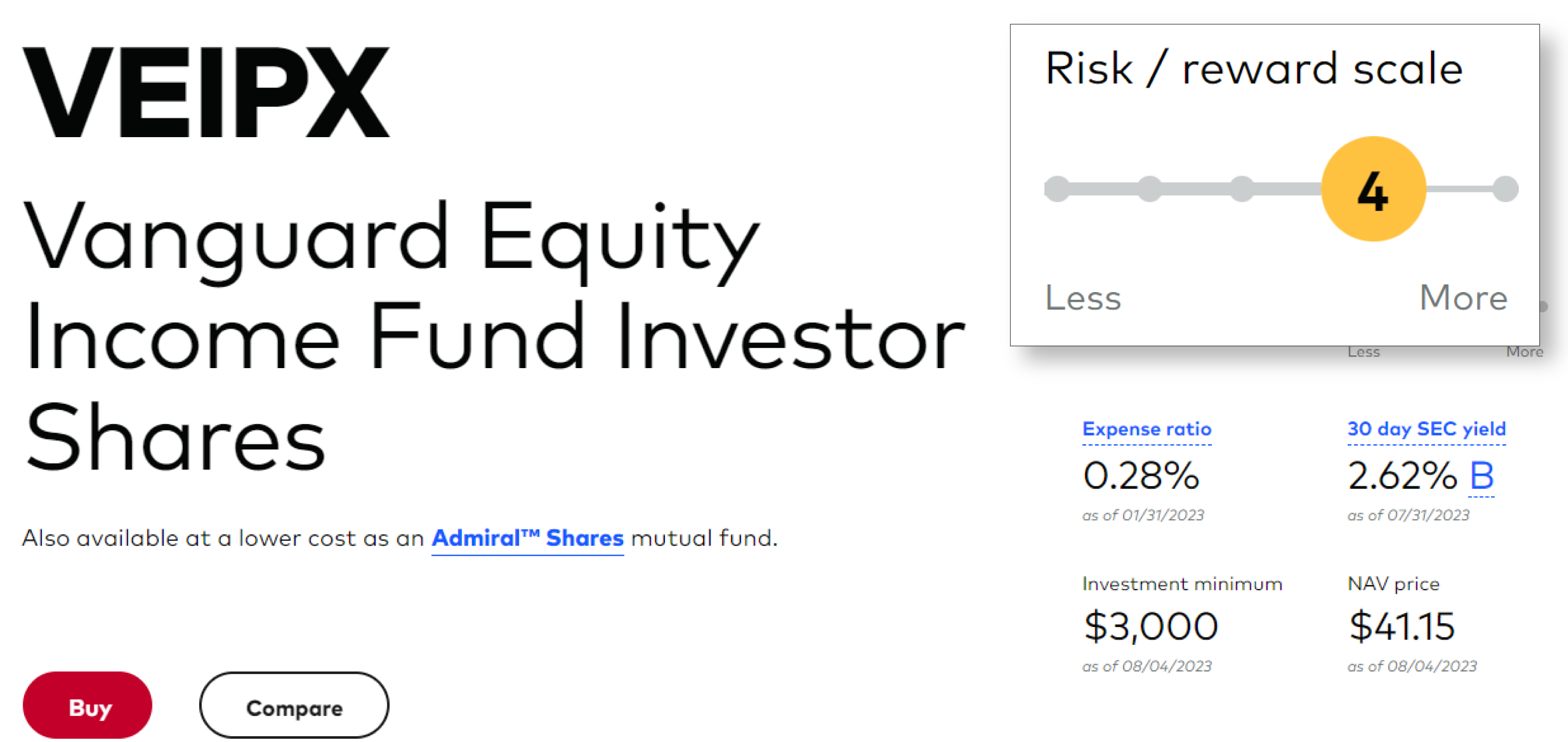
We have a comprehensive overview that includes year-to-date and historical performance, as well as fees. Now, let's delve into its level of risk. Vanguard highlights that the Vanguard Equity Mutual Fund is ranked 4 out of 5, leaning more toward the "more" risk side than the "less" risk side. Vanguard explicitly mentions at the top right corner that the risk/reward scale is at 4 out of 5 for risk. This suggests that while it's not the highest risk, it's still relatively significant. The only attempt at quantifying risk is through this simple risk-reward scale, which can be seen as a somewhat basic measure.
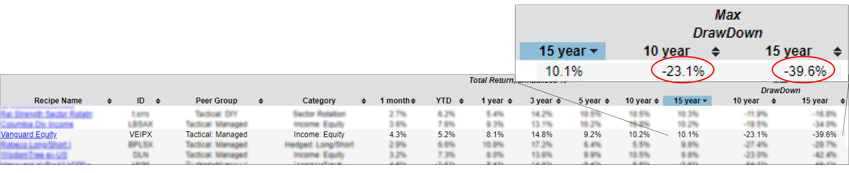
What we aimed to achieve at Recipe Investing is to offer a broader range of perspectives on the balance between risk and return for various funds. If we return to our overview page and focus on the Vanguard Equity, we can observe its performance over different timeframes, spanning from 1 month to 15 years. As we go deeper, over the past 10 years, there's been a 23% decline (which might not be too concerning). However, when considering the past 15 years, the decline has been steeper, at 39.6%. It's important to note that these figures are based on month-end data, and they could be slightly higher if some investors consider intra-month data (which we don't include). This implies that the fund's value has dropped by around 40% at some point over the past 15 years. This level of decline doesn't indicate a low-risk investment. To Vanguard's credit, they designate it with a 4 out of 5 risk rating, but there isn't specific quantification tied to it.
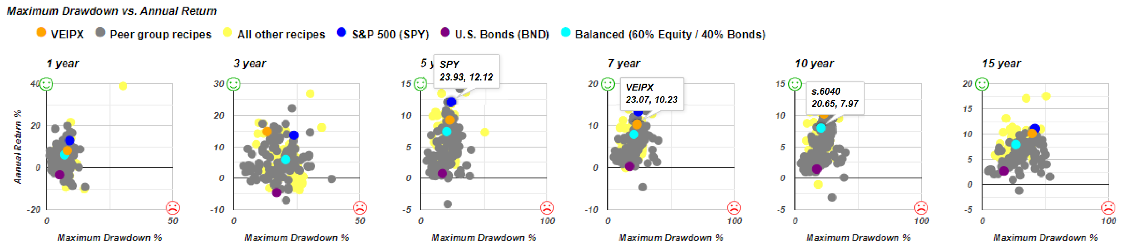
Then if we go further into the Vanguard Equity scatterplot risk versus return, we can see the orange dots placed right between the performance of the S&P 500 (SPY) ETF and a Balanced (60% Equity / 40% Bonds) Fund (s.6040) is indicated by the teal dot. So really it's somewhere in between the spy and the balance fund kind of consistently that's based on maximum drawdown.
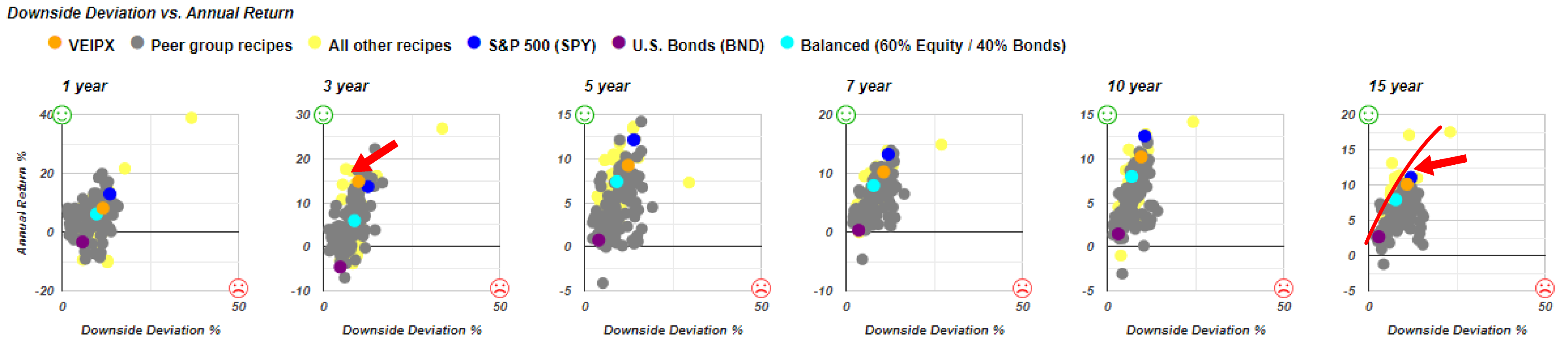
When we consider an alternative measure, such as comparing downside deviation to annual return, interesting insights emerge. Looking at the last 3 years, the fund has managed to achieve a greater return while assuming less risk compared to the S&P 500. This is certainly favorable. However, when we examine the data over the span of 15 years, the fund's performance aligns more closely with a spectrum that ranges from investments with lower risk and lower returns to those with higher risk and higher returns—similar to the S&P 500, symbolized by the blue dot.
On a risk return basis, it's not fundamentally different from a broader market fund. And it does have some substantial risk. And this is the number we were seeing earlier with the maximum drawdown. It is very important to look at risk versus return, not just return. And at Recipe Investing, we try to provide just about as many ways as we can think of to do that.
Using M-Squared as a measure of risk vs. return
Let's look at one risk versus return measure that we haven't looked at in a little while, and that is M-Squared or the Modigliani risk-adjusted performance metric, also called “M2”. But the nice thing about the M-Squared is that instead of a ratio, which by definition is unitless, the Sharpe Ratio and the Sortino Ratio don't have units. It's a number like 1.0, 1.2, 2.0…. When you're ranking things by the Sharpe Ratio and the Sortino Ratio, it definitely gives investors the best risk versus return all the way down to the worst risk versus return. But sometimes it's a little hard to get our minds around exactly what a Sharpe Ratio of 1.5 means.
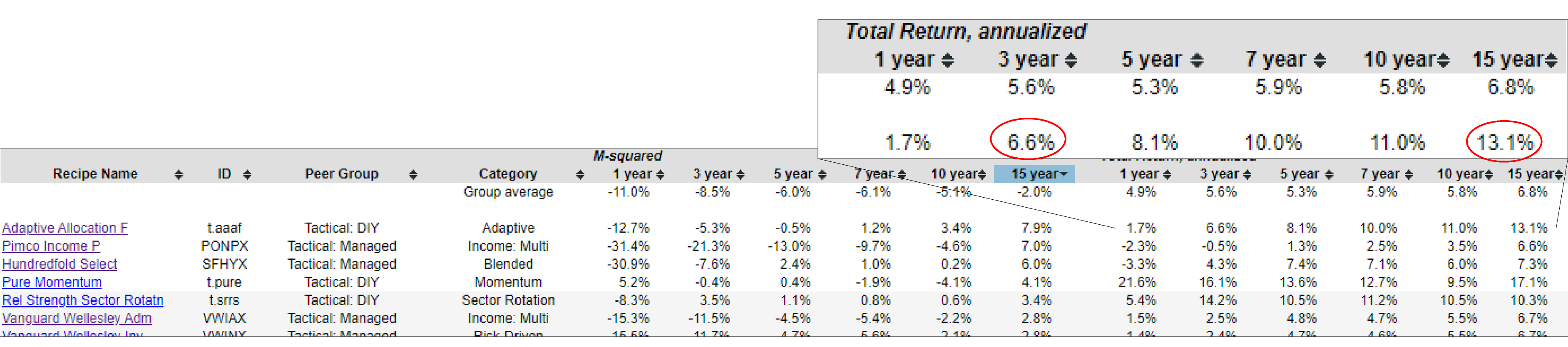
Whereas with this M-Squared or M2 ratio, by sorting the table by 15 years, we can see for example, Adaptive Allocation F (t.aaaf) portfolio has had an actual return annualized of 13.1% over the past 15 years, which is quite strong even over the past 3 years, it had a 6.6% annualized return. But then what the M-Squared ratio does, it basically takes the Sharpe Ratio, but then adjusts it to put it back in terms of a percentage that then we can compare. If investors want to rank these portfolios based on the Sharpe Ratio, and rank them based on the Modigliani risk-adjusted performance metric or the M-Squared percentage, they would rank in the same order. It's just that the M-Squared is a little bit easier to digest because it's in percentage, which we've come to understand, is a good method for gauging return.
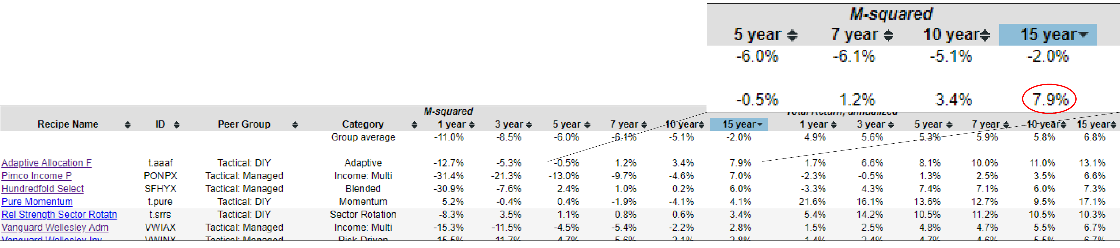
So this Modigliani risk-adjusted performance metric, still gives the Adaptive Allocation F portfolio top marks, but it does kind of bring it down to size at a 7.9% risk adjusted return instead of the 13.1%. In reality, investors are getting a 13.1% return, but for comparison purposes, given that it is a higher risk portfolio, they're kind of downgrading it to 7.9%.
This is just a good technique. If investors wanted to see sort of what's been going on over the last year, some of these funds and portfolios that we try can be ranked by this M-Squared percentage across any of these time periods. That’s another tool that we have available for comparing the many different portfolios, both tactical and static and what we call tactical manage, which would be an exchange rated fund or a mutual fund that's being managed by a professional manager.