Article-2023-07
July 2023 Recipe Investing - Commentary
Topics this month
- The July 2023 Monthly winners
- Using the Five-Year Graph to Analyze t.srqr
- RIP for a Vanguard Mutual Fund (VPGDX)
- Who's Crushing It over the past 1 year and over the past 15 years
- When a Brand Name might not be the best choice
Welcome to the July 2023 commentary from recipeinvesting.com. We track investible portfolio recipes that allow investors and advisors to build portfolios that minimize risk and maximize return. We reallocate and rebalance monthly, so we have plenty of new material to cover for our comparisons this month.
The July 2023 Monthly winners
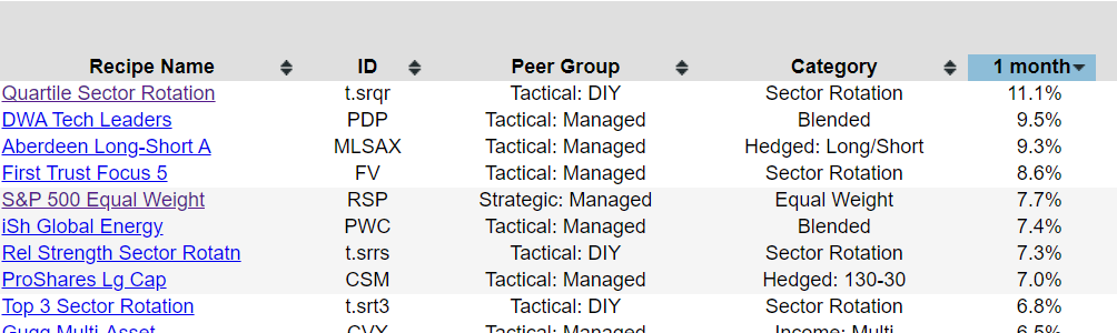
Let’s head right into the portfolio recipes and we have the scatter plots and the list of return and risk for all of the recipes that we track. By sorting it by one month, we'll see the July 2023 winners. The Quartile Sector Rotation (t.srqr), a tactical asset allocation portfolio, has really done phenomenally this past month with 11.1% return just for this single month. Now, remember that this comes with a significant drawdown over the past 10 years, 15 years, and maybe even more recently. So it's not without risk that you get with this tremendous monthly return.
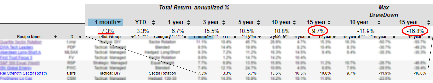
Also looking down the list, we can see that there are several different types of funds. We have an exchange-traded fund, a long-short mutual fund, and a tactical asset allocation fund with the "t." prefix, which we use to call our tactical recipes. Keep in mind these might have solid one month returns, but then you really need to look back and see how that's done over time and how consistent they've been. In this case, the Relative Strength Sector Rotation (t.srrs) portfolio recipe, almost 10% return annualized over the last 15 years with a maximum drawdown over that same period of just about 17%. So, pretty interesting risk and return trade-off there.
Using the Five-Year Graph to Analyze t.srqr
We can also do a little more analysis if we want to jump into the Quartile Sector Rotation (t.srqr) recipe. Let's explore some powerful tools that can help us analyze risk and return in one comprehensive view. One such tool is the scatterplot, which provides valuable insights. It allows us to examine various risk measures such as maximum drawdown, downside deviation, and standard deviation. However, if we want to delve deeper into the data, we can turn to the 5-year trend chart. This chart offers a longer-term perspective on trends and patterns. Let's dive in and see how these tools can enhance our understanding of the financial landscape.
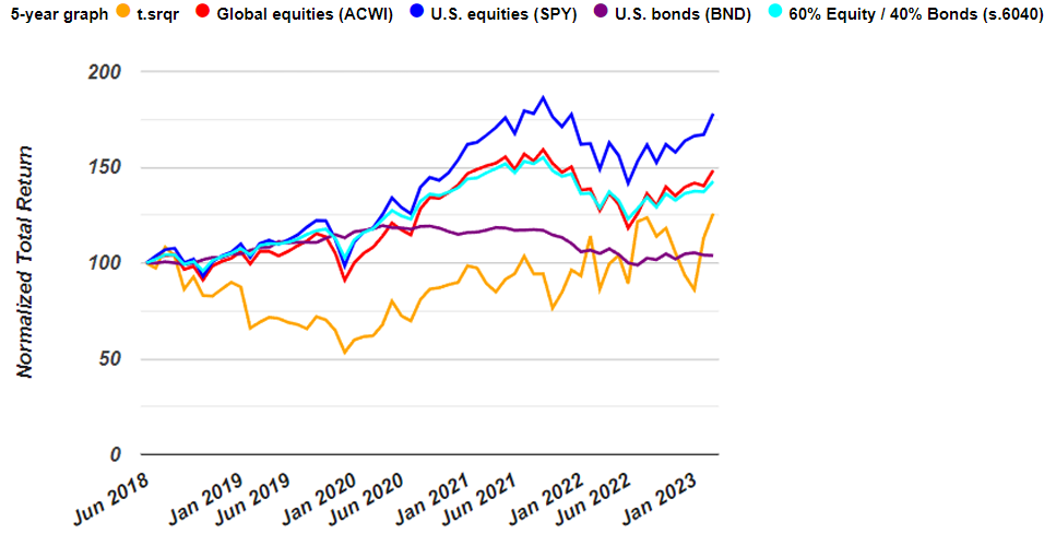
Let's take a closer look at a fascinating 5-year chart that offers valuable insights into various assets. This chart presents a relative perspective, starting from an indexed value of 100 five years ago. One standout performer is the S&P 500 (SPY), which has shown consistent growth, reaching a remarkable 177.9. This translates to an impressive 77.9% increase over the past five years. On the other hand, the orange line represents the Quartile Sector Rotation (t.srqr) recipe we've been monitoring. While it had a phenomenal performance last month, it experienced a significant downturn recently. These trends provide valuable information for our investment strategy. Let's delve deeper into the implications and analyze their significance.
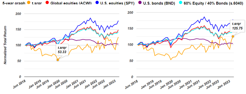
In the side-by-side 5-year chart, we can see that we have almost a 50% drawdown, 47% Drawdown over this period, over a year and a half looking back starting 5 years ago. And then finally as of month end it's up to 125.75. In other words, it's up 25.75% over the past 5 years. So 25.75 divided by 5 should be around 5%, a little less than 5% return due to compounding. And sure enough, under the 5-year column we see that it's 4.7% annualized over the past 5 years.
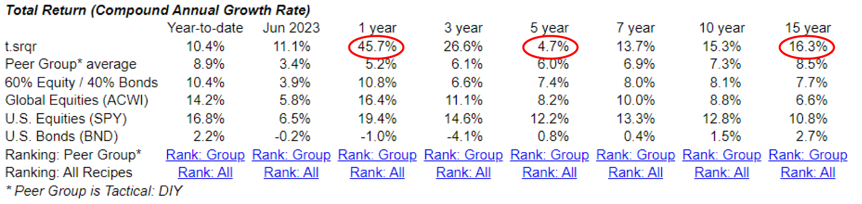
While the Quartile Sector Rotation recipe may not have performed exceptionally well over the past 5 years, it has managed to generate a compounded return of 16.3% over a 15-year period. In the last 1 year, it has delivered an impressive return of 45.7%. This indicates a significant rebound, although not without encountering some turbulence along the way. If you're interested in assessing the performance of a specific portfolio recipe, mutual fund, or ETF in comparison to benchmarks, the 5-year chart can be quite useful. It provides a relative view that allows for meaningful comparisons.
RIP for a Vanguard Mutual Fund (VPGDX)
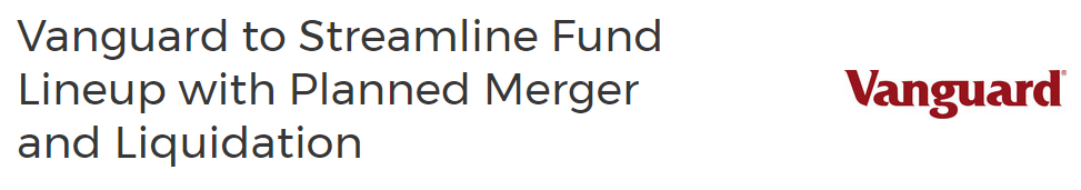
In the past month, we experienced a noteworthy event in the world of funds. One of the funds we've been keeping an eye on, the Vanguard Managed Allocation Fund, has merged with another fund. The name itself caught our attention, as it hinted at a blended fund that combines equities and fixed income or bonds. The goal is to strike a balance and achieve a favorable risk-adjusted return. While it has performed reasonably well, it appears that the Vanguard Managed Allocation Fund had striking similarities to the Vanguard LifeStrategy Moderate Growth Fund. Consequently, they've decided to liquidate one and consolidate it into the other. This development is quite interesting.
Speaking of the Vanguard LifeStrategy Moderate Growth Fund (VSMGX), it belongs to a small family of funds at Vanguard. This family includes the moderate growth life strategy, growth life strategy, conservative growth, and life strategy income funds. It's great to see Vanguard offering options that cater to different risk appetites. Looking at the 10-year historical returns, we have 3%, 4.5%, 6%, and an impressive 7.5% annualized return for the Vanguard LifeStrategy Moderate Growth Fund. So, whether you prefer a mild, medium, or spicy approach, Vanguard has you covered with their LifeStrategy Moderate Growth Fund family. It's commendable that they aim to address various investor preferences with this lineup.
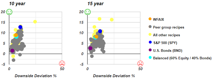
As it turns out, we do track one of these the Vanguard LifeStrategy Moderate Growth Fund in the list of Recipe Investing recipes. And that's the Vanguard LifeStrategy Growth (VASGX) fund , which is the most aggressive of those four that we just looked at. Let's zero in a little bit on these risk and return profiles, we can either do maximum drawdown or for fun, we’ll go straight to downside deviation, which is similar to standard deviation, but it's not penalizing the portfolio for the upside deviation, which we like.
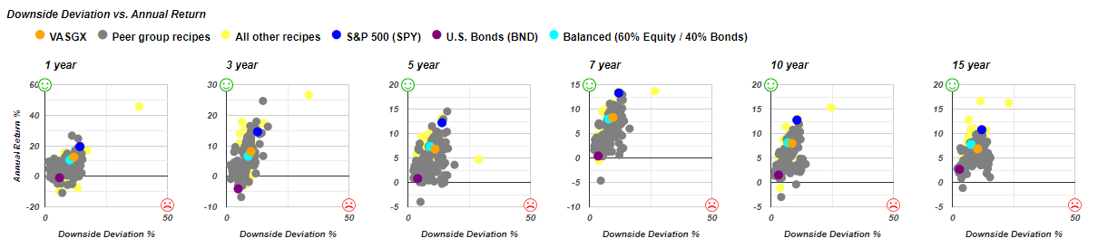
We observe an intriguing comparison between the Vanguard LifeStrategy Growth fund represented by the orange dot and the teal dot, which signifies a Balanced 60-40 recipe comprising two ETFs. This particular balanced recipe is a straightforward approach we closely monitor in Recipe Investing. The orange dot appears higher and to the right on the chart, indicating that it assumes slightly more risk while generating a relatively higher return. This trade-off between risk and return is a noteworthy aspect to consider.
And as we look closer, the orange dot is a little closer to the blue dot, which is the S&P 500 represented by the ticker SPY. It's a little more SPY-like than it is truly Balanced 60-40, but at least you're getting a bit extra return on the vertical axis for the additional downside deviation as a proxy for risk on the horizontal axis.
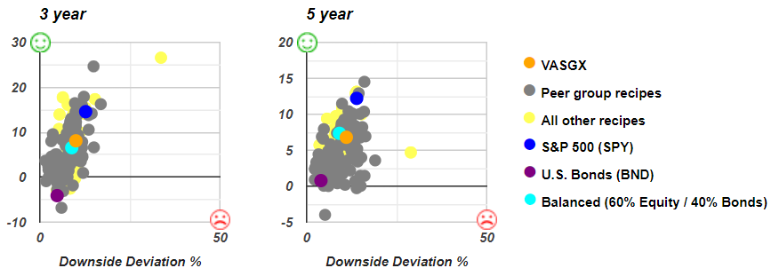
And again, 3 years, a little higher risk, a little higher return over 5 years, actually not a good trade off. You're getting a lower return and a higher risk. You can see that the orange dot is below and to the right of the teal dot, which means it's worse on both counts.
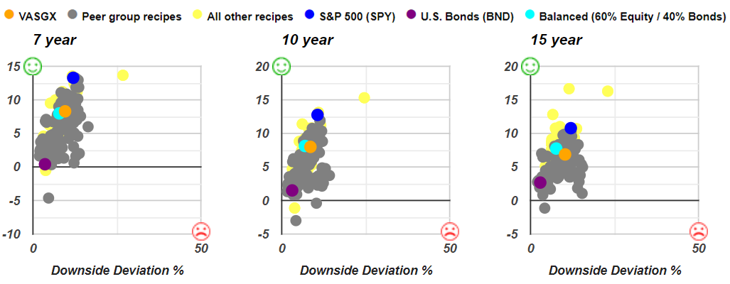
We can then look at 7 years slightly above and to the right of the 10-year, it looks like it's slightly below and to the right. And then over 15 years, somewhat interestingly, it's a bit higher risk and a bit lower return than a very simple 60-40 blended portfolio.
The Vanguard LifeStrategy Growth fund, even at its most aggressive within the LifeStrategy family (though not particularly aggressive overall), falls short when compared to the 60-40 simple balanced funds. This serves as a reminder that well-known brand names often offer a variety of portfolios in ETFs and mutual funds. However, it's crucial to understand that just because a product carries a reputable brand name and adheres to an index, it doesn't necessarily imply that their methodology or investing approach is suitable for everyone. It's essential to carefully evaluate and consider various factors before deciding to participate in any particular investment method or index.
Let's head into a couple more topics before we wrap up. Let's look at the full list of recipes that we track. And again, these are tactical recipes, some exchange traded funds, mutual funds, and then we also have the "s.", which are the strategic allocations that don't change each month, but we do rebalance them each month. So even though this ETF aggressively is using a collection of ETFs in a fixed Allocation, we will refresh every month and, and rebalance it back to that original allocation.
Who's Crushing It over the past 1 year and over the past 15 years
But just as an exercise, if we look at lets say the returns over the past year, and say “Who's really been crushing it over the past year?” And we can see that it ranges from almost 46%, and then by the time we get down to 10% return over the past year, but let's just say or ask the question, “What's returned more than 10% over the past one year and annualized has returned more than 10% over the past 15 years?”
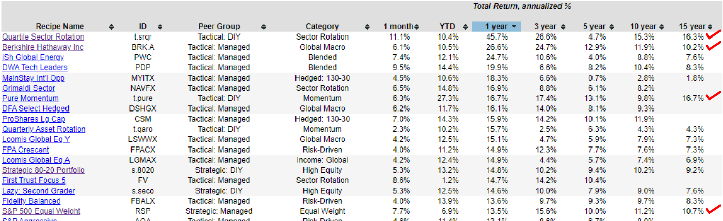
We can do a quick scan of that. There's 4 that have done more than 10% over the past 1 year and annualized over the past 15 years. We have the Quartile Sector Rotation (t.srqr), which we've discussed. It's doing great, but not without some significant risk.
Then we have Berkshire Hathaway Inc (BRK.A). Interesting, we got to give Warren Warren Buffett some credit there. Over 10% annualized over the past 15 years with a 40% drawdown over that same period.
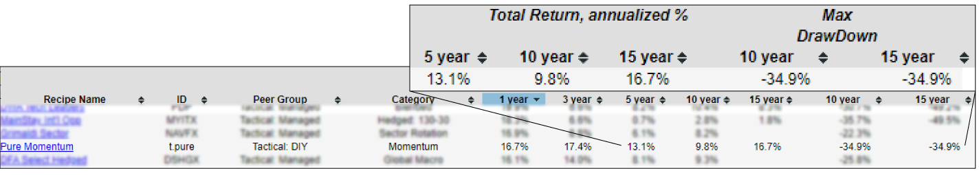
This Pure Momentum (t.pure) tactical portfolio recipe that has done 16.7%. Actually, that's even better than Quartile Sector Rotation, but it has had a 34.9% max drawdown. You'd have to drill into that a little bit more to see if there's any weakness or downside or something that we're overlooking. But interestingly, it's certainly done well over the past year, even over the past 5 years. It's done, 13.1% annualized. Pure Momentum strategy, pretty heavily concentrated as I recall.
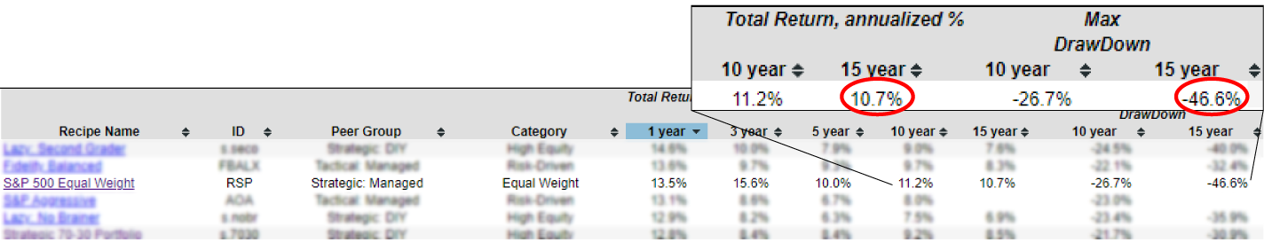
And then we also have a simple S&P 500 Equal Weight (RSP). That's an exchange-traded fund, but it weights equally all the ingredients in the S&P 500, and that's done 46.6%, I think, a little better than the regularly weighted S&P 500. In other words, a little bit lower drawdown and a better than 10% annualized return over the past 15 years.
It's fascinating to consider how we might uncover hidden gems within this list. Building upon our previous discussion, let's now shift our focus to the 15-year performance rankings. By examining the table below, we can observe the full range of recipes and their corresponding performance over this 15-year timeframe. This column provides valuable insights into the long-term performance of each recipe.
When a Brand Name might not be the best choice

The Vanguard LifeStrategy (VASIX) has its 3.6% return annualized over the past 15 years. And a very moderate and reasonable drawdown of less than 17% over that same period. But really there's so many ways to do better than this. Because there's dozens of portfolios that have a greater return than that. And many of them will have less drawdown. There's a wide range of these portfolios that we need to be looking at. And just because it's got the Vanguard brand name on it doesn't mean necessarily that it's a keeper.
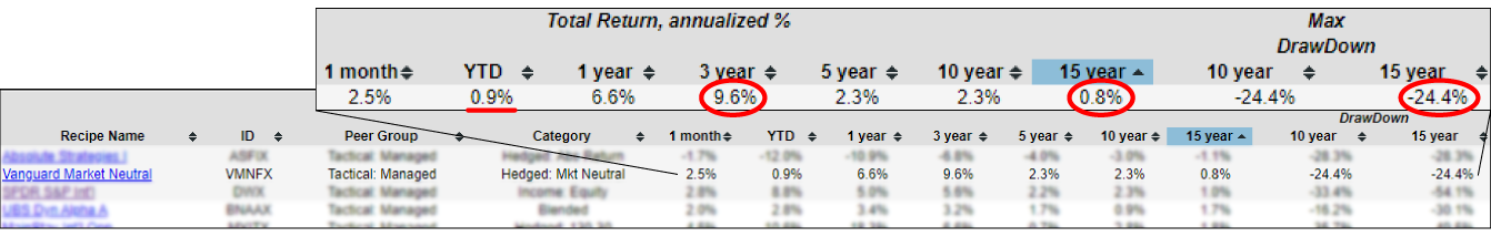
There's also this Vanguard Market Neutral (VMNFX) which is a hedge strategy, and they've done 0.8%, so less than 1% annualized over the past 15 years, and they still have drawn down nearly 25% over that period. So really just a clunker, again, it's done better over certain periods, but over a long term, even over the past year, less than a percent up, not great.
I continue to find it interesting that despite some of these blue chip names of some of the most prestigious firms, they're using a particular absolute return strategy or a market neutral strategy, their hands may be tied and they may follow that strategy. They get what they get, but it's not necessarily anything to be too excited about. We can look back at a number of these brand names.
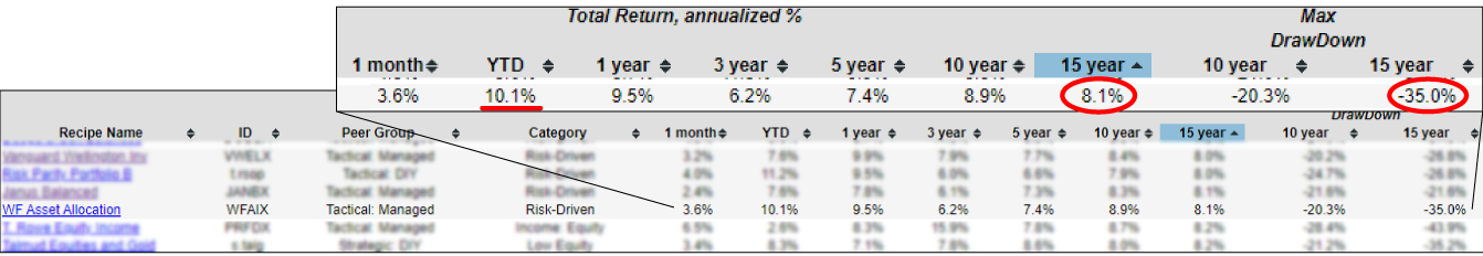
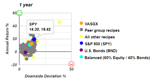
And the last one I wanted to look at is Wells Fargo Asset Allocation (WFAIX).A very interesting 8.1% over the last 15 years annualized with just 35% maximum drawdown over that same period. Sounds great. So if Wells Fargo were trying to sell this to me, I could potentially get excited. It's done pretty well over the last 1 month and over the last year.
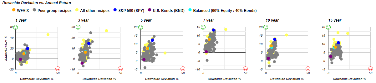
Then we can begin to evaluate that. But importantly, we can't do that in isolation. If we check Wells Fargo Asset Allocation (WFAIX) fund and we can look at its downside deviation we can get very specific about its performance profile versus risk. And as it turns out, this orange dot is nearly on top of the teal dot. So the teal dot is this Balanced 60-40, simple allocation, and over 1 year it's less risk and less return. There's not really any about the same three years. Looks like it's slightly better in terms of risk and return over 5 years. We'll give him a win on that one.
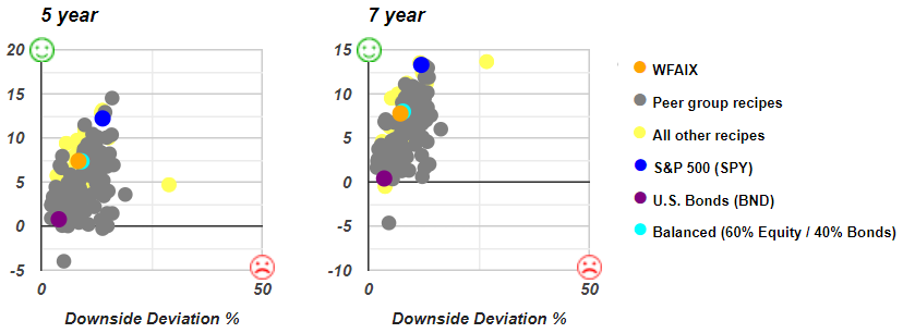
By looking closer in this scatter plot, it's below and to the left of the teal dot. It has lower risk and lower return, but about the same. It does win on the 10-year and then on the 15-year it's a bit higher risk and higher return. But then, so are a lot of things kind of in the 15-year zone.
What's intriguing is that this investment option seems to be holding its ground compared to the balanced recipe benchmark. While we could say it's performing decently or even performing well, it doesn't stand out as something particularly extraordinary. This is especially noteworthy when we consider that it achieves similar results to the balanced portfolio recipe that we use as a benchmark for comparison. It's essential to analyze these findings and delve deeper into the factors driving their performance.