Article-2023-04
April 2023 Recipe Investing - Commentary
Topics this month
- Top Portfolio Ingredients for Mar 2023: technology-related
- Top Portfolio Recipes are mostly tactical
- Better than BND? The Defensive Bond Portfolio Recipe, t.dbnd
- Market neutral funds struggle (and some don't survive)
- An interesting Long/Short fund with an Investor share class
Welcome to the April 2023 commentary from recipeinvesting.com. We track investible portfolio recipes that allow investors and advisors to build portfolios that minimize risk and maximize return. We reallocate and rebalance monthly, so we have plenty of new material to cover for our comparisons this month.
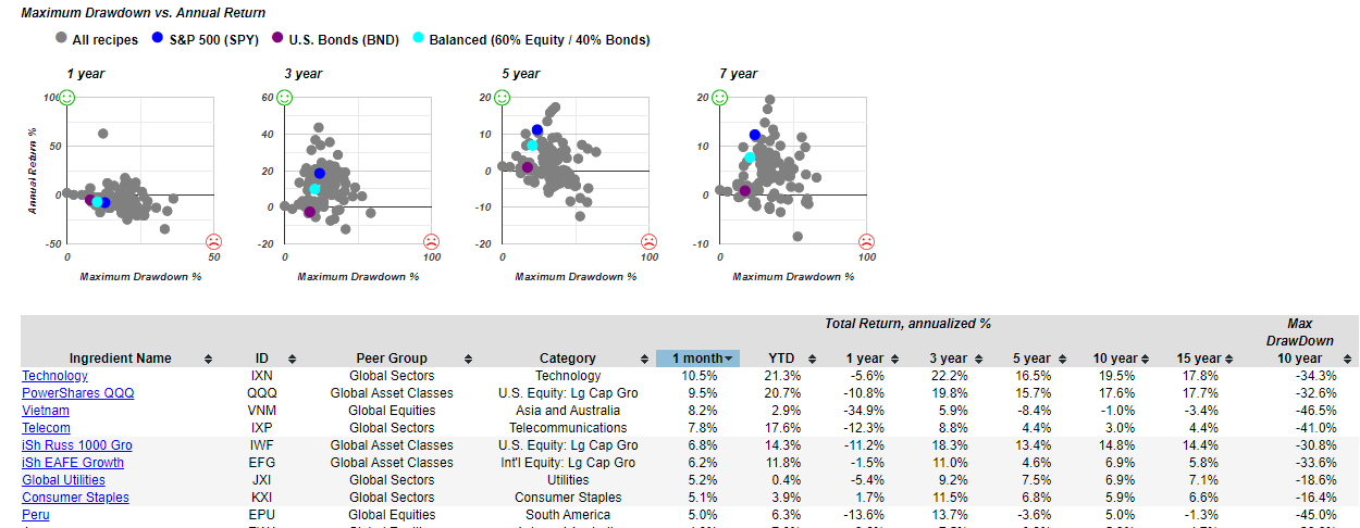
Let’s take a look at the content that we've updated for this month of April. And we have both portfolio recipes, which are the model portfolios, and we also have ingredients, which is a selected list of mutual funds and exchange traded funds, many of which are used as ingredients in the different portfolios that we track. So let’s see the image below and we see some scatter plots, and we can see what's been happening over the past month.
Top Portfolio Ingredients for Mar 2023: technology-related
We've got technology power shares up dramatically. Keep in mind they do suffer from some drawdown, and we don't have the 15 year numbers here, but they've had significant drawdowns over the past 15 or more years. So it doesn't come without risk. And as a reference point, if we look down, we can see the S&P500 (SPY), which can be helpful for a benchmark. We can see it right here:
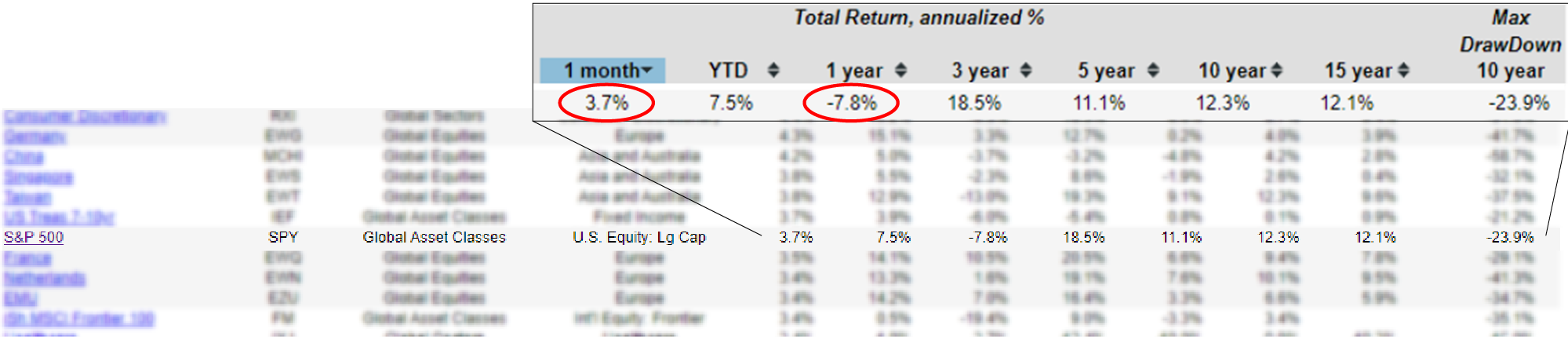
It's done 3.7% over the last one month, and it's done -7.8% over the last 12 months over the last year.
Let's get back to the portfolio recipes, the combinations of exchange traded funds, mostly some mutual funds that create these static and tactical recipes that we track the performance of each month.
Top Portfolio Recipes are mostly tactical
Here's the list for the time period ending March 31st, 2023 and we can see what's been happening over the past month. We can see that with the exception of this Permanent Plus (s.plus), all of these top 10 or 15 are all tactical asset allocation portfolios.
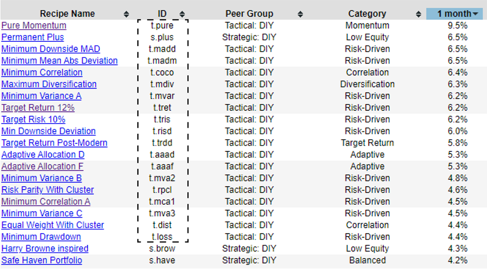
All of these have a T dot (t.) prefix, and then the S dot (s.) shows the static or strategic portfolios that are rebalanced every month, but the fundamental components of them don't change every month. We can see that a lot of these have done well over the past month, especially.
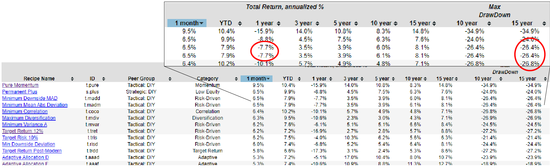
And if we just use the S&P500 as a rough benchmark of down 7.8%, we can see below that few of these for example, these -7.7% have done relatively well, slightly better than the S&P500 over the past year, but with considerably less drawdown because the S&P500 had about a 50% drawdown over that period where these are holding in there around 27% peak to trough drawdown over that 15 year period.
So an interesting point of comparison there. Now, if we go back to the one year period, instead of just looking at one month, which just sort of highlights some of the recent volatility, we can look back at one year and look at the top performers over that past year.
We can see with the scatter plots up here, scatter plots are very helpful because they show risk and return simultaneously for all of the different portfolios. Each portfolio recipe is a dot. Now, with one year, we have this negative correlation from risk and return, which is, I guess, kind of to be expected because the portfolios that have had a lot of draw done over the year haven't done very well during the year. So this is just showing that relationship. We have this negative correlation.
However, when we get into the longer time periods, like 10 years or 15 years, we see more of a positive correlation where the higher risk assets, or in this case portfolio recipes should have a higher return. And we see that playing out over the longer time period. Not to say that there aren't a lot of portfolio recipes that fall into this zone of being low return and high risk in this case, as indicated by the maximum drawdown as a proxy for risk. We can also view that in terms of standard deviation or downside deviation, which are two alternate risk measures that we can see if you drill down into some of these others in more detail.
Better than BND? The Defensive Bond Portfolio Recipe, t.dbnd
So let's look at the top three here. So we have this Defensive Bond (t.dbnd) recipe, Vanguard Market Neutral (VMNFX) and Robeco Long/Short I (BPLSX) institutional class mutual fund. So of these three, I think it would be good just to explore them in a little bit more detail.
On the one year scatter plot, if we just hover over any of these dots, we can get the ticker and also the return measure and risk measure for any of the dots on the scatterplot. And sure enough, there's Defensive Bond (t.dbnd) at the top for one year. It's led everybody, and by everybody I mean the couple hundred of portfolio recipes that we track here, over the past year, it's done 8.9%.
And if we drill down into this a little bit more closely, we can see the scatter plot, maximum drawdown percent in return for this portfolio, which is the Defensive Bond (t.dbnd) portfolio, and you can read about more about how it chooses from three different asset classes or it can also switch into SHY ( a very short term bond ETF). So it's picking from three different ETFs and can also switch over to the SHY if needed.
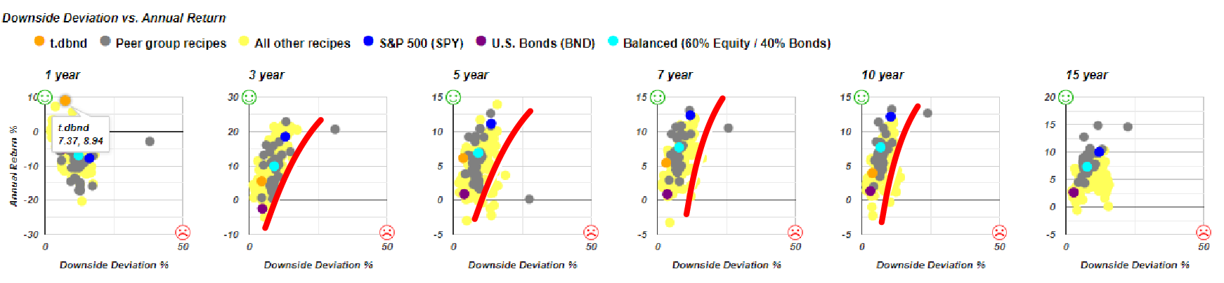
And then we can begin to see another risk measure, downside deviation. And here we see kind of the positive correlation over the different time periods where higher risk, higher return, and we can begin to kind of evaluate the effectiveness of this Defensive Bond (t.dbnd), which is represented by the orange dot. Clearly in one in over the past year, it's done very well, the best of all that we track. But even over all these other time frames, we don't have 15 years of data, so that’s the reason why we don’t have an orange dot on this diagram, but over 10 years, we can notice that it's above and to the right of the purple dot, which is the US Bonds (BND) ETF.
It's above and to the right, which means that it's higher risk and higher return, which is a trade off that you could decide if you wanted to, but in this case, over the past 7 years, 5 years, and the past 3 years, it got a higher return while being also lower risk based on downside deviation. So this is quite a good alternative to the U.S. Bonds (BND) fund because it's giving you either about the same level of risk or a little bit less risk, but with considerably more return.
And it's certainly showing that in the one year timeframe where it's the best of them all at about the same level of drawdown that the U.S. Bonds (BND) fund has experienced. So that could be worth a look. Again, it's not quite as exciting as some of these other higher risk and higher return portfolio recipes, but down in the lower risk zone, it's definitely a standout.
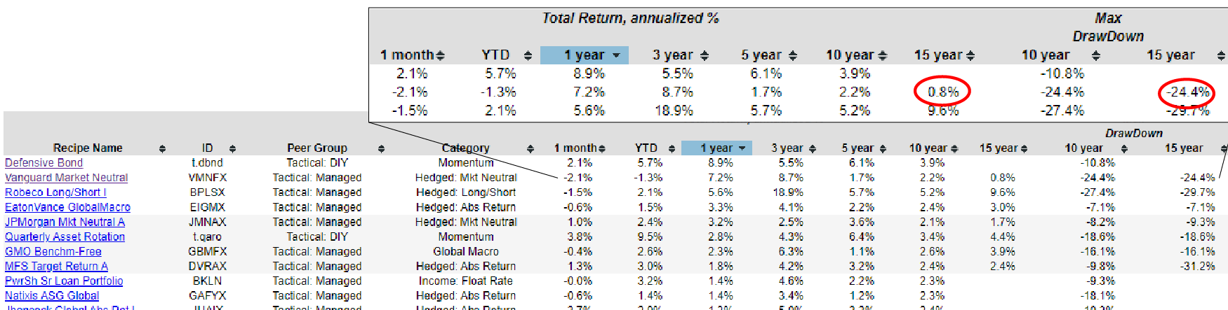
Let's go back to our list and look at Vanguard Market Neutral (VMNFX) mutual fund. Which has done well over the past year, but we can see over the past 15 years, annualized has done less than 1% a year. They've done a good job of being market neutral. But the challenge is over the 15 year time horizon, it's been a bit rough and the drawdown of 24%, about maybe about half of what the S&P500(SPY) has done, but it's still not a huge return over the past 15 years.
Market neutral funds struggle (and some don't survive)
Also over the past several months, some of these market neutral funds have been liquidated. Here's some that have disappeared off of recipe investing.com just because they've been liquidated by the fund sponsors or the providers of these funds.

An IQ Hedge Market, Neutral Tracker Fund, IQ Hedge Macro fund, and this Putnam Multi-Asset, Absolute Return Fund, and Class Y have just closed shop. And there’s an article from SeekingAlpha.com talking about those Index IQ funds that have been liquidated. So all of them had assets under 20 million, so they weren't very large at all. And if they're not performing well, then you can see why someone would just choose to shut them down. And in the case of this Putnam Multi-Asset Absolute Return fund, here's what the prospectus said that they were trying to achieve: “The investment seeks to earn a positive total return that will exceed the return on US treasury bills by 7%”. Well that's a good business if you can get it, but it's very hard to sustain. We applaud them for aiming at that objective, but we can also understand how that would be very difficult to achieve year in and year out. And I think the market agreed and they didn't get they didn't get the results that they wanted, so they shut it down.
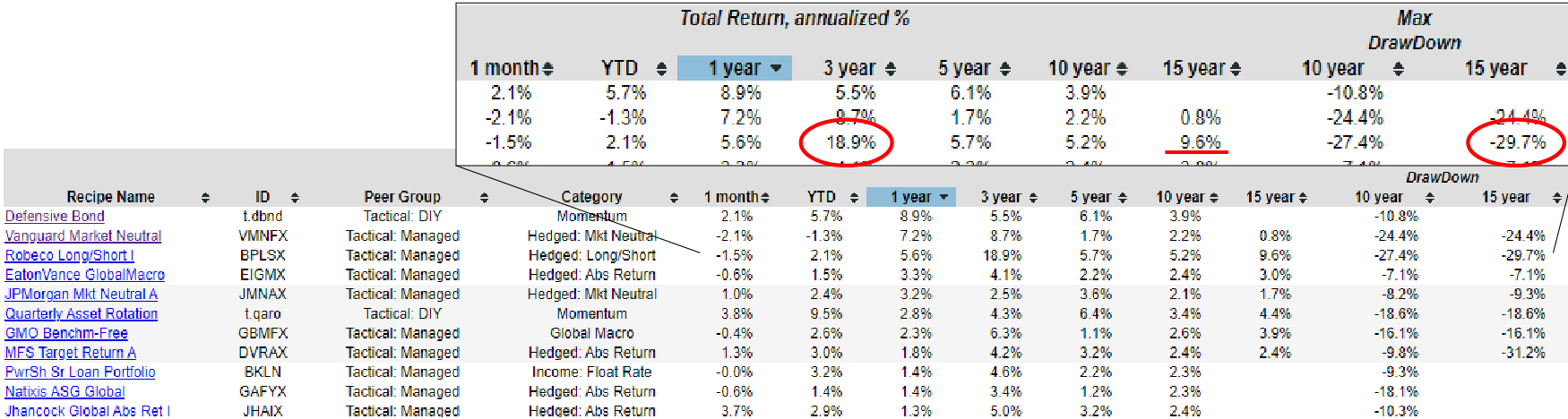
Let's go back and look at this Robeco Long/Short I (BPLSX) fund, which interestingly has done quite well over, not only the past year, but look at this 3-year annualized return of 18.9%, which is quite remarkable over the past 15 years, it's done 9.6% annualized, and now it has been down almost 30% at some point peak to trough over the past 15 years. But if you could handle that it's an interesting fund to look at.
An interesting Long/Short fund with an Investor share class
We also observed is that there's a retail or investor class on MutualFunds.com
So this institutional class (BPLSX) is for institutional investors, so there's limits on that. A minimum of a hundred thousand investment, you might have to work through an investment advisor. There is an investor class (BPLEX) that has a much lower minimum investment, slightly higher expense ratio. Now, this is an extremely surprising expense ratio of 2.85% in a bad way. But you can see that they have quite a bit higher transaction costs if they're taking both long and short positions. And so they've got quite a bit of work they're doing behind the scenes to earn these returns and perhaps to justify their expense ratio. Now what's interesting, on this site, they're saying their 3-year average return was 0.1%, which doesn't sync up.
And we can also go to another data source, Morningstar, which says that their 3-year return is again at 18.9%. Something's not quite right with that other site. This is just a reminder that if you're looking at performance data, you need to double check, make sure you've got the right numbers.
If we go into the BPLSX, sort it by year and go on total return, we can see that we're tracking right along with that 18.9% over 3 years annualized, and 5.7% for 5 years and 9.6% over 15 years.
So this is the orange line here in the line graph above, and we can see that it was relatively flat, but over the last couple of years, it's really come up, which has helped its statistics. So if we were looking at this investment back here in the 2020 timeframe, these numbers wouldn't nearly be as good, but it has come on strong over the last 3 years, obviously as evidenced by this 18.9% annualized over the past 3 years.
Let’s take a look at the top 3 Performers on a 1-year basis. I hope that it's helpful to get a perspective on the different funds that we track, the different recipes that we're looking at month after month.
And you can always check on these scatter plots to get a quick idea of what the hottest one is for the month and then relate that back to these risk measures. So Quartile Sector Rotation (t.srqr) doing very well, but it had considerable drawdowns.
The Adaptive Allocation F (t.aaaf) which is a favorite of a lot of our subscribers because of its lower risk with a higher return profile, up closest to the green smiley face, which is the hard to achieve, if not impossible to achieve a low risk and high return investment quadrant that we'd all love to be up there by the green smiley face, but we try to do the best we can.
Working along this frontier here, trying to find an investment that's sort of close to the red line.