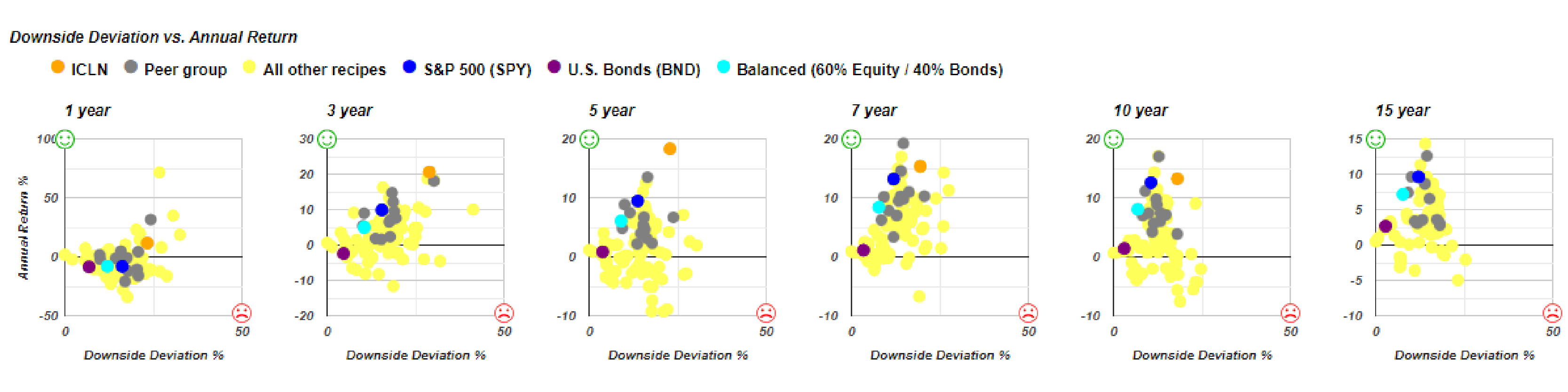
Article-2023-02
February 2023 Recipe Investing - Commentary
Topics this month
- ICLN: Clean Energy has great recent returns but watch out for the risk-return tradeoff.
- Multi-Asset Income portfolio recipe.
- The benefit of using scatterplots covering multiple time periods.
- Comparing the No Equity Portfolio Recipe to the 60-40 Balanced Portfolio.
- Top Portfolio Recipes over the past year.
Welcome to the February 2023 commentary from recipeinvesting.com. We track investible portfolio recipes that allow investors and advisors to build portfolios that minimize risk and maximize return. We reallocate and rebalance monthly, so we have plenty of new material to cover for our comparisons this month.
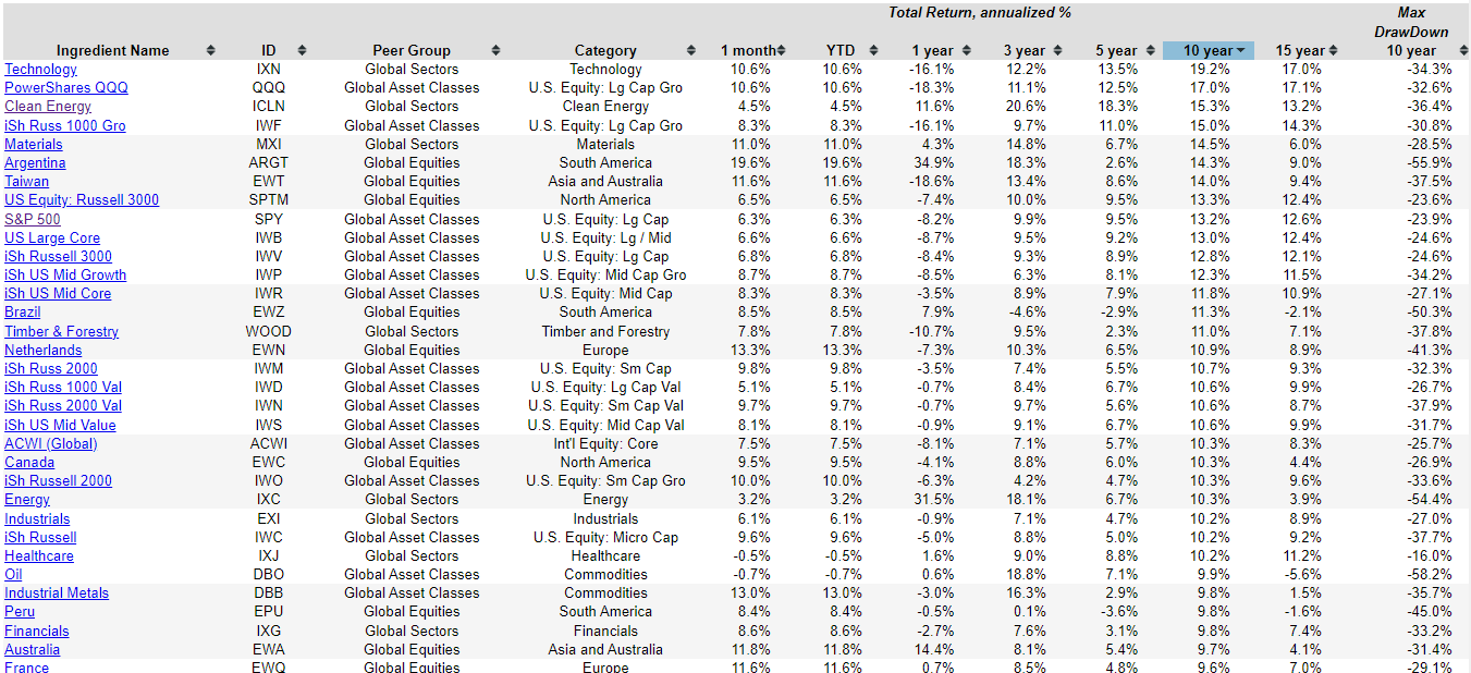
Let's take a first look at some of these ingredients
These ingredients, which is what we call some of the underlying exchange-traded funds, that can be combined to create recipes. These are individual global equity funds, global sector funds, and some global asset classes. They don’t make up a balanced portfolio in and of themselves, but it is interesting to look at some of these ingredients before we jump into the recipes.
One observation shown in this one-year graph is that the (purple, teal, dark blue) are really in a horizontal line, so the S&P 500, US Bond Fund, and a balanced 60-40 equity fund have really been doing about the same in terms of annual performance over the past year. They’ve all been within a half a percentage of each other, at around -8%. So, we’re really not seeing any risk of return, trade off or benefit from being in one of these other over the past year. Now, of course, over the past 7, 10, 15 years, that changes quite considerably. If we scan down the list of ingredients over the past year, we can see the top performers. There’s been some country funds that have come back pretty strongly.
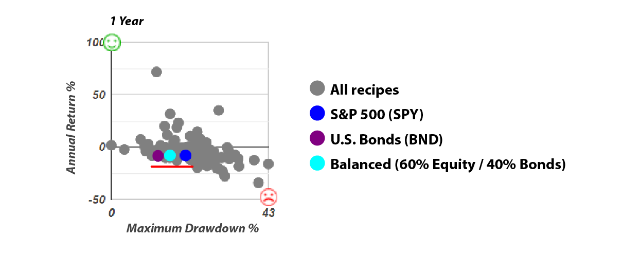
ICLN: Clean Energy ETF
And then we can look at something else that’s done pretty well over the past year, but without as much drawdown. This is clean energy. We can see the risk-return tradeoff for the clean energy ETF, which is ICLN. ICLN is represented by the orange dot on these scatterplots.
This gives us some idea of how this has been doing compared to these other three benchmarks that I just mentioned. The S&P 500 was represented by SPY, a broad-based US bond fund, and a balanced 60-40 portfolio formed from two ETFs. We can see that indeed this Clean Energy fund has done better and has had a positive return over the last year, unlike these other three benchmarks with a negative return. But if we look at these other time periods, 3 years, 5 years, 7 years, it has done well, but it’s really been at a higher risk and a higher return compared to SPY (represented by the blue dot). It’s done well, and it’s done better than SPY, but in every case, it’s been with greater risk.
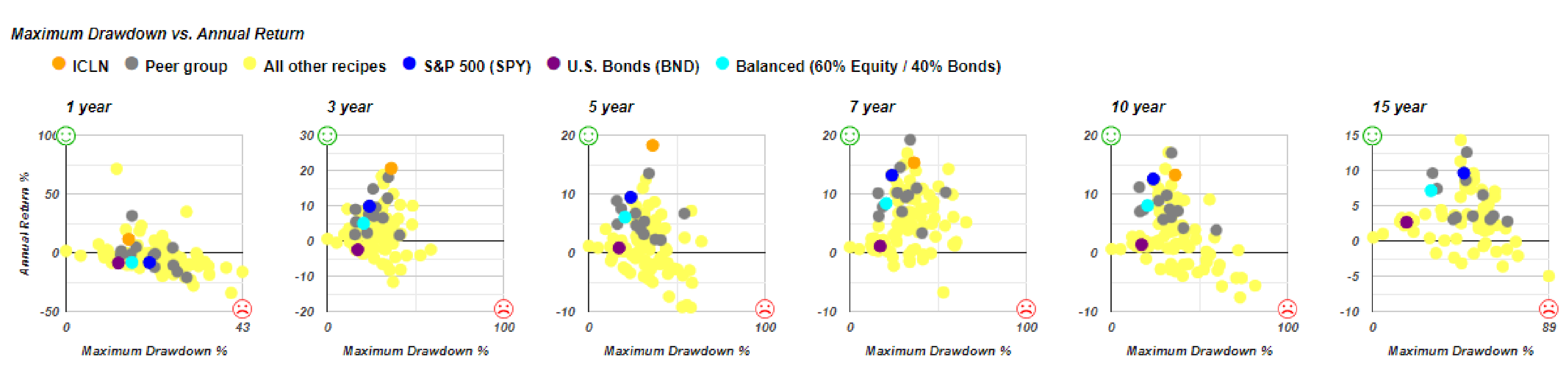
We can see another risk measure, downside deviation, which is kind of like standard deviation, as shown below.
We can see that the ICLN ETF (ICLN) doesn’t have 15 years of history. We don’t have an orange dot on the far-right graph, but on all these other graphs we can see that it is above and to the right of SPY (which is the dark blue dot). So again, it’s done better in terms of return, but it’s also had a greater downside deviation, which we would consider greater risk. That’s the importance of looking at both risk and return over a number of different time periods as we evaluate these portfolio ingredients. Before we leave this ingredient graph, let’s take a look at this 15-year chart below. We really do kind of have sort of this frontier, almost a wall as shown by the red line.
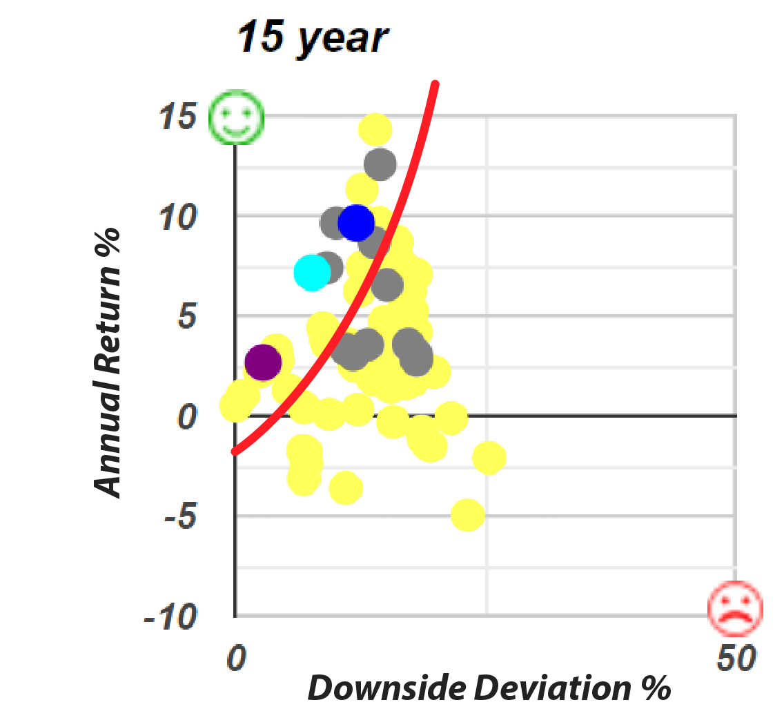
As you can see that it’s been very difficult for any individual ingredient to do better than a 60-40 balanced fund or the SPY or even this broad-based bond fund. In terms of risk and return, just looking at ingredients, this collection of these three benchmarks really does kind of provide the left frontier that’s difficult to surpass just using individual ingredients such as global asset class funds, global equity funds, or global sector funds.
Multi-Asset Income Portfolio Recipes
Let’s turn our attention now to portfolio recipes, which are the combinations of mutual funds, exchange-traded funds that can give us significantly better performance because we can blend them, we can get in and out of certain funds each month, and that provides a better risk versus return profile as opposed to just investing in single ingredients.
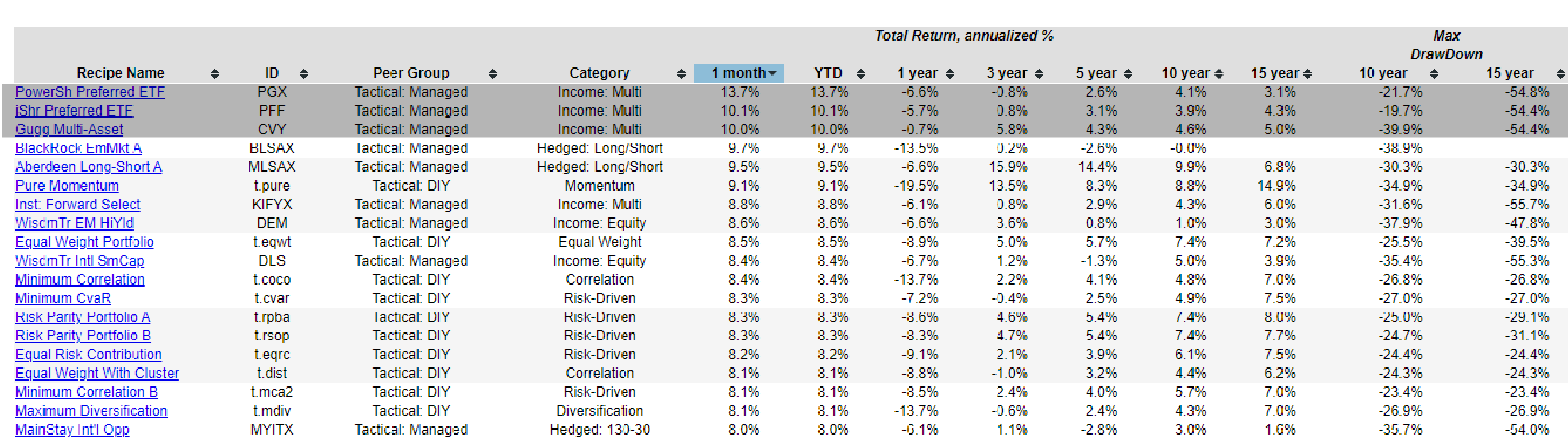
Let’s see what we’ve got going on for this past month, ending on January 31, 2023. We can see that the top three are both multi-asset income funds and, in these cases, PowerShares Preferred ETFs (PGX) that also have an income component.
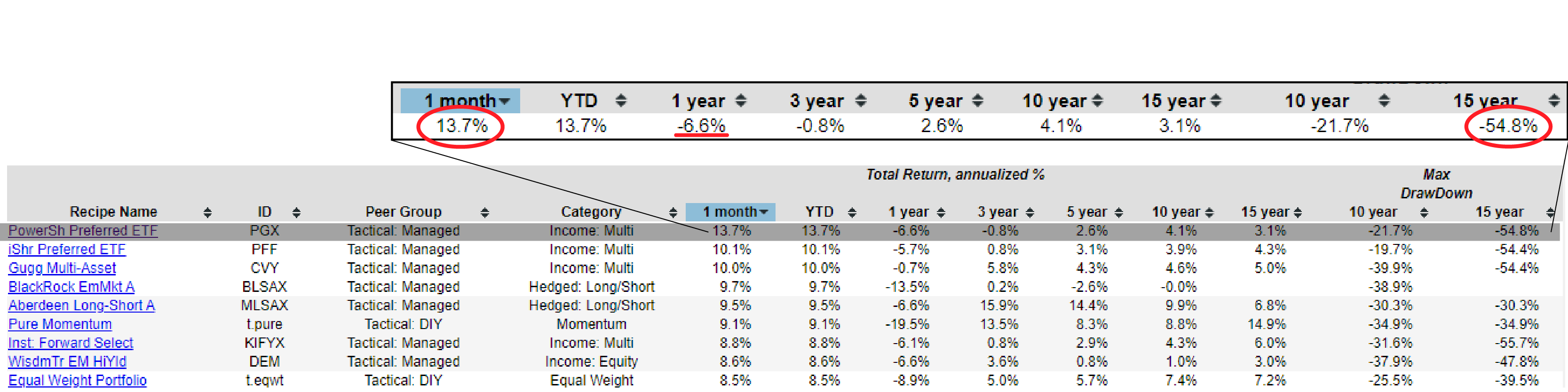
We think we look at this 13.7% number, and we can say that it’s impressive. In one month, it’s returned 13.7%. But then we can also look at some of the other time periods and realize that it’s had a great month, but over the past year it’s down to 6.6%. And interestingly, over the past 15 years, it has had at least one period where it’s been down almost 55% based on the month and total return numbers. This is a continued reminder that as we look at these individual recipes, even recipes or actively managed funds that combine a lot of different underlying securities, we need to look at them in the full context of risk versus return.
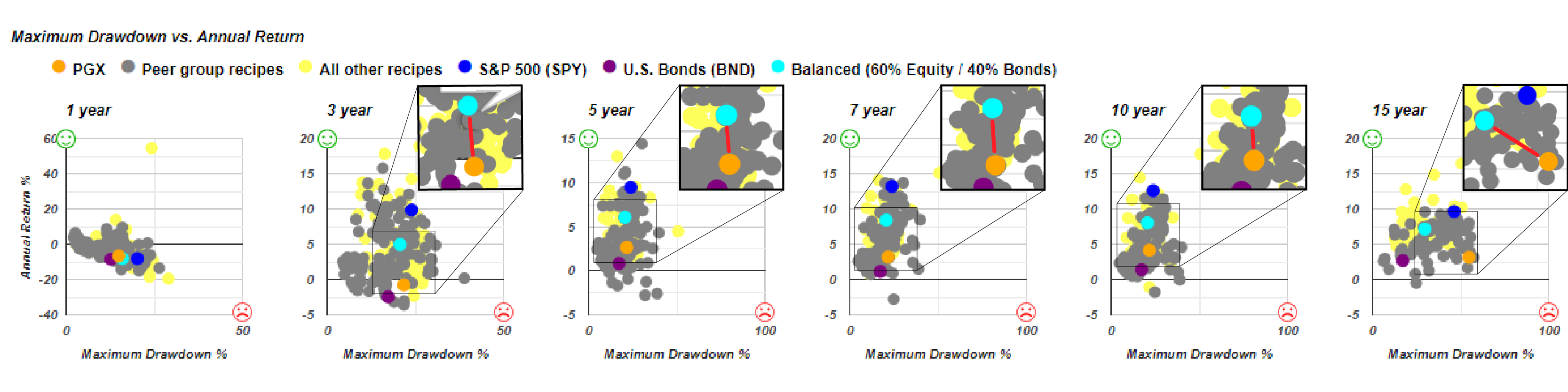
In the graph above, we can see the orange dot, which is the PowerShares Preferred ETF (PGX). It’s done very well in the past month, but this is the one-year graph. It hasn’t done that great. And then you can see in every time period, 3 years, 5 years, 7 years,10 years, and 15 years, it’s all below and to the right of this benchmark balanced portfolio.
That means that in every time period, except for the last year, it’s been higher risk and lower return, which is really the worst combination. And this is using maximum drawdown as the risk measure over those individual periods. And if we look at it as shown below using downside deviation, it’s just about the same.
We can say that it has had a little less risk than the teal dot. You can see it appears just to the left of the teal on the chart above. But it is still a poor return. And over 15 years, it’s definitely higher risk in terms of downside deviation with lower return. In fact, it’s done about the same as a bond fund, but with about as much risk as the S&P 500 (SPY). That’s kind of poor combination of getting bond-like returns but taking on equity type risks. The thing that I like about these scatterplots is that we really have a quick way to visualize risk and return, not only for an individual security that we’re looking at, say the one in orange, but then we can compare it to these benchmarks and all the other portfolios that we’re tracking about 200 in total across the different varieties.
No Equity Portfolio: A Good Alternative?
That’s kind of deeper dive into one particular recipe that looks good from the one-month perspective. But then, when we dig a little deeper, it starts to show some weakness. Let’s go back to one month and say we have quite a few Tactical that have done well this past month. No equity portfolio (s.noeq) is an interesting portfolio. What if you say, you know what, I’m out, I’m tired of this equity volatility, I just want to know about the equity portfolio. This is based on gold real estate and long-term bonds. Let’s go ahead and look at that No Equity Portfolio (s.noeq).
No equity portfolio (s.noeq), which is a quite straightforward strategic or static allocation that just splits it among three ETFs and then rebalances every month. It’s a very simple portfolio to maintain. And it’s compared similarly to this 60-40, but it’s in this case, lower risk, but also lower return as we make this observation shown below.
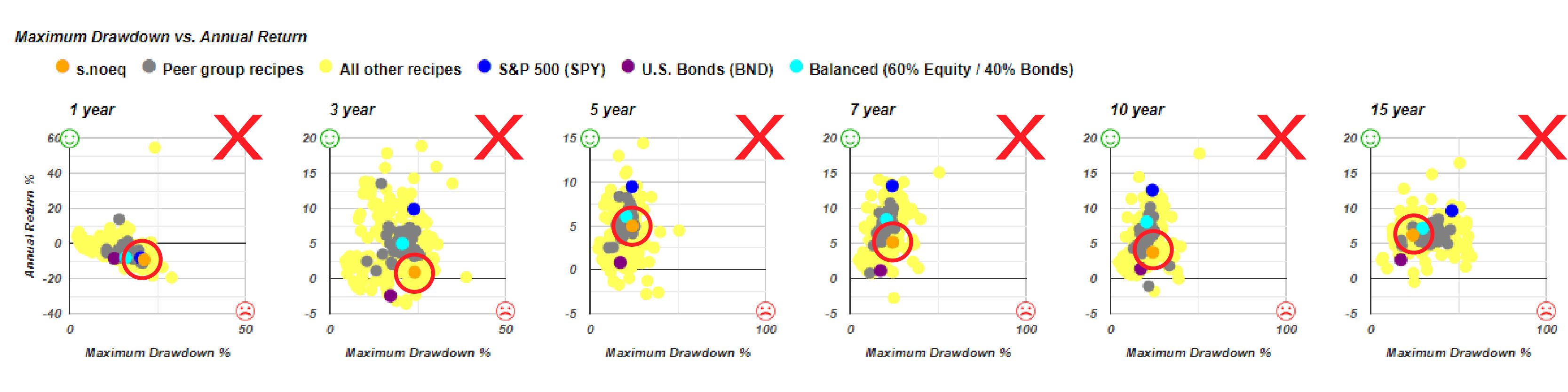
And in this case, this is headed in the wrong direction, right? Higher risk, lower return compared to the 60-40 benchmark that’s in the wrong place. So basically, all of these, it’s not even beating the 60-40 benchmark, except for and it’s not beating it in the 15-year time period either. It’s just doing it with lower risk, lower return. We have to kind of assess the viability of these with respect to some of these alternatives. And that’s why even something as simple as the 60-40 balanced portfolio, is a good benchmark because frankly it is a little bit difficult to beat.
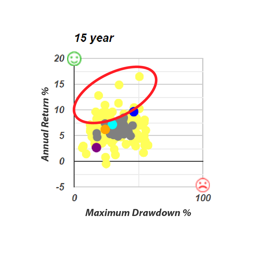
This is the 15-year maximum drawdown, and there are several Tactical portfolios that are beating the 60-40 benchmark, but frankly, there’s a lot more on this side of that line that aren’t even beating that simple 60-40 balanced portfolio benchmark. Let’s take a look at this no equity fund that invests in bonds, gold and real estate. It has some good performance, but compared to 60-40, it doesn’t really stack up.
The Quartile Sector Rotation (t.srqr)
And let’s go back to the portfolio recipes and we’ll rank by one year and we’ll see if we can observe anything else. Total return for the whole collection of portfolio recipes that we tracked. This Quartile Sector Rotation (t.srqr) has continued to do not so great this past month but has done for not only over the past year up over 50%. Again, that comes with some risk over the past 15 years.
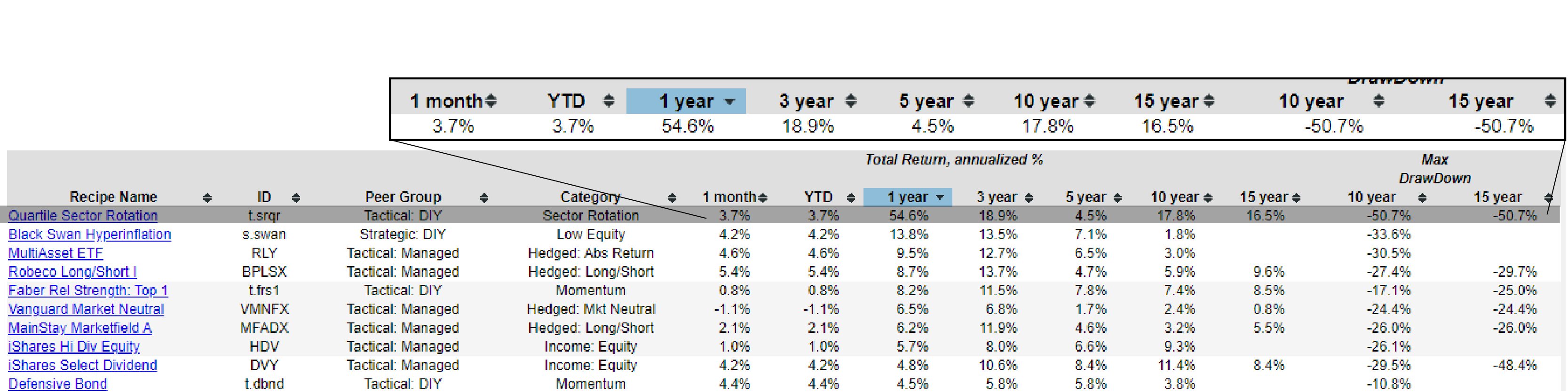
There has been a period at the end of a month when it was down more than 50%, but it snapped back. And you can see that weakness kind of occurred between year 3 and 5, because this 5-year number is a kind of its lowest total annual return number that we see. But over 15 years, 16 and a half percent over one year, over 50% up. We can see some interesting trade-offs with risk and return there.
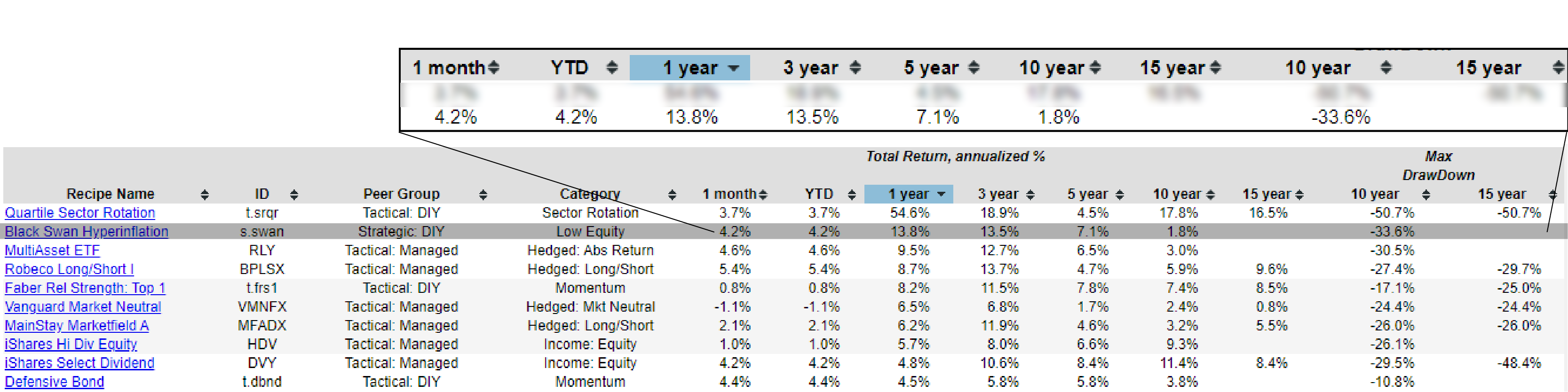
Black Swan Hyperinflation (s.swan)
The Black Swan Hyperinflation Portfolio (s.swan) is a static portfolio that we rebalance at the end of every month, but we don’t change the components. That’s done reasonably well over the last month and over the last year or two. But as shown in the graph below, over 10 years has not done great and lost a third of its value over the past 10 years. And we don’t have 15 years of history due to the age of the underlying securities that are inside of the Black Swan Hyperinflation Portfolio. (s.swan).
If we wrap up just by seeing how we’re doing on a 15-year basis. We continue to see that this quartile sector rotation has done well over the past 15 years. Some momentum-based funds, what I call one of the fan favorites, the Adaptive Asset Allocation Portfolio F (t.aaaf). I know several subscribers use and enjoy that. That’s done consistently well, almost 13% over the last 15 years. And the most drawdown that it’s had over the past 15 years is 18.9%. And then looking back at that for this month, it’s ticked up just six and a half percent just in this past month. It has a little bit of softness over the last year, but it looks like that’s kind of balancing out and it’s coming back to its normal form with a better performance over this past month.